.avif)
Razorpay Magic is a one-click checkout payment solution that streamlines online payments by securely using pre-saved customer data - such as addresses and preferred payment methods - to enable faster digital transactions.
By eliminating checkout friction, the platform reduces cart abandonment, improves conversion rates, and delivers a smooth, high-performance checkout experience for businesses and consumers alike.
Our mission was to redesign the Razorpay Magic checkout experience to improve usability, optimize mobile digital payments, and deliver a seamless, conversion-focused payment flow that reduces friction at every step of checkout.
by streamlining the one-click flow to eliminate friction and reduce time-to-pay.
through a simplified, intuitive digital payments experience.
by removing checkout friction and improving completion rates.
with a mobile-optimized, consistent checkout across devices.
Razorpay Magic was designed with focused UX enhancements and payment innovations to optimize end-to-end checkout and enable reliable payments.
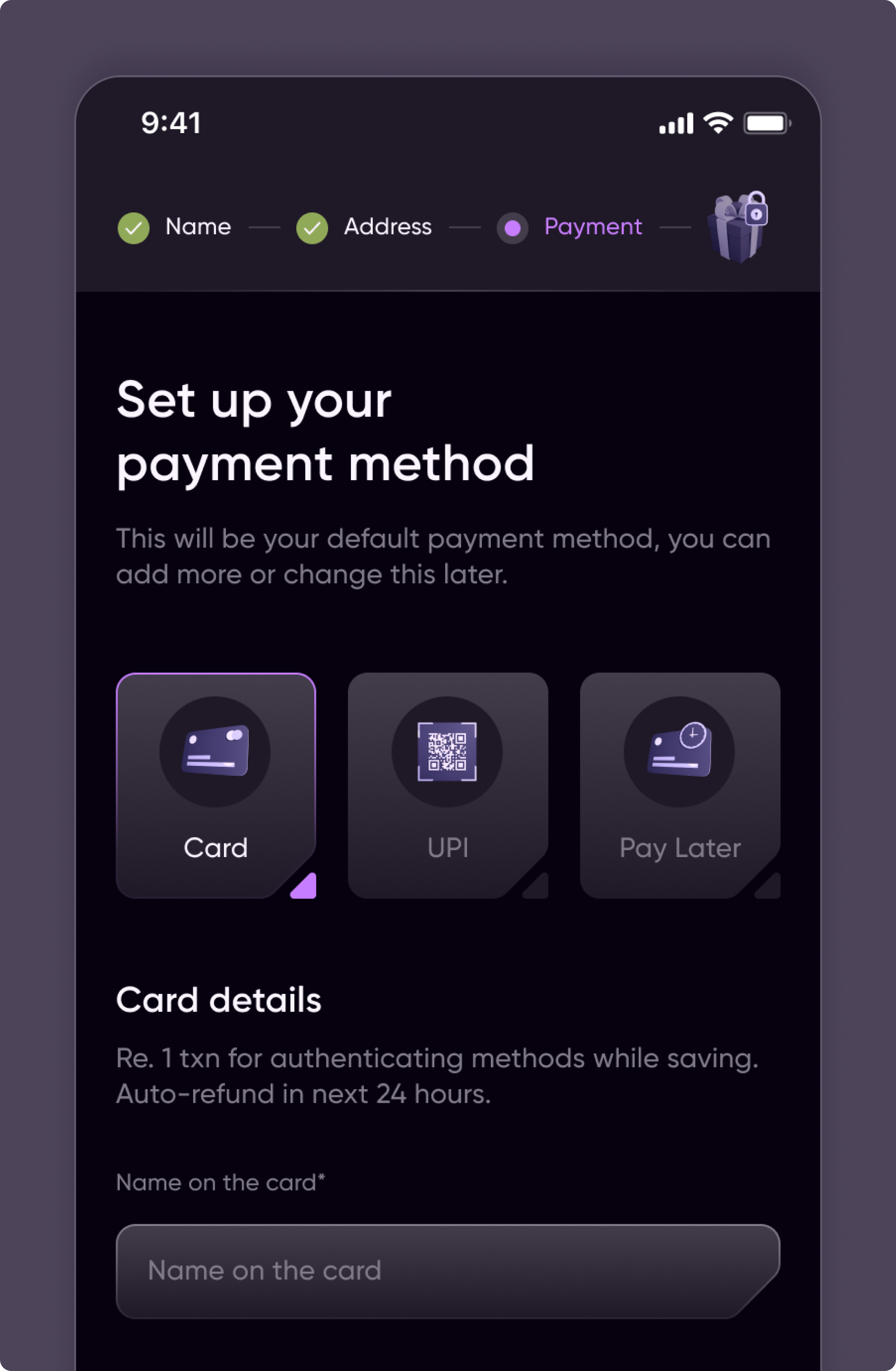
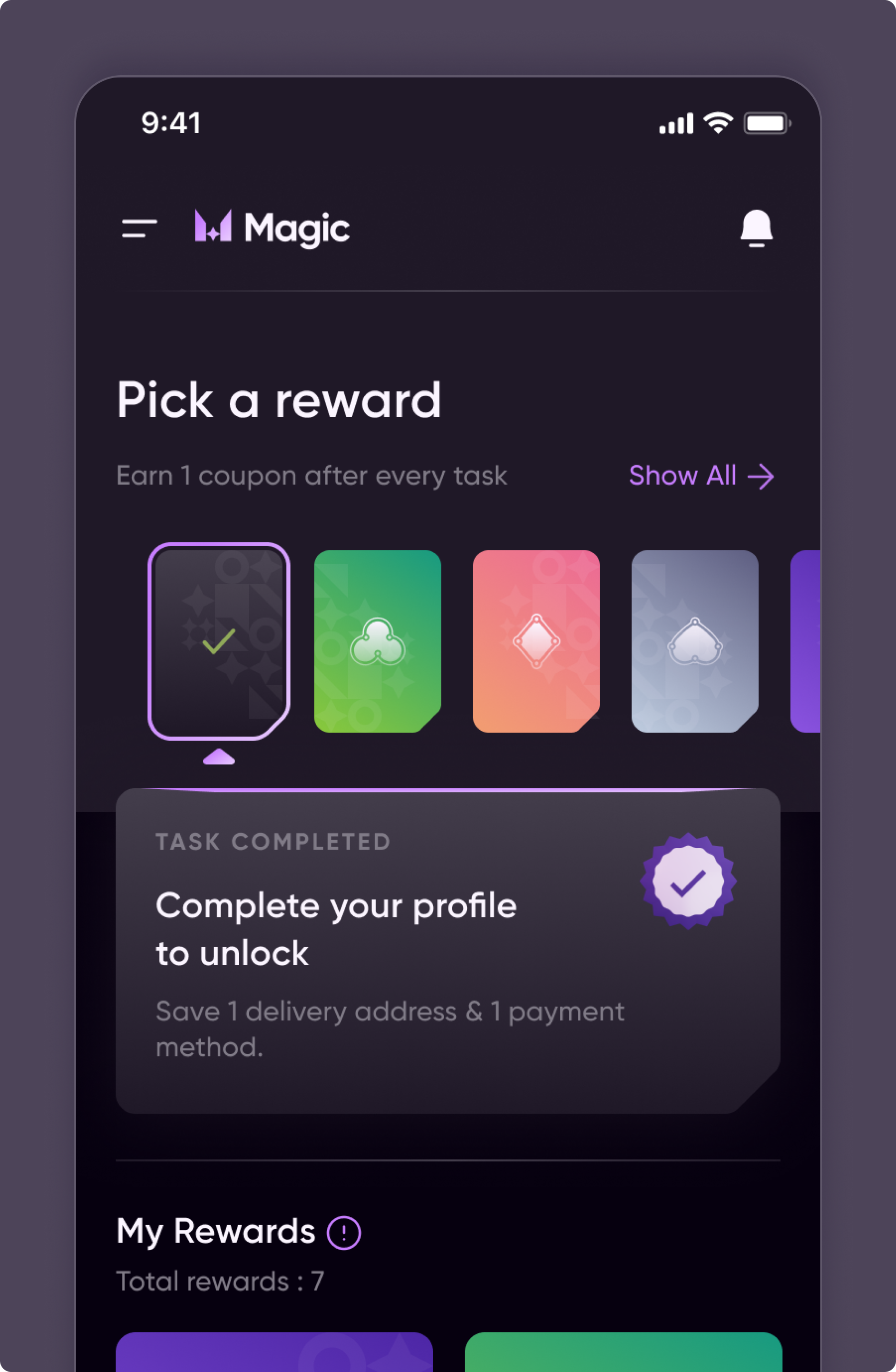
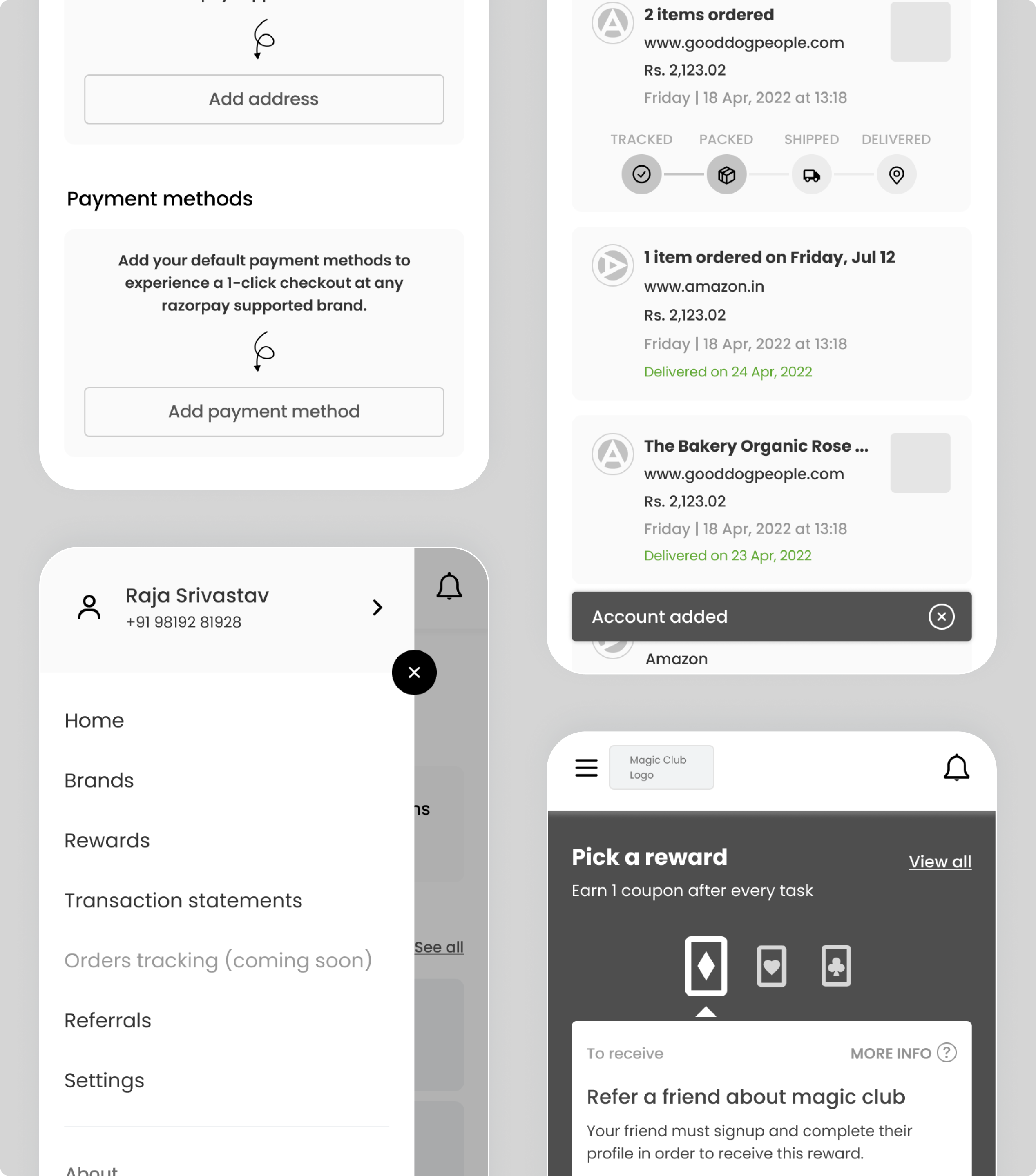
Persona-led flows enabled a pre-filled checkout using saved addresses, payment methods and coupons, reducing friction and time-to-pay.
Icons, color systems and typography enhanced usability while reinforcing a professional, trustworthy visual identity across checkout.
A visually intuitive interface was designed to prioritize clarity, simplicity, and ease of use - allowing users to complete payments quickly.

Razorpay Magic was designed with focused UX enhancements and payment innovations to optimize end-to-end checkout and enable reliable payments.
Razorpay Magic was designed with focused UX enhancements and payment innovations to optimize end-to-end checkout and enable reliable payments.
Persona-led flows enabled a pre-filled checkout using saved addresses, payment methods and coupons, reducing friction and time-to-pay.
Persona-led flows enabled a pre-filled checkout using saved addresses, payment methods and coupons, reducing friction and time-to-pay.
Icons, color systems and typography enhanced usability while reinforcing a professional, trustworthy visual identity across checkout.
Icons, color systems and typography enhanced usability while reinforcing a professional, trustworthy visual identity across checkout.
A visually intuitive interface was designed to prioritize clarity, simplicity, and ease of use - allowing users to complete payments quickly.
A visually intuitive interface was designed to prioritize clarity, simplicity, and ease of use - allowing users to complete payments quickly.
For Razorpay Magic, we simplified a complex checkout into a fast, intuitive payment flow - reducing friction and driving conversions.
improved via a low-friction, streamlined checkout interface.
strengthened with awareness of user preferences and context.
reinforced with clear visual markers, iconography, color systems, and typography.
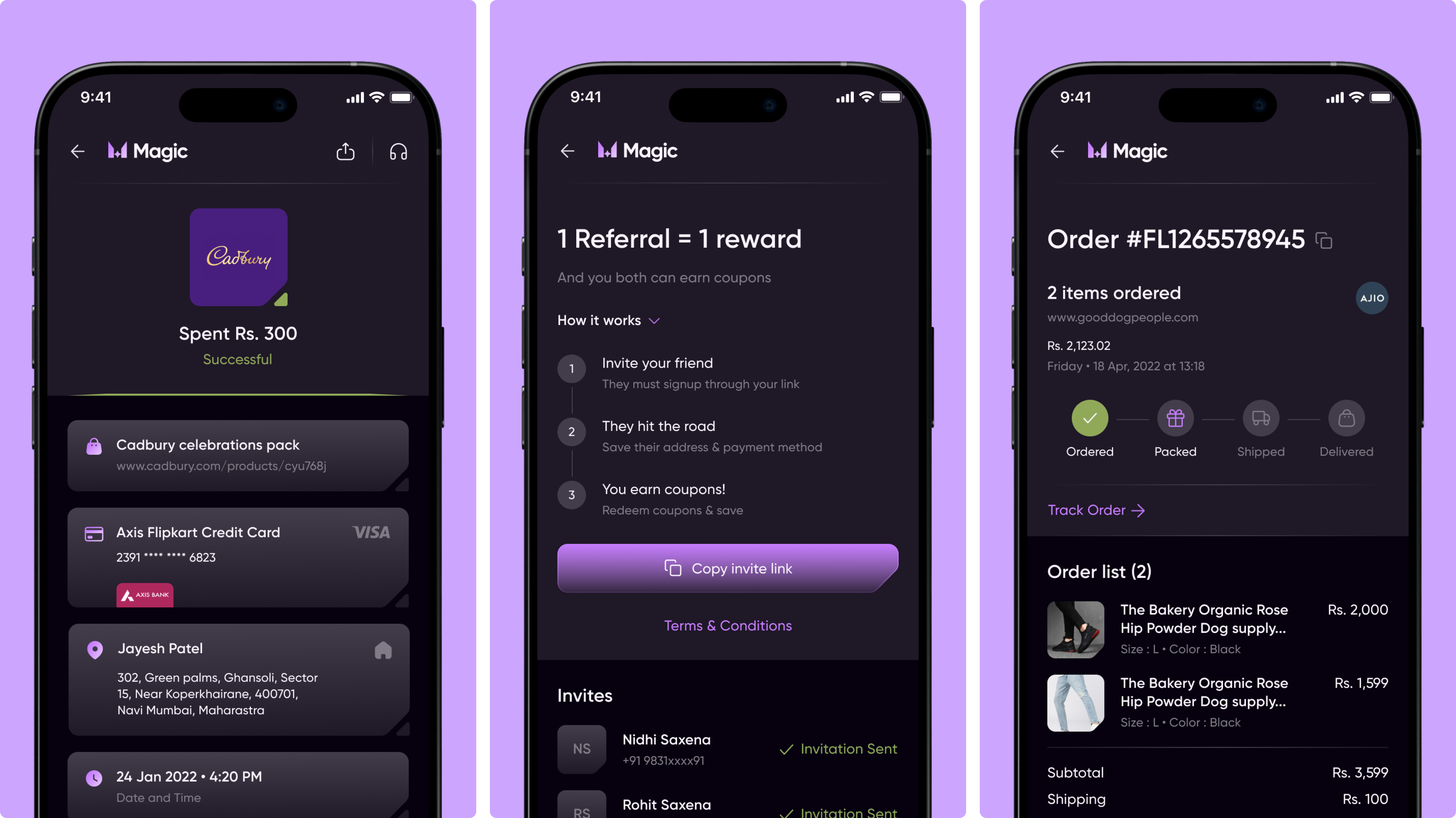
Mobile app UX and visual design enabling rewards, referrals, and order summaries for seamless checkout experience.
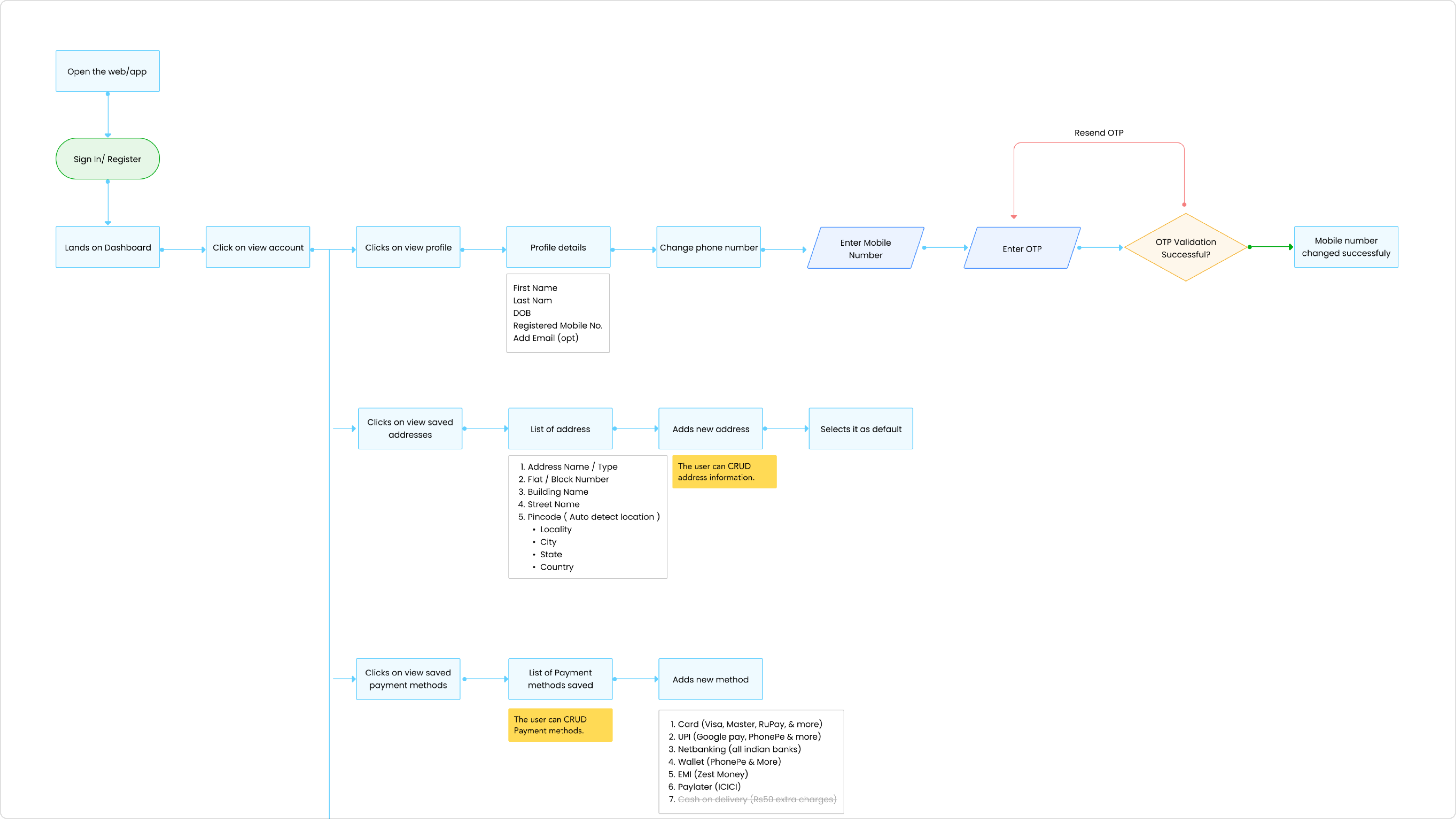
Defined a detailed information architecture mapping the end-to-end journey from login to checkout, simplifying complex payment flows.
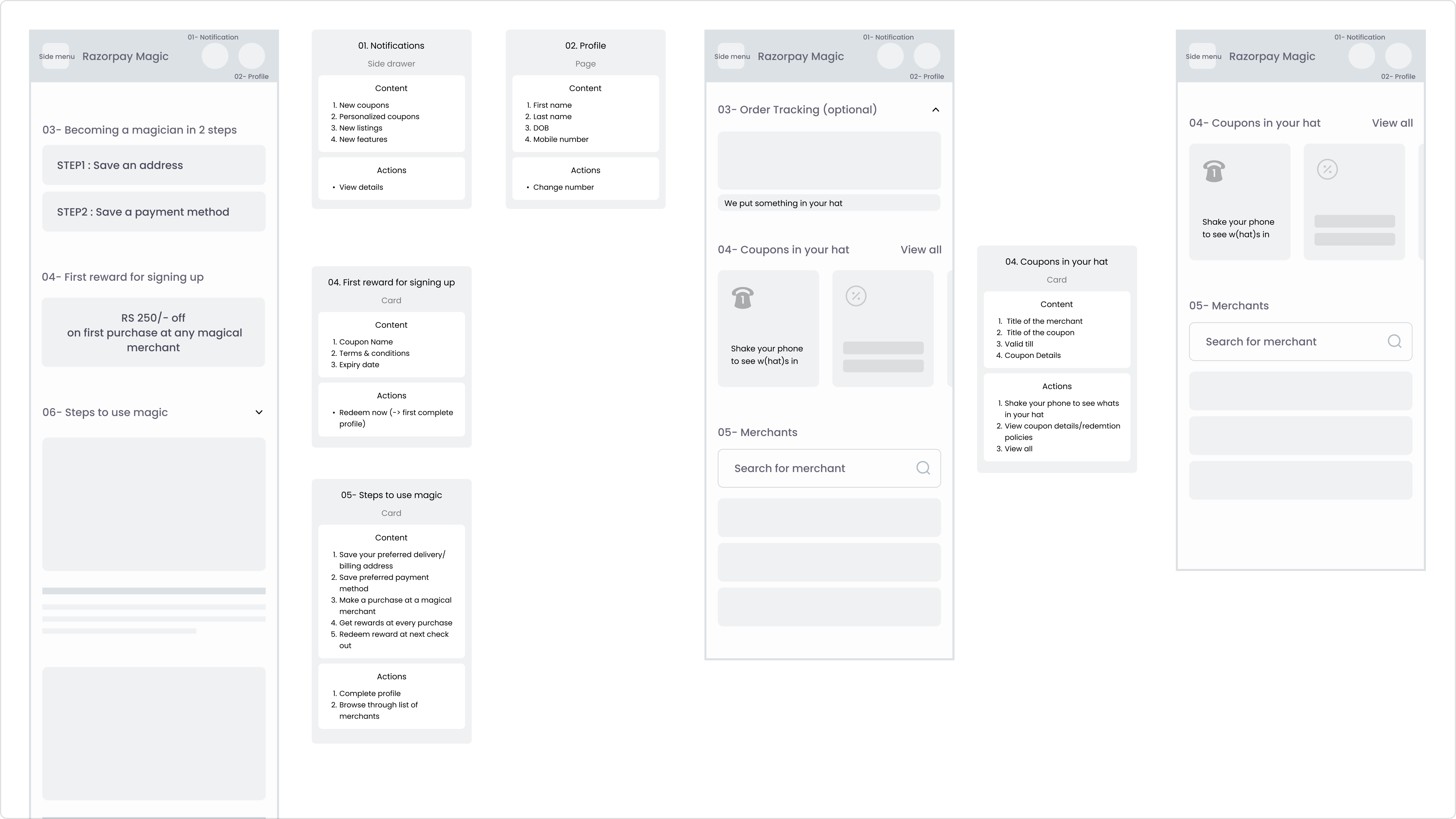
Previsualized with coupon application wireframes to reduce friction and improve clarity during checkout.
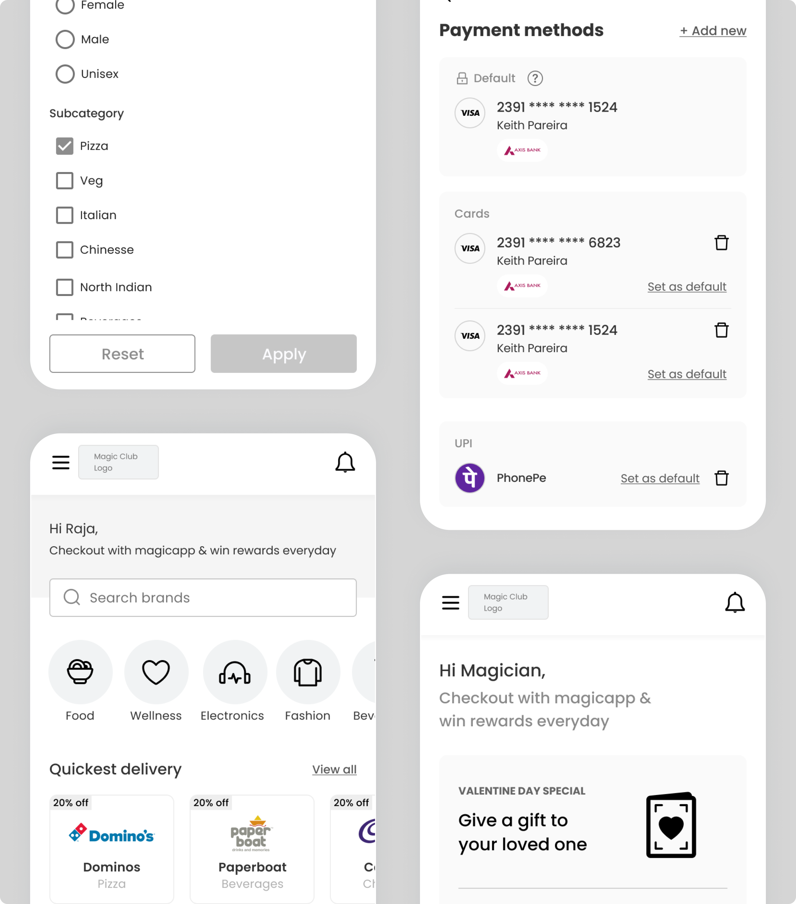
Created mobile-optimized wireframes for selecting and managing payment methods to ensure fast, consistent transactions across devices.
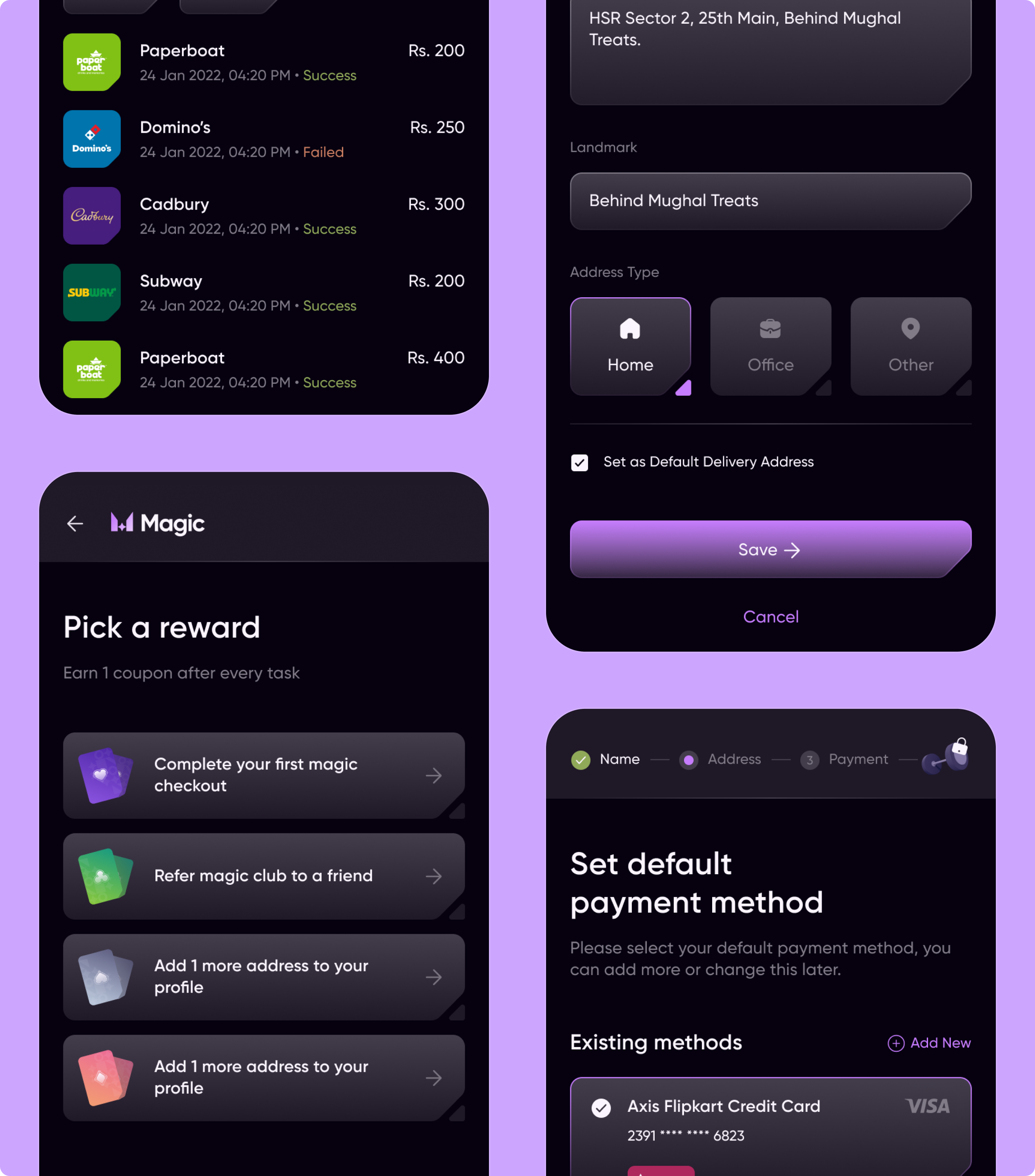
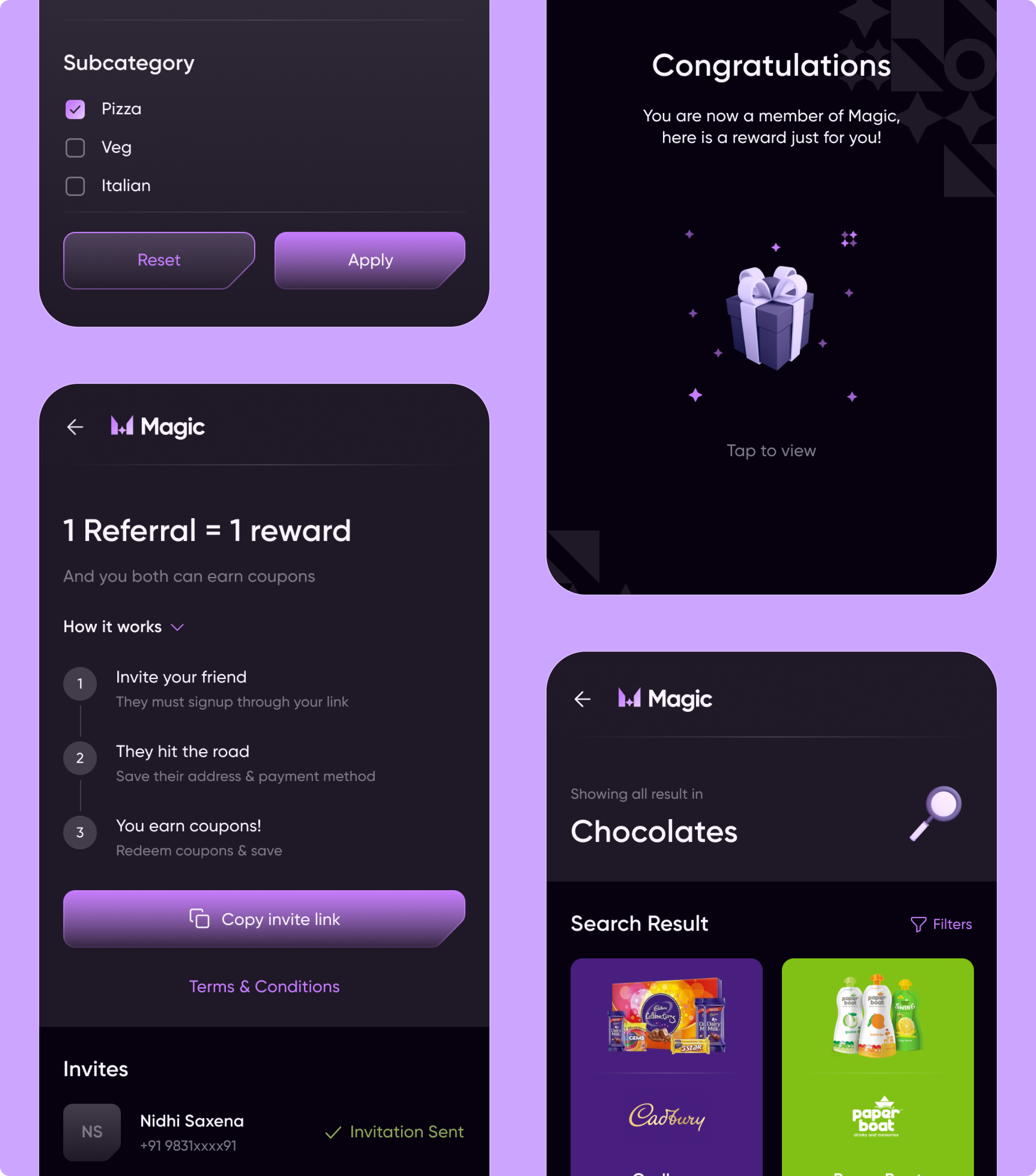
Designed end-to-end checkout and engagement experiences (rewards, referrals, address & payment setup, search & discovery) to enable faster, frictionless transactions.
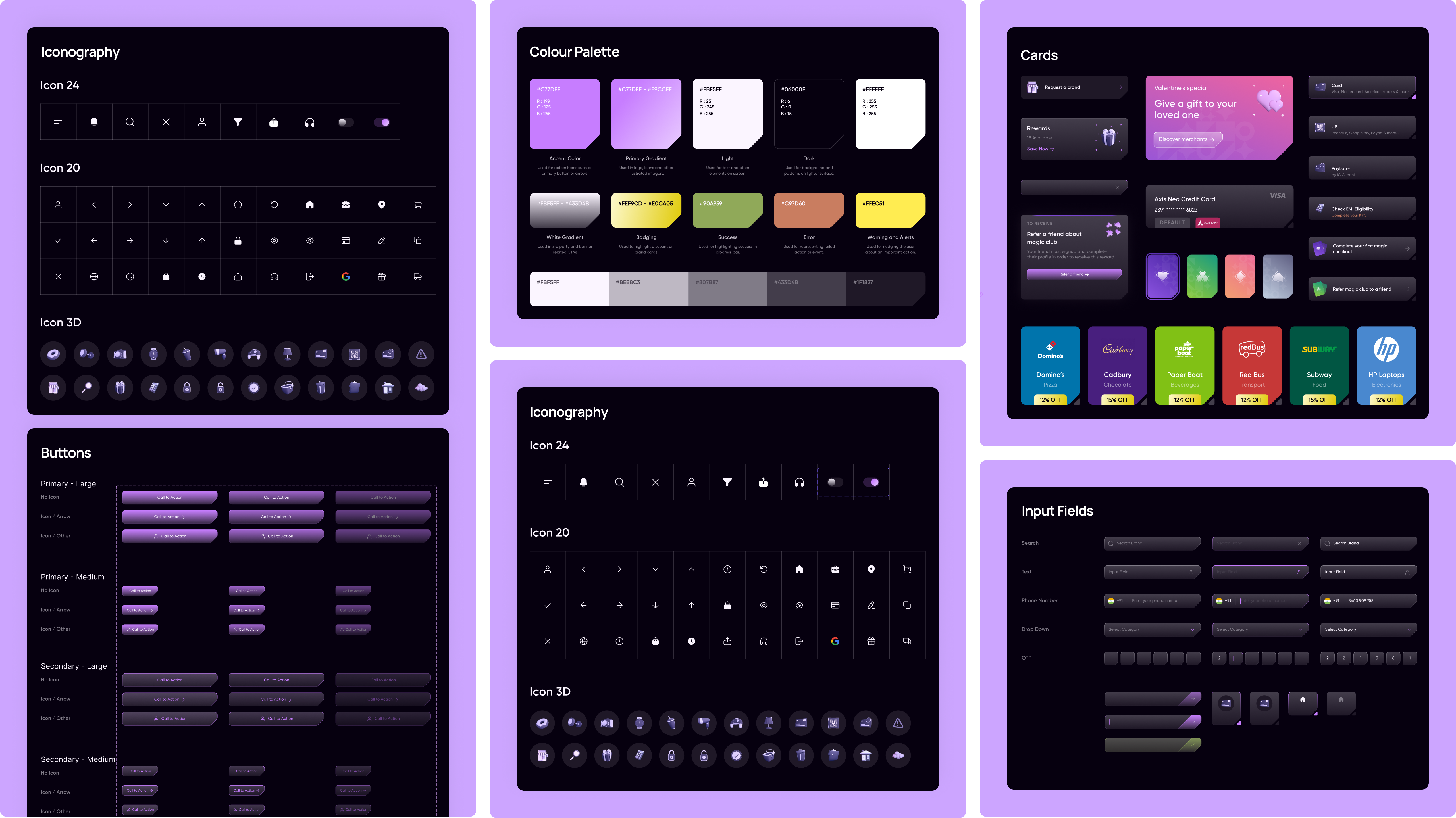
Built a scalable design system (color palette, iconography, cards, buttons, input fields) to ensure visual consistency and streamline product scalability.
Razorpay Magic is a one-click checkout experience NetBramha designed for Razorpay, India's largest full-stack payment gateway. The brief was to collapse a multi-step checkout into the fewest possible taps without weakening fraud protection.
Checkout is the highest-scrutiny, highest-drop-off moment in any payment flow - every extra field costs conversions. NetBramha's BHIM transaction-flow redesign solved a related problem at a different scale: both projects treat the number of steps to complete a payment as the primary metric to design against.
A payment gateway can have excellent infrastructure and still lose transactions at the final step if the checkout interface introduces friction, confusion, or unnecessary re-authentication.
That's precisely where Razorpay Magic was aimed - the single highest-leverage screen in the entire payments journey. It's the same principle behind NetBramha's IAMIN micro-investment flow, where every additional step between intent and action measurably reduces how many people actually save.
A payment gateway's checkout has to work correctly across thousands of merchants with different catalogues, price points, and customer bases simultaneously - it can't be tuned for one business's specific customers.
That constraint doesn't exist in a typical e-commerce redesign like SPAR's retail platform or Tira's beauty commerce experience, both of which were designed around one specific brand's catalogue and customer base rather than a multi-tenant infrastructure layer.
NetBramha's fintech infrastructure work spans payments (Razorpay Magic, BHIM), credit (TransUnion CIBIL), lending (ONE Muthoot,
Ninjacart's farmer loan digitisation), and institutional debt (Yubi) - five different layers of how money moves through India's financial system, not one narrow specialism.
Reducing steps in a checkout flow isn't the same as reducing security - the fraud and authentication logic in Razorpay Magic runs in the background rather than being surfaced as additional manual steps for the customer.
Designing security to be invisible rather than visible is a recurring pattern in NetBramha's regulated-industry work; the same approach underpins how TransUnion CIBIL presents sensitive credit data without adding friction for the person trying to read it.
Recommended Next
Designing a seamless mobile banking experience for 60M+ HDFC users


