Oxford University Press (OUP), the world’s largest university press, is a globally respected education publisher delivering innovative learning solutions.
Oxford Advantage is its integrated ed-tech platform for school children, offering digital content, teaching resources, and learning tools to support educators and learners across diverse academic needs.
Our mission was to revamp the Oxford Advantage Learning Management System and landing pages to deliver a modern, intuitive, and accessible learning platform - improving navigation, teaching workflows, and cross-device usability for a large, diverse user base.
by redesigning intuitive, engaging LMS journeys across India for 20+ crore OUP learners and educators.
through a structured content strategy that reduced reliance on customer support.
by establishing a cohesive, scalable design system for Oxford Advantage.
with a modern, accessible learning platform reinforcing Oxford Advantage’s leadership in ed-tech.
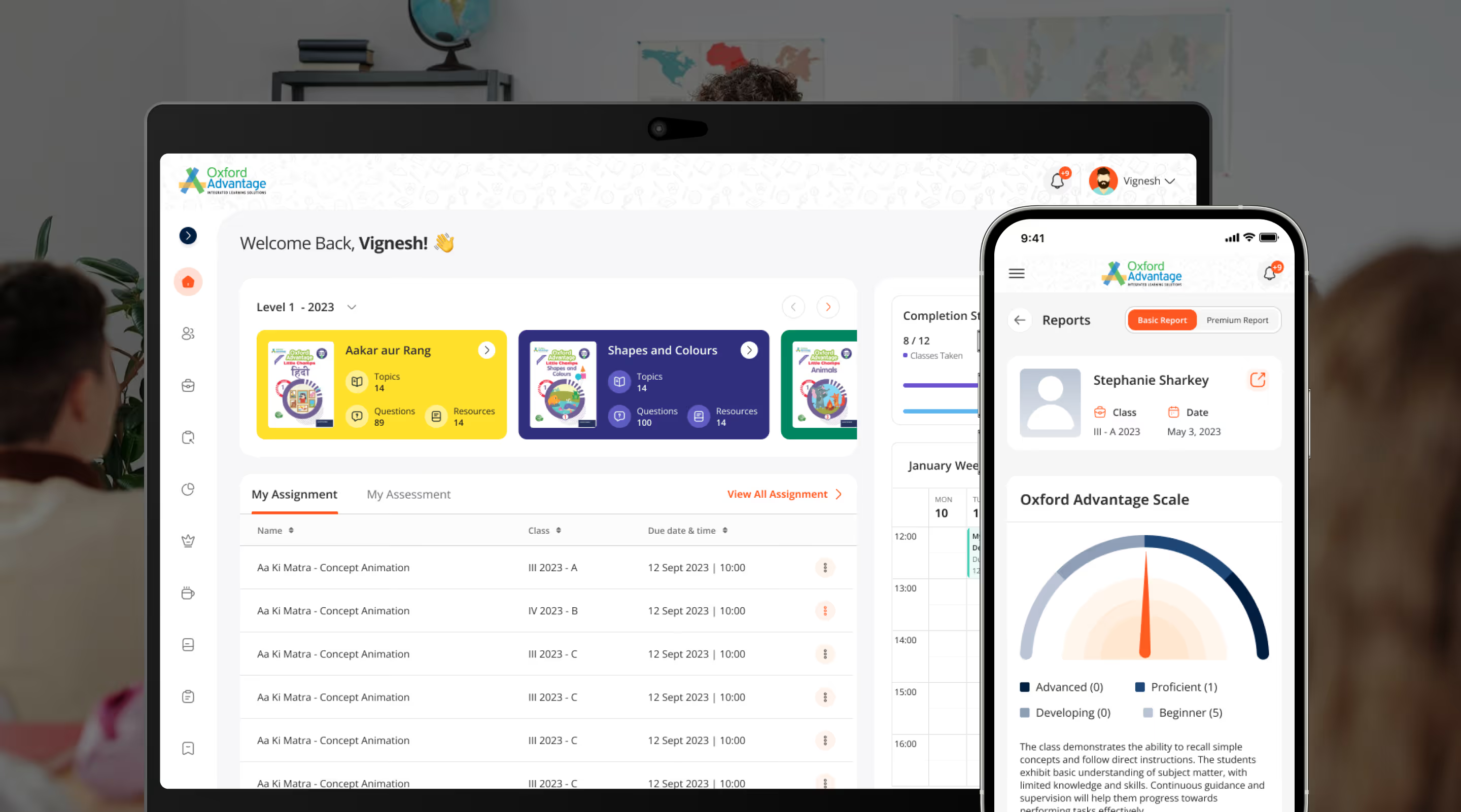
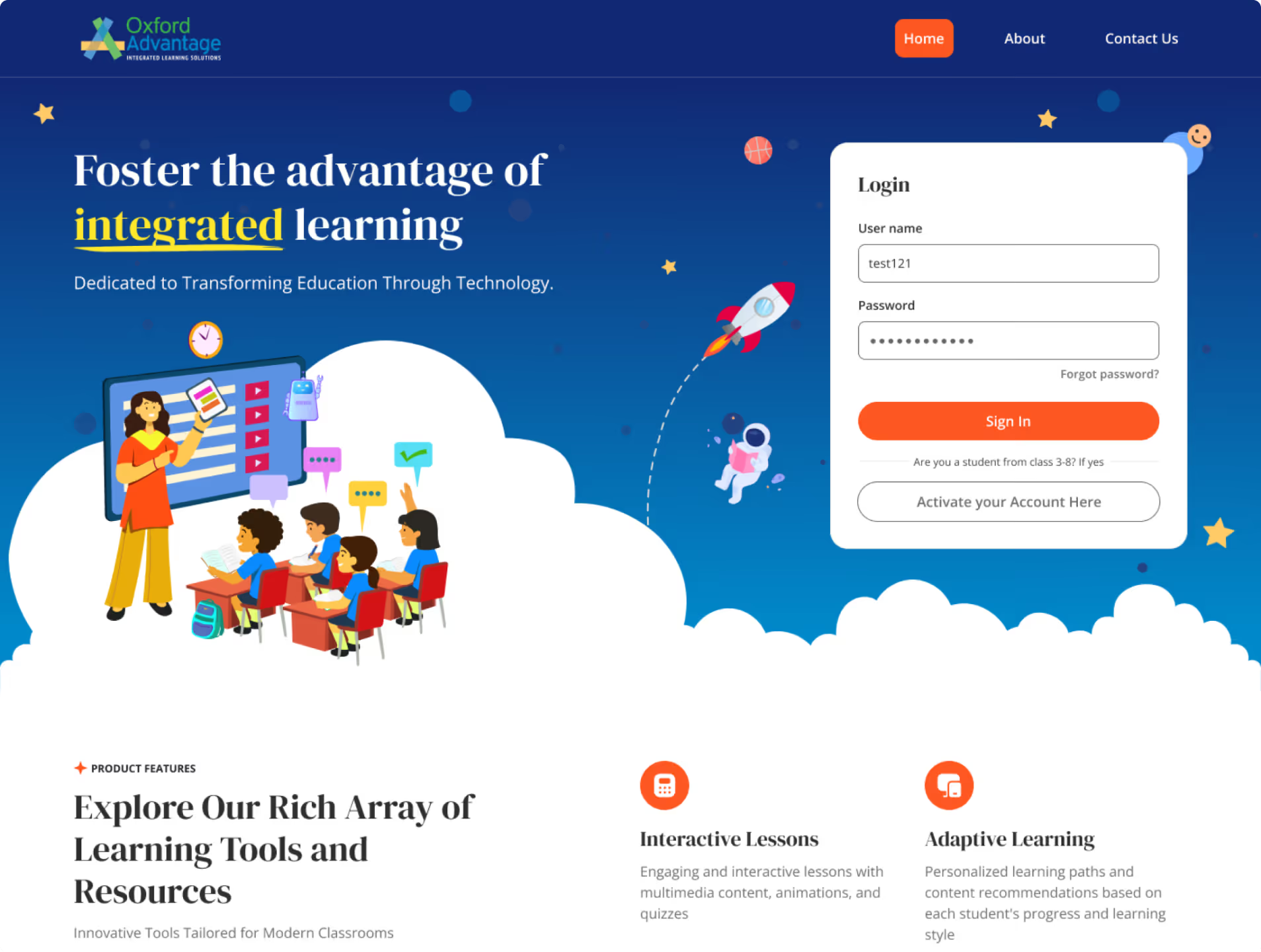
Modern, clean design with clear hierarchy, structured layouts, and engaging illustrations enhancing discoverability and usability.
Purpose-built UI components and widgets simplified navigation and supported seamless learning and teaching workflows.
Clean, minimal layouts with engaging illustrations improved accessibility and made the platform approachable for younger learners.


The interface was modernized for clarity, with personalized dashboards enabling tailored learning across roles and devices.
Modern, clean design with clear hierarchy, structured layouts, and engaging illustrations enhancing discoverability and usability.
Modern, clean design with clear hierarchy, structured layouts, and engaging illustrations enhancing discoverability and usability.
Purpose-built UI components and widgets simplified navigation and supported seamless learning and teaching workflows.
Purpose-built UI components and widgets simplified navigation and supported seamless learning and teaching workflows.
Clean, minimal layouts with engaging illustrations improved accessibility and made the platform approachable for younger learners.
Clean, minimal layouts with engaging illustrations improved accessibility and made the platform approachable for younger learners.
The interface was modernized for clarity, with personalized dashboards enabling tailored learning across roles and devices.
The interface was modernized for clarity, with personalized dashboards enabling tailored learning across roles and devices.
For Oxford Advantage, the redesign improved learning flows, strengthened visual identity, and elevated usability - positioning the LMS as a leading ed-tech platform in India.
simplified through intuitive journeys for educators and learners
enhanced via a structured content strategy reducing support dependency
elevated by a modern UX and cohesive visual language
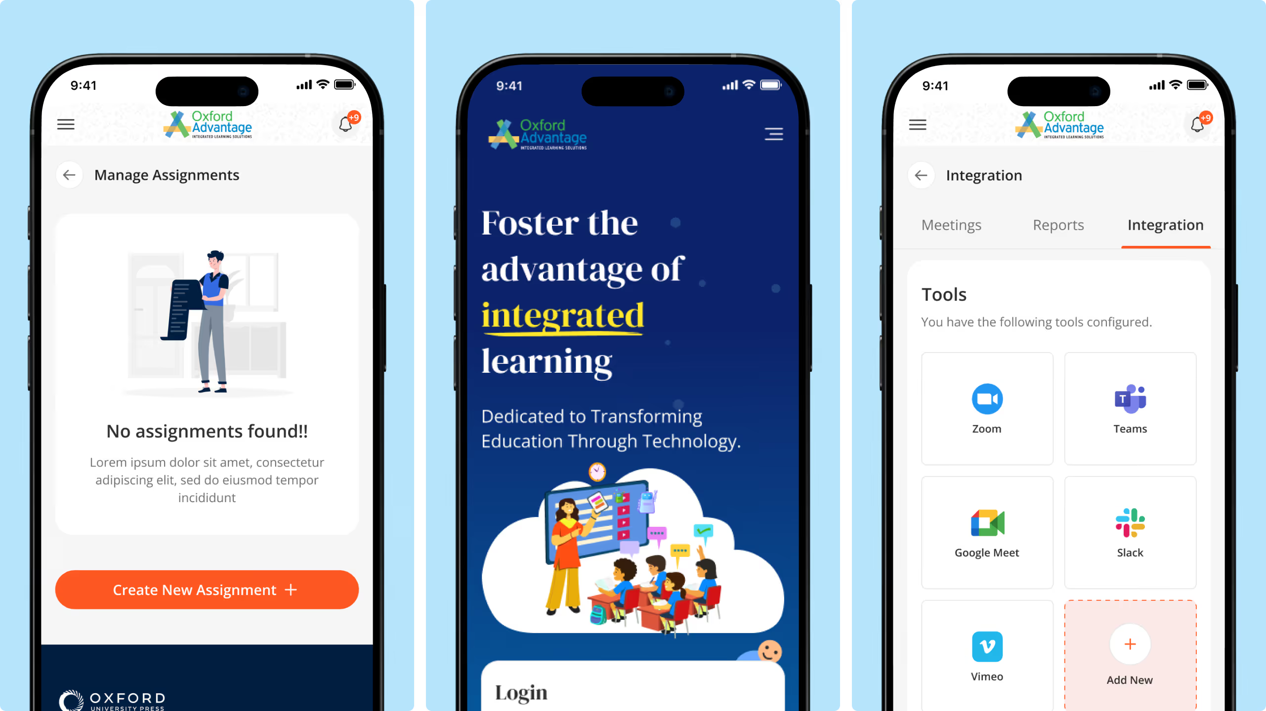
The design emphasized clarity and simplicity, enabling users to focus on content without unnecessary distractions.
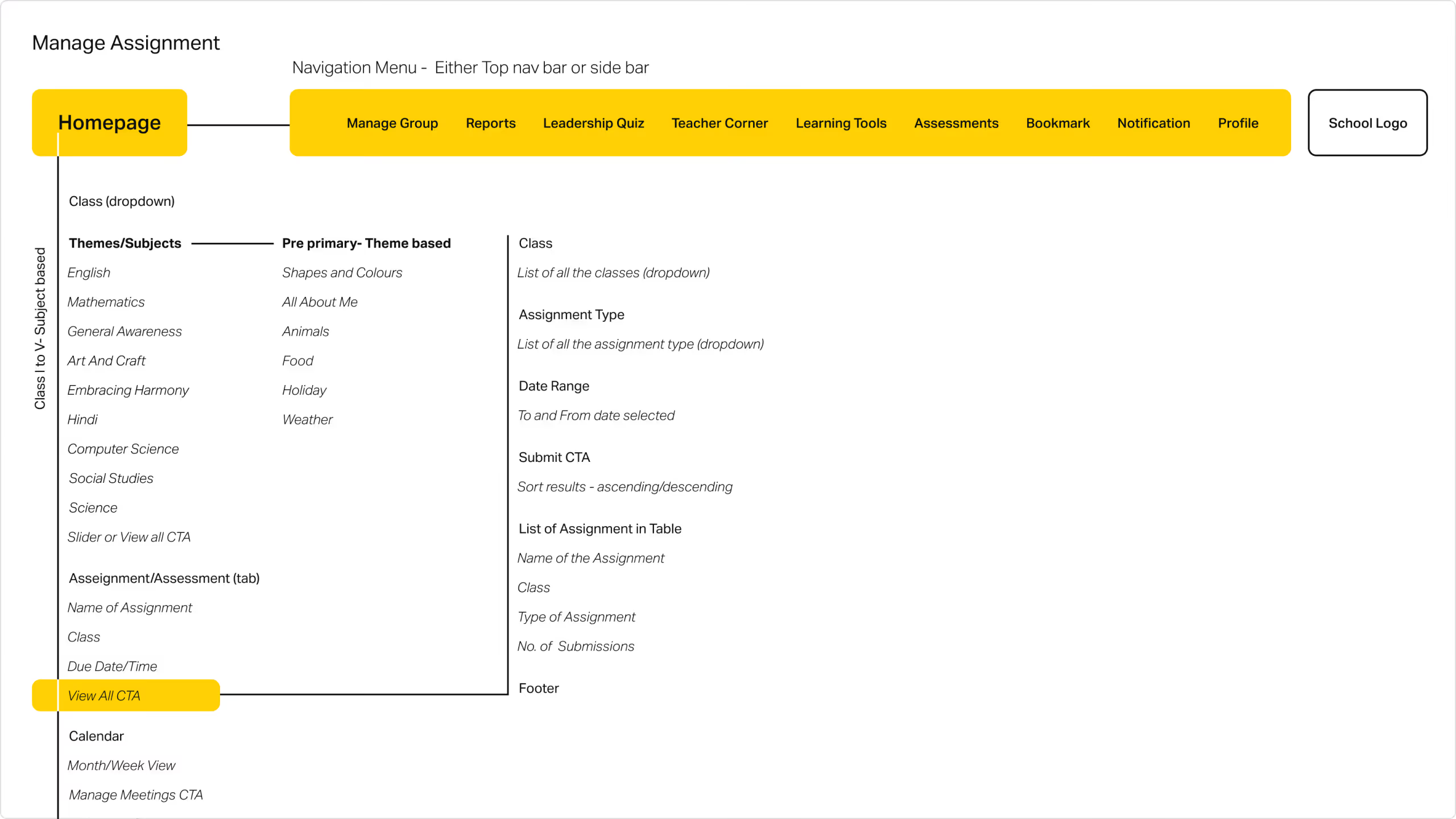
Navigation was streamlined by simplifying user flows, enabling educators and learners to easily access and interact with key platform modules, improving usability and engagement.
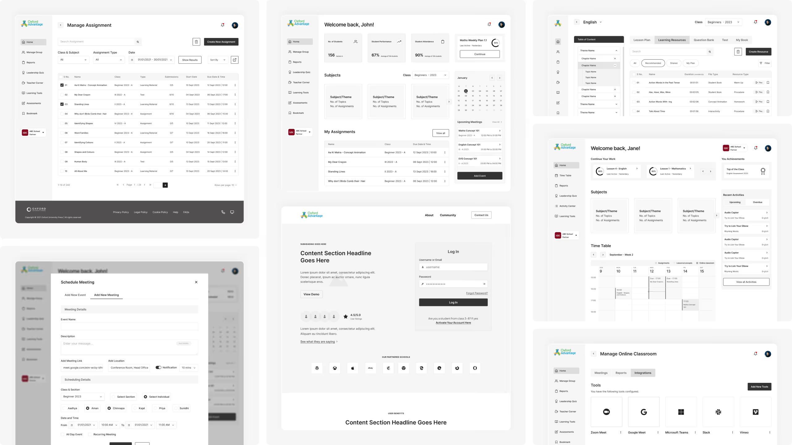
LMS wireframes were created to streamline learning workflows, define clear navigation patterns, and ensure seamless multi-device usability.
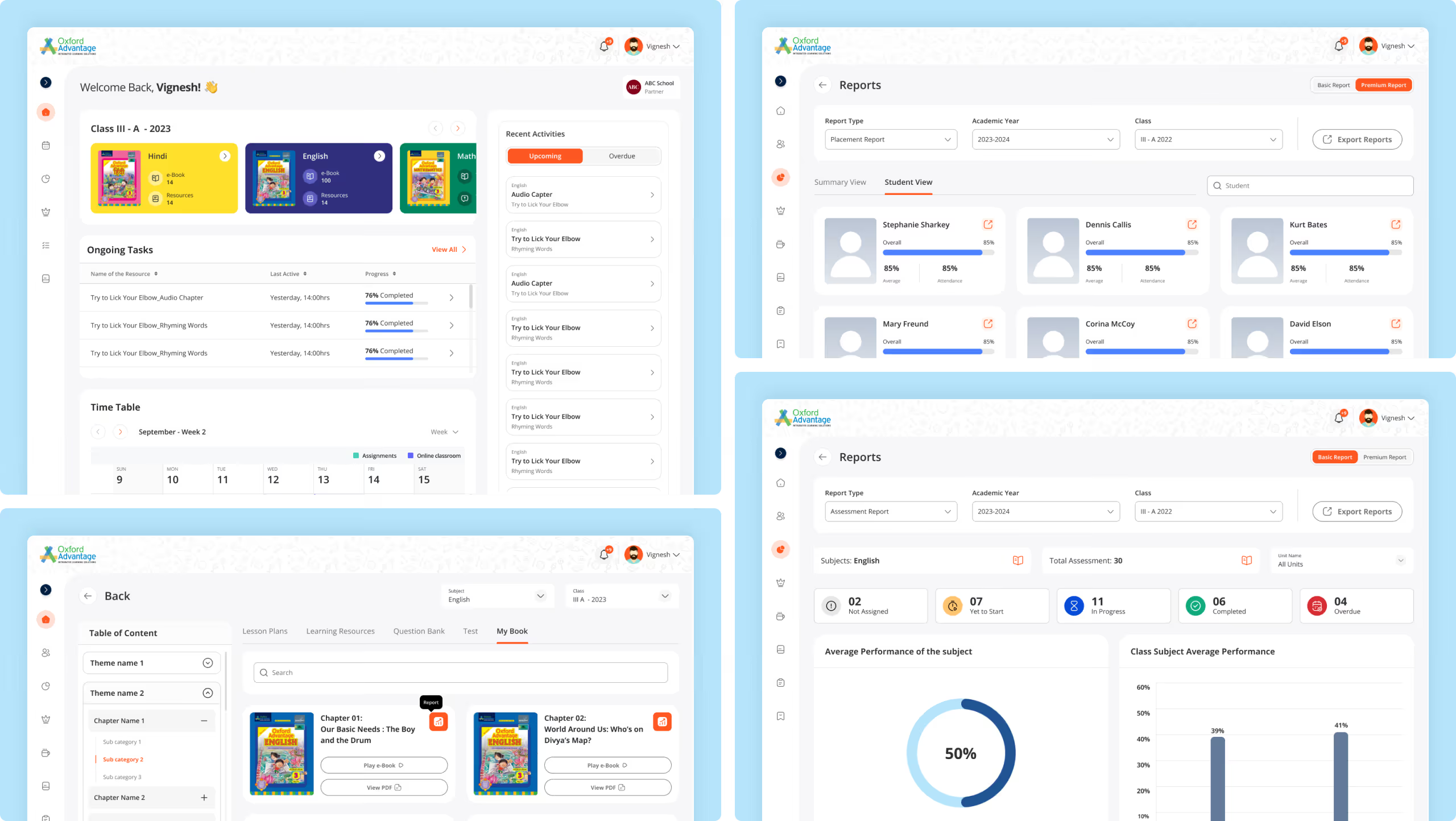
A cohesive visual system was applied to enhance clarity, reinforce brand consistency, and elevate the overall learning experience.
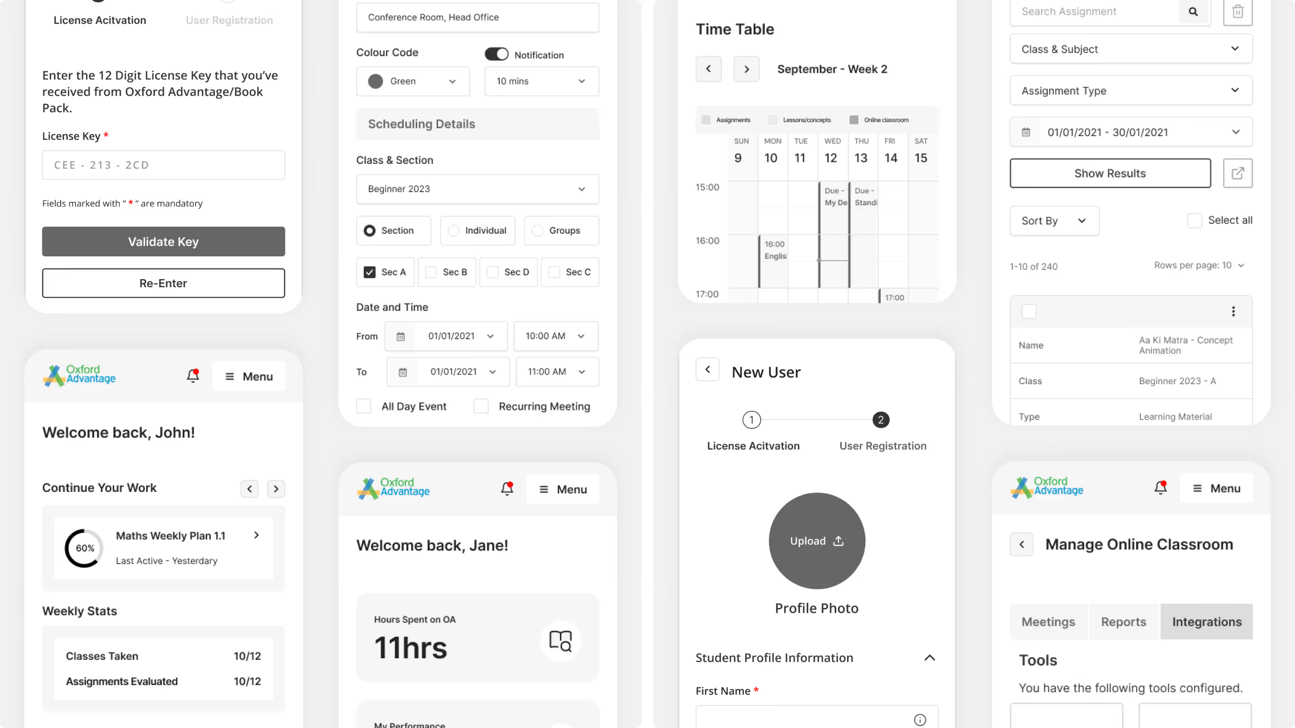
Mobile App wireframes were structured to prioritize content hierarchy, guide user journeys, and support conversion-focused interactions.
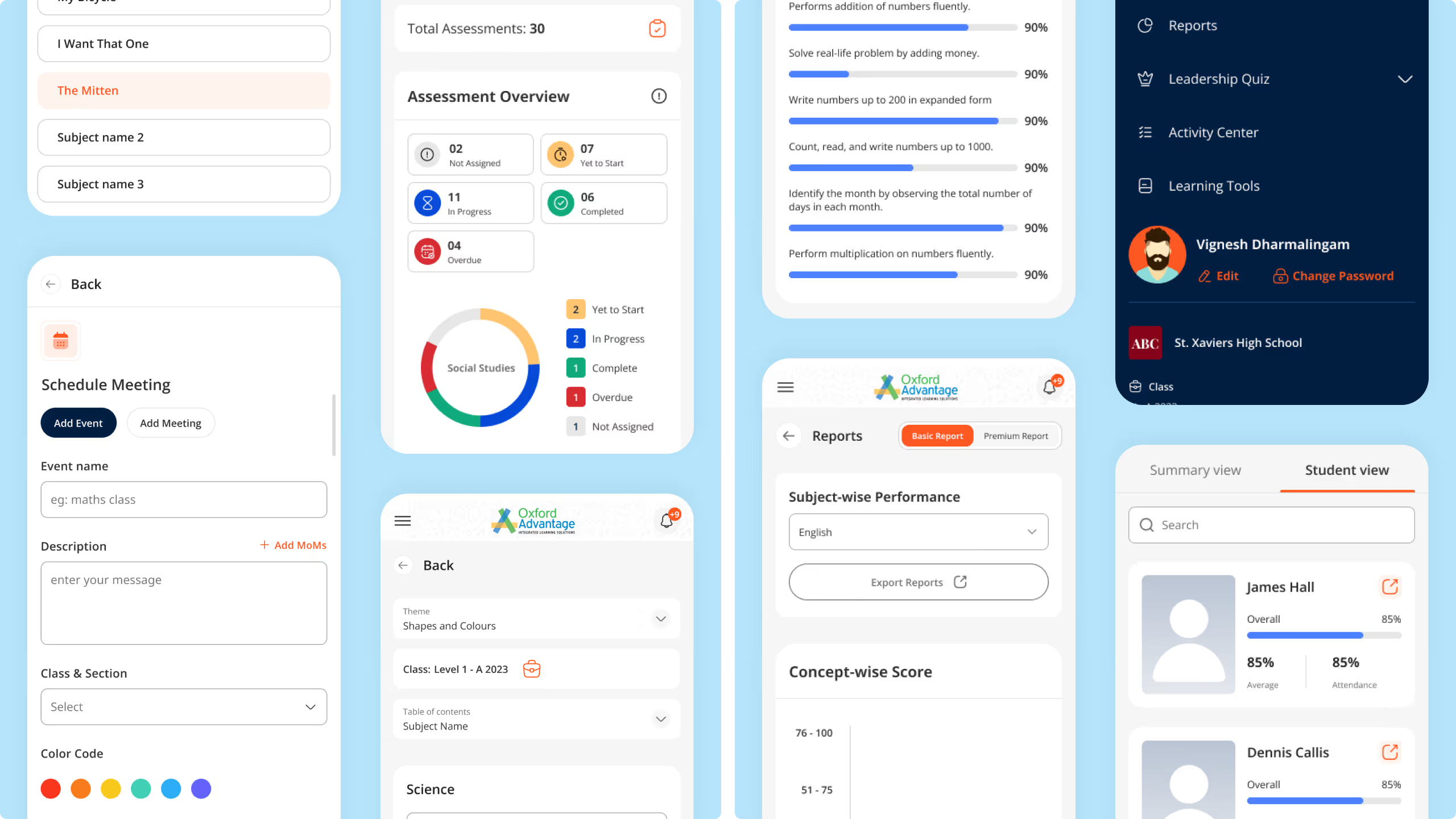
Modern, brand-aligned visuals were designed to strengthen identity, improve readability, and drive meaningful engagement.
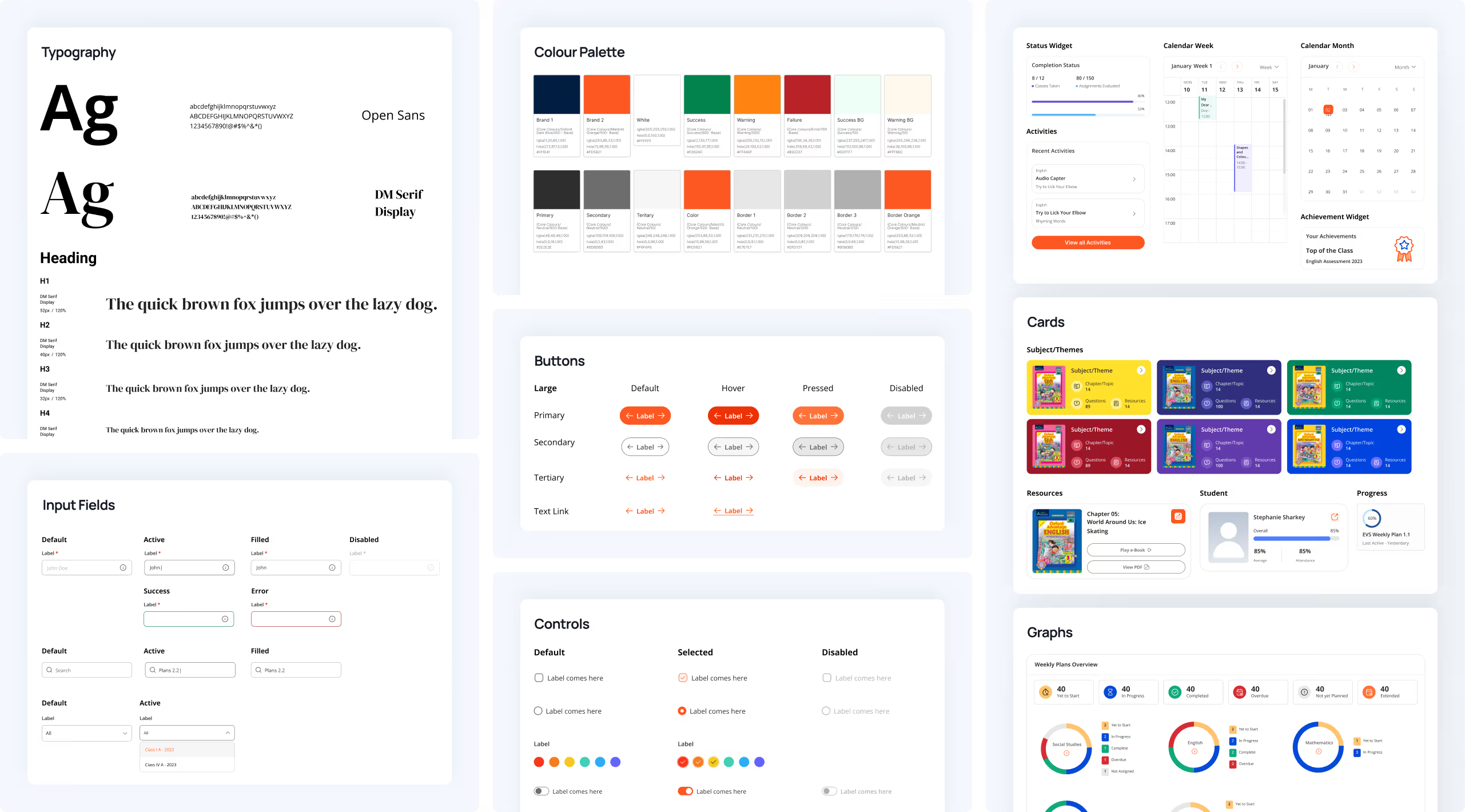
Scalable, cohesive design system with an adaptable style guide to unify UI components and future-ready platform consistency.


NetBramha enhanced the digital learning platform for Oxford University Press, the world's largest university press, founded in 1478 and publishing 6,000+ new books annually for a global audience of students and educators.
A 1478 founding date is a genuinely unusual credential in a UX portfolio - it signals NetBramha can operate within an institution's centuries of accumulated brand expectation and editorial standards, not just move fast inside a startup's blank-slate freedom.
Academic publishing platforms serve institutional buyers, individual educators, and students simultaneously, each with different needs from the same content - unlike a consumer learning app built for one type of user.
That multi-stakeholder design problem is closer to what NetBramha solved for 1to1help, where employers (buyers) and employees (users) also needed different things from one platform, than to a single-audience consumer product like iQuanta.
Oxford University Press's digital learning platform reaches millions of students, teachers, and researchers globally - a genuinely international audience rather than an India-first or single-market user base.
Combined with Springer Nature and SIXT, OUP is part of the small set of NetBramha projects built primarily for a global, non-Indian-first audience from day one.
Balancing genuine usability improvement against an institutional brand identity that carries centuries of accumulated trust - a redesign that felt like a completely different, unfamiliar product risked undermining the very credibility the brand relies on.
NetBramha navigated a comparable, if less extreme, version of that tension with Prajavani, a newspaper publishing continuously since 1948, where modernisation also had to preserve decades of reader trust rather than override it.
Yes - NetBramha's edtech portfolio also includes iQuanta (competitive exam prep for 3 lakh+ learners) and Cymorg (AI-gamified enterprise training, DNA Paris Design Award 2024) - spanning consumer test-prep, enterprise corporate learning, and institutional academic publishing as three distinct segments of the education and learning space.
Recommended Next