Redesigning the NB Mascot
NB Mascot Redesign
When I joined NB in 2012, I was always tempted to change the NB mascot. Though the doodle used back then was good, it still didnt effectively communicate our brand. So we decided if at all we redesign it, it should be something that’s much much better. And not just for the sake of doing it.

After a lot of thinking, we decided to get a new mascot in place. We wanted the new mascot to have the following traits
Quirky – to represent that we are a fun loving bunch of young folks.
Stylish – Unique and something that’ll represent your friendly neighbourhood designers.
Memorable – We wanted our new mascot to be extended to all our collaterals and touch points, not just restrict with the web.
The Exploration for mascots
Here are the initial concepts we came up with.

Initial Concepts
Though we kind of liked a few ideas there, we werent convinced entirely. And here I did a few more. One of the inspirations on our moodboard were the “minions” and obviously I took it serious 😉 So we rejected this too.

Rejected Options
Hitting the right note for the mascot
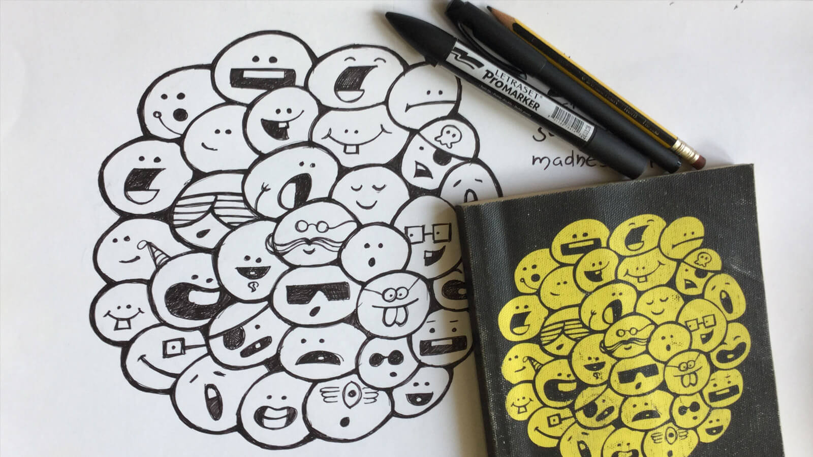
After many explorations and consuming a lot of lead, it all started falling in place

The excited beings
And we fine-tuned them a bit and were used in our previous set of collaterals and Website. These were hand-drawn and scanned and traced in Illustrator. All vector beings…

The final ones that made it…
Our extended Family
We were pretty happy with what we had. And then we decided to put all expressions together for our tshirt Print. This was on a lazy Monday Afternoon when I didnt have much to do, was just creating a random doodle. And the magic happened.

They are everywhere now…

Happy people