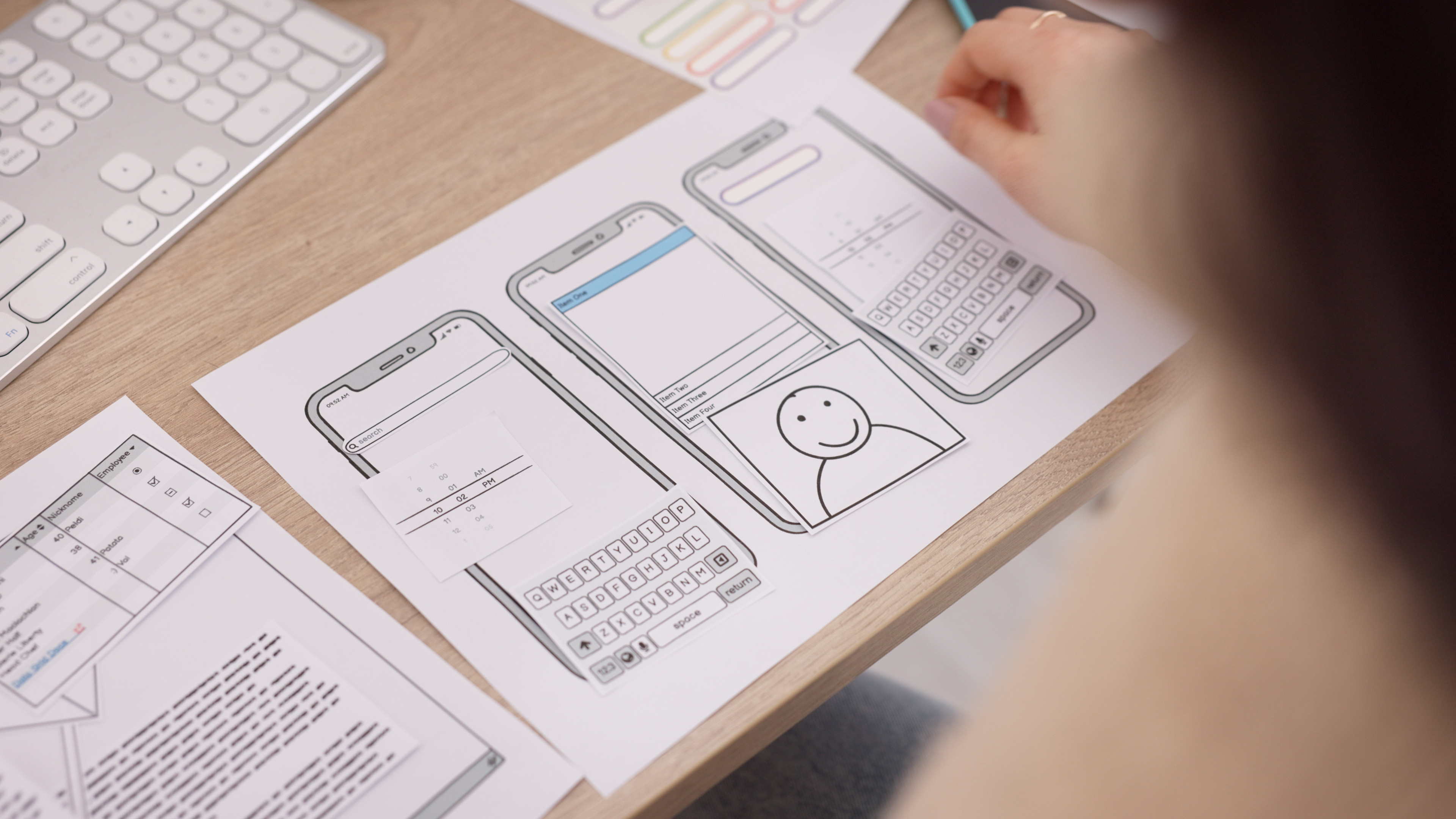
10 Micro-Interaction Examples to Elevate UX & Reduce User Frustration
In most digital products, the biggest interface changes often steal attention: major feature releases, system overhauls, or redesigned screens. But the real magic lies in the smallest details. Micro-interactions, those tiny, purposeful moments where a user receives feedback, guidance, or subtle cues, play an outsized role in creating smooth & intuitive experiences. These micro-moments reduce hesitation, prevent errors & help users feel in control.
Micro-interactions typically consist of four elements: a trigger (user action or system event), rules (what happens after the trigger), feedback (what the user sees or feels) & loops or modes (how it adapts over time). Even though they last only milliseconds, they establish trust, improve clarity & significantly reduce frustration.
From a usability-heuristic perspective, micro-interactions support visibility of system status, error prevention, user control & freedom, consistency, recognition over recall & aesthetic minimalism. When thoughtfully designed, they become the connective tissue that makes a product feel alive, responsive & reassuring.
Designing Effective Micro-Interactions
Effective micro-interactions start with purpose. Every animation, transition, or cue must support the user’s goal, not distract from it. Timing is critical; an animation that’s too slow disrupts flow, while one that’s too fast fails to communicate. Subtlety is essential because the best micro-interactions often go unnoticed due to feeling natural, not decorative.
Consistency ensures that users build predictable mental models across the interface, reducing cognitive load. Accessibility is equally important: motion must respect reduced-motion preferences, remain device-friendly & never interfere with readability or performance. Finally, micro-interactions should be tested, measured & iterated because their true impact emerges through data on errors, drop-offs & completion rates.


10 Micro-Interaction Examples That Enhance UX
Progress Bars & Checklists in Onboarding
Progress indicators reduce user anxiety by making long flows predictable. Checklists & step counters keep users motivated, help them complete tasks faster, & reduce abandonment in multi-step onboarding.
Inline Form Validation
Real-time feedback during form filling prevents errors before submission. Success or error indicators reduce frustration, improve accuracy, & reinforce error-prevention principles.
Tooltips, Hotspots & Contextual Hints
Contextual guidance helps users learn features without feeling overwhelmed. These hints reduce cognitive load by enabling recognition instead of recall.
Success & Completion Animations
Simple celebrations like checkmarks or subtle confetti moments reinforce positive actions & improve emotional engagement. They should remain fast, lightweight, & on-brand.

Loading Indicators & Skeleton Screens
Instead of blank screens, skeleton UIs or simple loaders reassure users that progress is happening. Skeleton screens also reduce perceived wait times & increase patience.
Hover & Focus Feedback
Hover states, shadows, or gentle scaling cues signal interactivity & reduce guessing. They prevent rage clicks & improve clarity in dense interfaces.
Toggle & Switch Transitions
Smooth toggle animations communicate state change instantly. They align with user expectations of cause & effect while making preferences feel responsive.
Undo & Reversal Snackbars
After actions like deletion, an undo option gives users a safety net. This supports user freedom & reduces anxiety around irreversible actions.
Micro-Animations for Tactile Feedback
Subtle button ripples, icon bounces, or tap feedback give interfaces a tactile feel. These micro-animations increase perceived responsiveness & product quality.
Real-Time System Status Indicators
Typing indicators, live search feedback, or listening animations in voice interfaces reduce uncertainty & build trust by keeping users informed.
Integrating Micro-Interactions into Your Design Workflow
Integrating micro-interactions begins with auditing key user journeys to identify points of hesitation or drop-offs. These areas present opportunities for improvement. Prototyping ensures timing, weight & feel remain consistent across devices. Metrics such as completion rates, error rates & satisfaction scores help measure impact. Finally, adding micro-interaction patterns into your design system ensures scalability & consistency as the product evolves.

Common Pitfalls to Avoid
Designers must avoid overstimulation because too many animations create cognitive noise. Micro-interactions should never delay actions or cause performance issues, especially on slower devices. Accessibility must be respected since motion affects users differently. Missing feedback at critical moments leads to confusion about whether an action succeeded or failed.
Conclusion
Micro-interactions may be small, but their impact on usability is significant. They bridge the gap between functional interactions & human-friendly digital experiences. When thoughtfully implemented, they reduce friction, prevent errors, build confidence & create delightful moments that make a product feel polished. Users may not always notice micro-interactions consciously, but they immediately feel the difference when these moments are missing. Great UX lives in these tiny, intentional details.