Revving Up the Vehicle Rental Experience: Navigating Pitfalls and Opportunities With Design

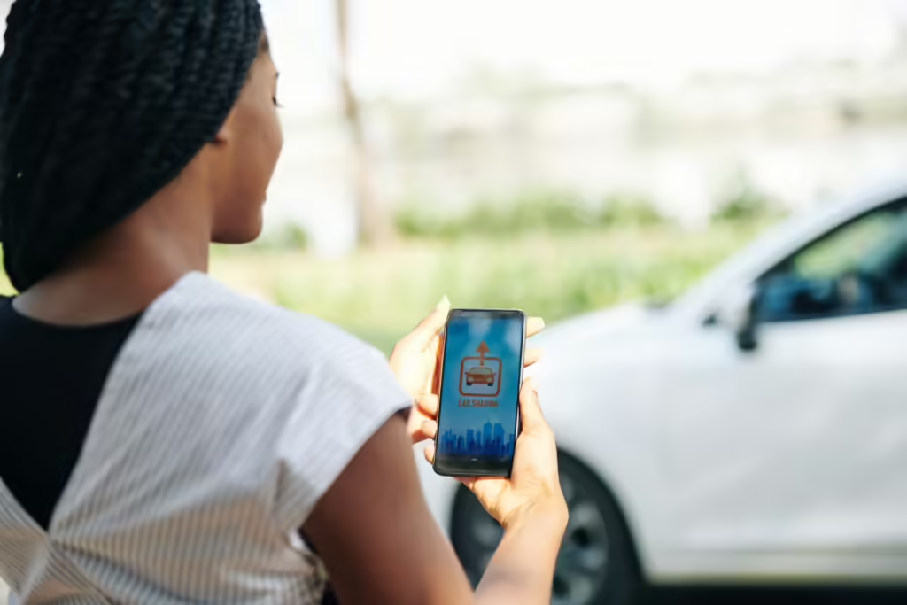
Renting A Vehicle: User Frustrations & Woes
Have you ever found yourself staring at a rental car app, overwhelmed by endless lists of vehicles and a confusing booking process? These frustrations are all too common for travelers seeking a convenient and hassle-free rental experience. In today’s competitive travel industry, a well-designed user interface and user experience are not just nice-to-haves; they’re essential to attract and retain customers. Effective UI/UX design can transform a frustrating rental experience into a seamless and enjoyable journey, leaving travelers eager to return.

Imagine struggling to find the perfect vehicle, only to be met with a complicated booking process that requires you to input countless details. Or perhaps you’ve experienced the frustration of unclear pricing information, hidden fees, and unexpected charges. These common user frustrations can significantly impact a traveler’s overall experience and lead to dissatisfaction.
Understanding the User Journey: A Data-Driven Approach
The vehicle rental booking process typically involves several key stages:
- Search and Discovery: Users begin by searching for available vehicles based on their desired location, dates, and preferences.
- Vehicle Selection: Once search results are displayed, users evaluate various options, considering factors like vehicle type, price, and features.
- Booking and Payment: Users proceed to book the selected vehicle and complete the payment process.
- Confirmation and Pickup: The booking is confirmed, and the user receives instructions for picking up the vehicle.
However, this seemingly straightforward process can be fraught with challenges and pain points for users. Understanding these pain points is crucial for improving the overall user experience.
Data-Driven Insights for Vehicle Rental Platform
To gain a deeper understanding of user pain points, vehicle rental companies can leverage data analytics and user research techniques. By analyzing user behavior and feedback, they can identify common challenges and areas for improvement.
- Search and Discovery: Users often struggle to find the perfect vehicle that meets their specific needs. They may encounter difficulties with filtering options, limited availability, or confusing pricing information.
- Vehicle Selection: The process of selecting a vehicle can be overwhelming for users, especially if they are unfamiliar with different vehicle types or rental terms.
- Booking and Payment: Users may encounter issues with the booking process, such as complex forms, slow loading times, or unclear payment options.
- Confirmation and Pickup: Delays in confirmation or unclear pickup instructions can lead to frustration and inconvenience for users.
Real-Life Examples of User Pain Points
- 75% of users abandon the booking process due to unclear pricing information.
- 60% of users struggle to find the perfect vehicle that meets their specific needs and budget.
- Evidence suggests that many users experience delays in confirmation and pickup, leading to frustration and inconvenience.
User Personas for Vehicle Rental Products – Websites & Apps
To further refine the understanding of user pain points, it is helpful to create user personas. User personas are fictional representations of target users based on research and data. By developing detailed personas, vehicle rental companies can gain empathy for their users and tailor the booking experience to their specific needs.

Example User Personas:
- The Frequent Traveler: A busy professional who frequently rents cars for work and personal trips. They value convenience, efficiency, and personalized service.
- The Family Vacationer: A parent planning a family vacation who prioritizes safety, affordability, and flexibility.
- The Adventure Seeker: A thrill-seeking individual who rents cars for outdoor activities and road trips. They appreciate a wide range of vehicle options and competitive pricing.
By understanding the user journey and addressing common pain points, vehicle rental companies can create a more seamless and enjoyable booking experience for their customers. This, in turn, can lead to increased customer satisfaction, loyalty, and business growth.
UI/UX Design Pitfalls to Avoid in Vehicle Rental Booking
A well-designed user interface and user experience are essential for a successful vehicle rental booking process. However, many rental companies fall short in this regard, leading to frustrating experiences for users. Here are some common UI/UX design pitfalls to avoid:
Overwhelming Users with Too Many Options
One of the most common mistakes made by vehicle rental companies is presenting users with an overwhelming number of options. This can lead to confusion and decision fatigue, making it difficult for users to find the information they need.
Example: A rental car app that displays dozens of vehicle options at once, without providing clear filters or sorting options, can be overwhelming for users. This can lead to a decrease in user engagement and a higher abandonment rate.
Inconsistent Design Across Platforms
Inconsistent design across different platforms (desktop, mobile, tablet) can create a disjointed user experience. Users expect a consistent look and feel regardless of the device they are using.
Example: A rental car website that looks great on a desktop computer but is difficult to navigate on a smartphone is a prime example of inconsistent design. This can lead to a negative user experience and lower conversion rates.

Poor Navigation
A poorly designed navigation structure can make it difficult for users to find the information they need. This can lead to frustration and abandonment of the booking process.
Example: A rental car app with a complex menu structure that requires multiple clicks to reach the desired information can be frustrating for users. This can lead to a decrease in user satisfaction and a higher likelihood of users choosing a competitor.
Slow Loading Times
In today’s fast-paced world, users expect websites and apps to load quickly. Slow loading times can lead to a negative user experience and decreased conversions.
Example: A rental car app that takes several seconds to load can be frustrating for users, especially on mobile devices. This can lead to a higher bounce rate and lower conversion rates.
Inefficient Payment Process
A complicated or insecure payment process can deter users from completing the booking process. Users expect a smooth and secure payment experience.
Example: A rental car app that requires users to enter multiple pieces of personal information during the payment process can be off-putting. This can lead to a decrease in user trust and a higher likelihood of users abandoning the booking.
UI/UX Pitfalls and Their Impact
- Overwhelming Options: A rental car company that offers hundreds of vehicle options without providing clear filters or sorting options may see a decrease in user engagement and a higher abandonment rate.
- Inconsistent Design: A rental car company with a website and app that have different layouts and navigation structures may experience a decrease in user satisfaction and a higher bounce rate.
- Poor Navigation: A rental car app with a complex menu structure that requires users to navigate through multiple screens to find the information they need may lead to frustration and abandonment of the booking process.
- Slow Loading Times: A rental car website or app that takes several seconds to load may see a decrease in conversion rates due to users losing patience and leaving the site.
- Inefficient Payment Process: A rental car app that requires users to enter multiple pieces of personal information during the payment process may deter users from completing the booking and lead to a decrease in revenue.
By avoiding these common UI/UX design pitfalls, vehicle rental companies can create a more enjoyable and user-friendly booking experience. This can lead to increased customer satisfaction, loyalty, and business growth.
Best Practices for Vehicle Rental Booking UI/UX
To create a truly exceptional user experience, vehicle rental companies should adhere to the following best practices:
User-Centered Design
Prioritize user needs and preferences throughout the design process. Conduct user research, gather feedback, and create personas to understand your target audience.
- Empathy: Put yourself in the shoes of your users and understand their motivations, frustrations, and goals.
- User Testing: Regularly test your designs with real users to identify pain points and areas for improvement.
- Iterative Design: Continuously refine your designs based on user feedback and insights.
Example: A rental car company can conduct user interviews and surveys to understand the most common pain points experienced by their customers. This information can then be used to inform design decisions and improve the booking experience.
Clear and Concise Language
Use simple, understandable language that is easy for users to comprehend. Avoid jargon and technical terms.
- Plain Language: Write in a conversational tone that is easy to read and understand.
- Avoid Jargon: Use clear and concise language that is accessible to all users.
- Use Bullet Points: Break up text with bullet points to make it easier to read and scan.
Example: Instead of using the term “vehicle class,” a rental car company could use the more understandable term “car type.” This helps users understand the available options without feeling overwhelmed by technical jargon.
Visual Hierarchy
Use visual cues to guide users’ attention to important information. This can help users quickly identify key elements and navigate the interface.
- Contrast: Use contrasting colors and font sizes to highlight important elements.
- Alignment: Align elements consistently to create a visually appealing and organized layout.
- White Space: Use white space to create a sense of balance and clarity.
Example: A rental car app can use larger font sizes and bold text to highlight the most important information, such as the total cost of the rental and the pickup and drop-off locations.
Accessibility
Ensure that your website or app is accessible to users with disabilities. This includes following accessibility guidelines like WCAG (Web Content Accessibility Guidelines).
- Screen Reader Compatibility: Make sure your content can be read by screen readers.
- Keyboard Navigation: Ensure that users can navigate your website or app using only a keyboard.
- Alternative Text: Provide alternative text for images and other non-text content.
Example: A rental car company can provide alternative text for images of vehicles to help users with visual impairments understand the type and features of the car.
Regular Testing and Feedback
Continuously test your designs and gather feedback from users. This will help you identify areas for improvement and make your booking experience even better.
- A/B Testing: Experiment with different design variations to see which ones perform better.
- User Surveys: Conduct surveys to gather feedback from users directly.
- Analytics: Use analytics tools to track user behavior and identify trends.
Example: A rental car company can conduct A/B tests to compare different versions of their booking page and see which one leads to higher conversion rates.
By following these best practices, vehicle rental companies can create a more user-friendly and engaging booking experience. This can lead to increased customer satisfaction, loyalty, and business growth.
Reimagining SIXT with Design Thinking & UX Framework
SIXT: A Global Leader in Vehicle Rental
SIXT is a leading international car rental company with a vast network of locations worldwide. The company offers a wide range of vehicles, from economy cars to luxury SUVs, catering to diverse customer needs.
SIXT approached NetBramha to modernize and optimize their vehicle rental portals, aiming to enhance both the responsive web and mobile app experiences. The goal was to create a more modular and scalable platform that addresses user pain points and delivers a superior user experience.
User pain points unearthed during discovery phase for SIXT
Users frequently encountered challenges in completing essential tasks online, such as updating personal information, resolving billing issues, or changing drop-off details. The booking process was often confusing, with unclear services and options, leading to abandoned reservations. Confirmation emails lacked clarity and essential information, further frustrating users. Additionally, many users heavily relied on customer care representatives for troubleshooting and information, limiting self-sufficiency. Hidden costs and unexpected charges due to unclear pricing information also contributed to user dissatisfaction.
Core Objectives of collaboration with SIXT
The primary goals are to enhance digital engagement, reduce reliance on physical and human interaction, prioritize discoverability, and increase revenue.
Specific Goals of the SIXT Redesign Project
The platform should deliver a consistent experience across all devices, offer contextual product recommendations, provide a robust troubleshooting flow, and enable users to easily modify their bookings.
Granular Design Goals for SIXT platform Redesign
Increased click-through rates (CTR) are essential for a positive user experience. A higher CTR indicates that users find the platform’s features and content relevant and engaging. This leads to increased customer satisfaction and reduced churn. Maintaining consistency across all platforms is crucial for a seamless user experience, reinforcing brand identity and building trust.
Product Strategy and Design for SIXT
To harmonize design systems across our three verticals, we identified shared elements, principles, and guidelines, ensuring a consistent user experience. Our strategy focused on creating a seamless cross-platform experience, optimizing for mobile devices, improving conversions, adopting a mobile-first approach, and reducing maintenance costs.
- We aimed to empower users through a self-service portal, providing clear information, streamlining the booking process, ensuring transparent pricing, and building trust.
- We focused on personalization, offering tailored suggestions based on user data.
- We implemented upselling and cross-selling strategies, dynamic pricing, and explored subscription models.
- To comply with varying data privacy regulations and legal limitations, we tailored the booking process to specific locations and introduced features like additional driver registration.
When designing for car rental/vehicle rental apps, especially for global audiences, such as for SIXT – it’s important to keep in mind legal & cultural nuances across different geographies. User research becomes an important factor in shaping product’s identity & also spelling its success, amidst fierce competition. Connect with us to kickstart your product’s journey from good to great!