Side project: Making of Helpmate app

HelpMate App
Recently, we published a design & concept for an app (Helpmate), to facilitate people helping one another.
Checkout all about Helpmate app here.
This is the making of Helpmate.
It was another beautiful day in Bangalore & we were out for our evening tea break (some of us drink milk though). We started having our usual tea conversations and Aashish talked about how he encountered a group of old people last night discussing the generation today. Although, there were many things they didn’t like or approve off, they seemed disheartened with one thing in particular. People have stopped helping one another.
We all sort of disagreed with the thought. Being designers and have learnt a lot from the Design community, we feel helping someone in need is the way to learn and grow as individuals. Not only that, if I look around, I’m surrounded by people who will readily help me if I’m stuck, provided I ask for it. When I moved into my new rented apartment, my neighbours helped me with setting up my stuff, the caretaker helped me with arranging my bed and connected me to others for any of the services I needed for my flat.
There are multiple other instances where we see the community at large come together to help each other. Take Chennai for example. Every person came out and did everything under the sun to help the ones in need during the recent floods. The Ugly Indian group works anonymously to improve our surroundings, and many more such instances can be found all over.
Onto something
In the coming few days we pondered over this thought multiple times, until, we decided we’ve to do something about it. We went ahead and researched if this is actually a problem in the present day. We needed to answer some fundamental questions in order to move forward. Do people across all demographics think the same? Do people get help when in need? How do they seek help? Whom do they seek help from?
As expected, we got some interesting answers. Most of the people fell under one of the following categories:
- They were either self sufficient or seek help easily when in need.
- They were skeptical to reach out to strangers or too shy to ask for help.
- They need help but don’t know whom to seek help from.
It was the last two categories we needed to do something about. There should be a better way to seek or give help. With most of us spending umpteen amount of time on our mobile devices, we knew it’ll be an app.
Other important insights generated from the interviews that shaped our thinking:
- Most young people believed that they get help when they ask for it.
- Old people are shy & open up to people with same cultures & age groups.
- Girls favor girls while seeking or giving help.
- Parents are skeptical for their children to seek or give help from strangers.
Designathon for HelpMate app
We organised a 2 day Designathon to take all of this forward. This way, we can focus and finish the work quickly. Also, it forced us to keep just the core necessary functionalities & get rid of the bells & whistles.
It was clear in our heads, what we wanted to achieve with the MVP.
- Simple and comprehensive .
- People across all demographics should be able to use it.
- Minimum features required to complete a help transaction.
We started looking for all kinds of inspirations & attempts to tackle such similar problems , which may or may not have been successful. We found a few attempts:
Somebody app
When you send your friend a message through Somebody, it goes — not to your friend — but to the Somebody user nearest your friend. This person (likely a stranger) delivers the message verbally, acting as your stand-in.
Be My Eyes – Lend Your Eyes to the Blind
Be My Eyes is an app that connects blind people with volunteer helpers from around the world via live video chat.
bSafe – The End Of Worry
bSafe connects you with family and friends to stay safe.
How we did it?
We started with listing down the bare necessary functionalities that the app should be able to handle. After much debate, we arrived at a list.
Building paper prototypes for HelpMate app
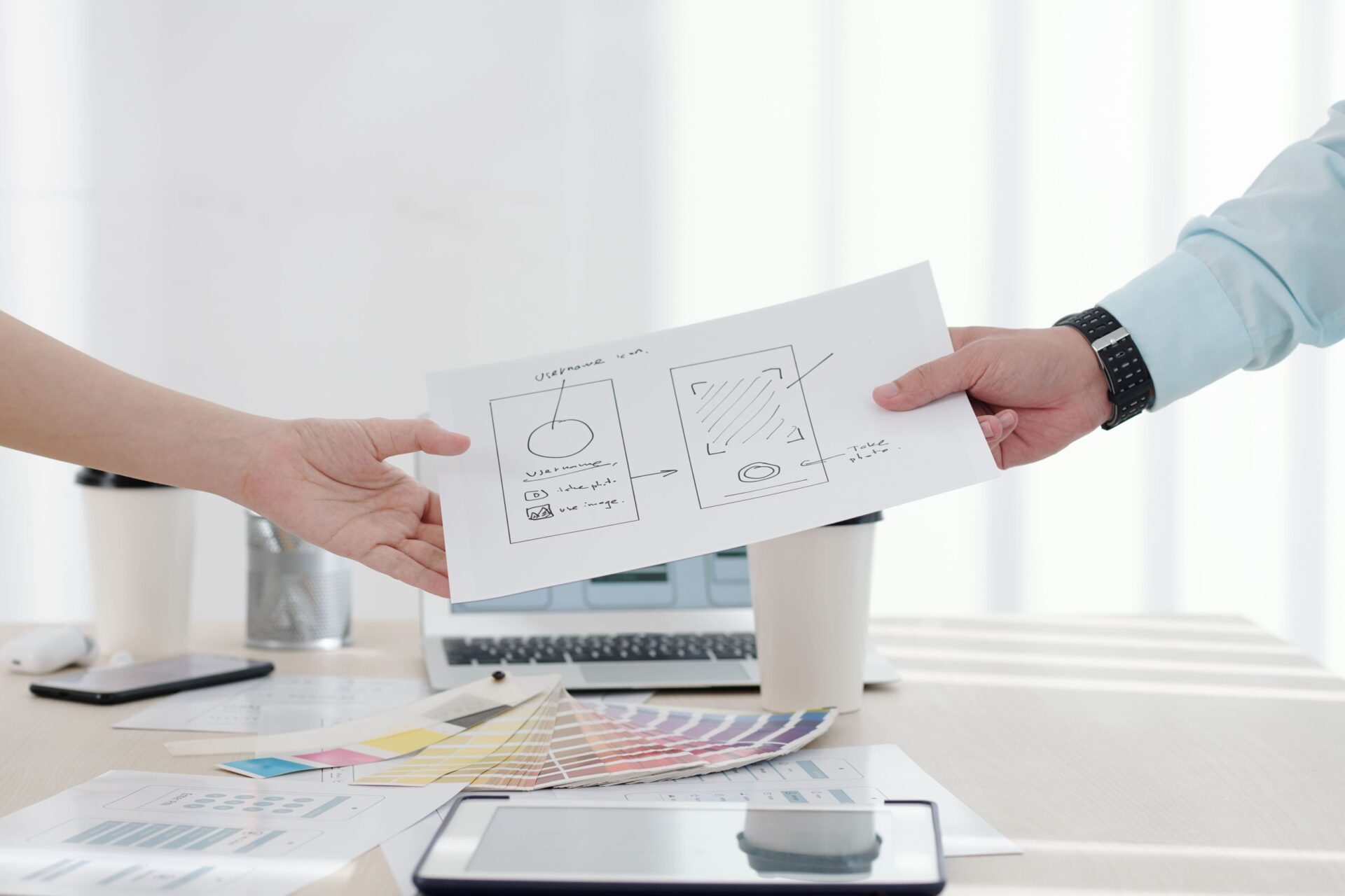
Now, it was time to take on paper & pencil, our favorite tools. We sketched a simple flow & validated it internally. The next step was building paper prototypes for all the screens. A mixed group of interaction, visual communication & graphic designers started sketching the paper prototypes. There were quite a few heated discussions during the process. All of them helped. In a couple of hours, after innumerable iterations, we were ready with the finished prototypes.


Visual direction
Visual language was tricky. We asked ourselves, ‘What kind of design is universal?’. We worked in a lot of different directions and a lot of failed attempts. Design trends by definition are short-lived, we decided not to go after any of them. We decided to go with a design language that’ll transcend the device and time dependent paradigms.


Seek help

Finding help
We were not convinced with the results. We decided to take another go at it. This time we thought of trying it with a color. We kept most of the elements from the previous attempt. Here is the output that came.


Although, we weren’t completely satisfied, we decided to go ahead with this because we wanted to strictly keep it as a 2-day exercise.
We did a round of usability testing with actual users & incorporated the learning in the visuals.
See how Helpmate app works.
Illustrations
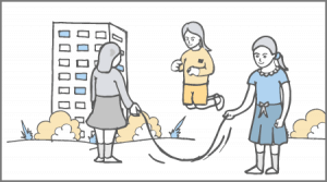
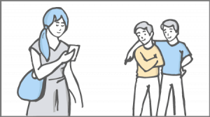
Parallely, a team of illustrators were working on the illustrations that we were to use while showcasing the case study. We wanted to keep the illustrations minimal. We were hugely inspired from Dropbox illustrations . A lot of iterations here as well.
These were the final illustrations:


Showcasing the app
Finally, it was time to showcase our study and the final product. We purchased a theme from Themeforest customized it to suit our requirements. We aggregated everything from different teams put it in the template around the narrative we wanted to tell.
Huff! That’s how those two exhausting, but, equally fun days ended.
Checkout all about Helpmate app here.
Do share your thoughts on the same. If you have another idea that we should work on, please share it in the comments.
Disclaimer
This is just a concept. As it was an MVP, we intentionally left out a few features, that were important but not necessary to make it work. Like, multi-lingual support, report or flag a user, user verification, Happiness Index of city, helper replying to a query, historical helps both extended and received, just to mention a few.


