Geography
India
Domain
Finance & Fintech
Platform
Mobile & Web App
Services
Research, Strategy, Design
A unified digital ecosystem reimagining investment for millions.
Leading Indian investment services company, Geojit, with a strong presence in India and the Gulf Cooperation Council countries, sought to modernize its existing mobile and web trading platforms. Geojit manages more than INR 93,000 crore in Assets Under Management and serves over 10 lakh users.
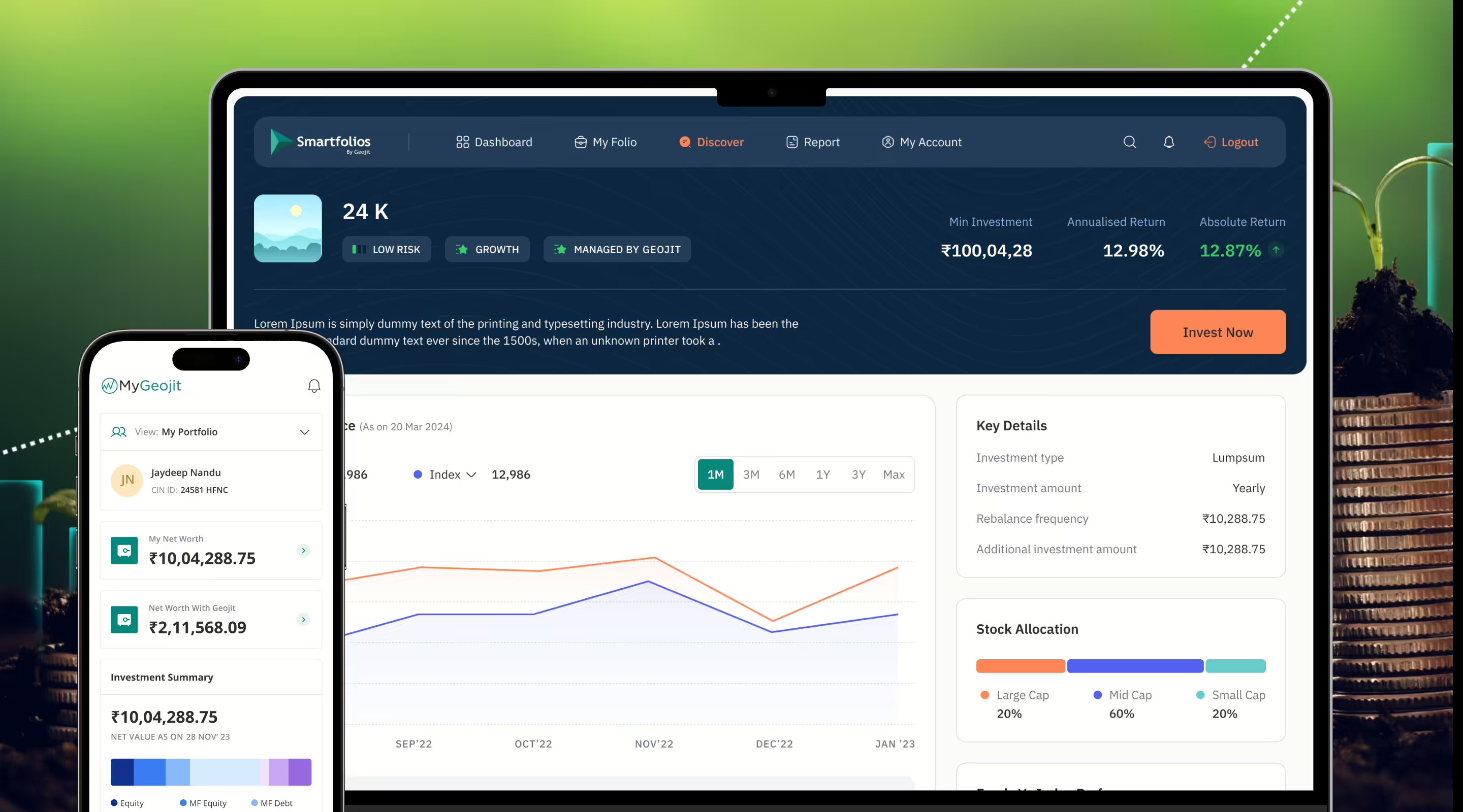
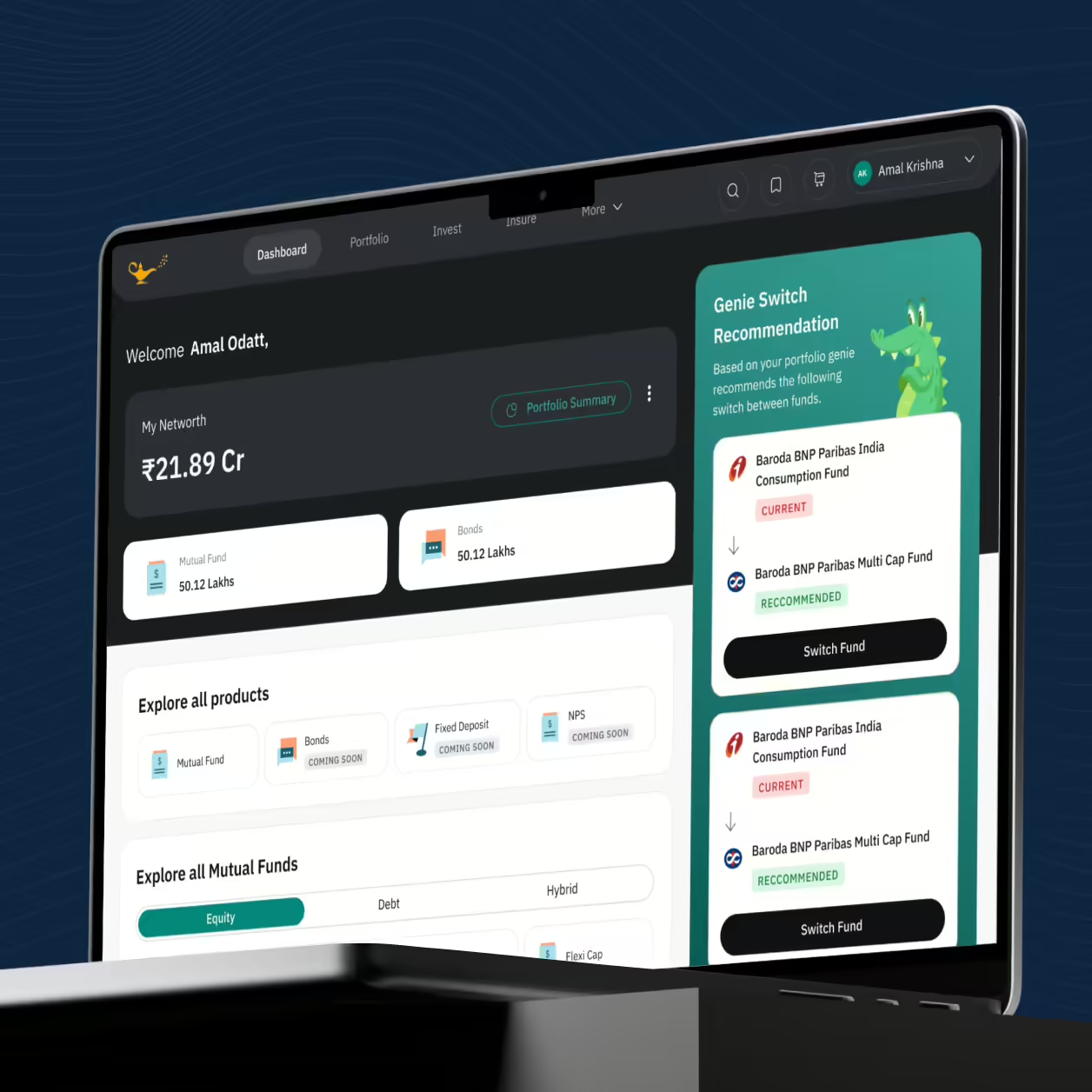
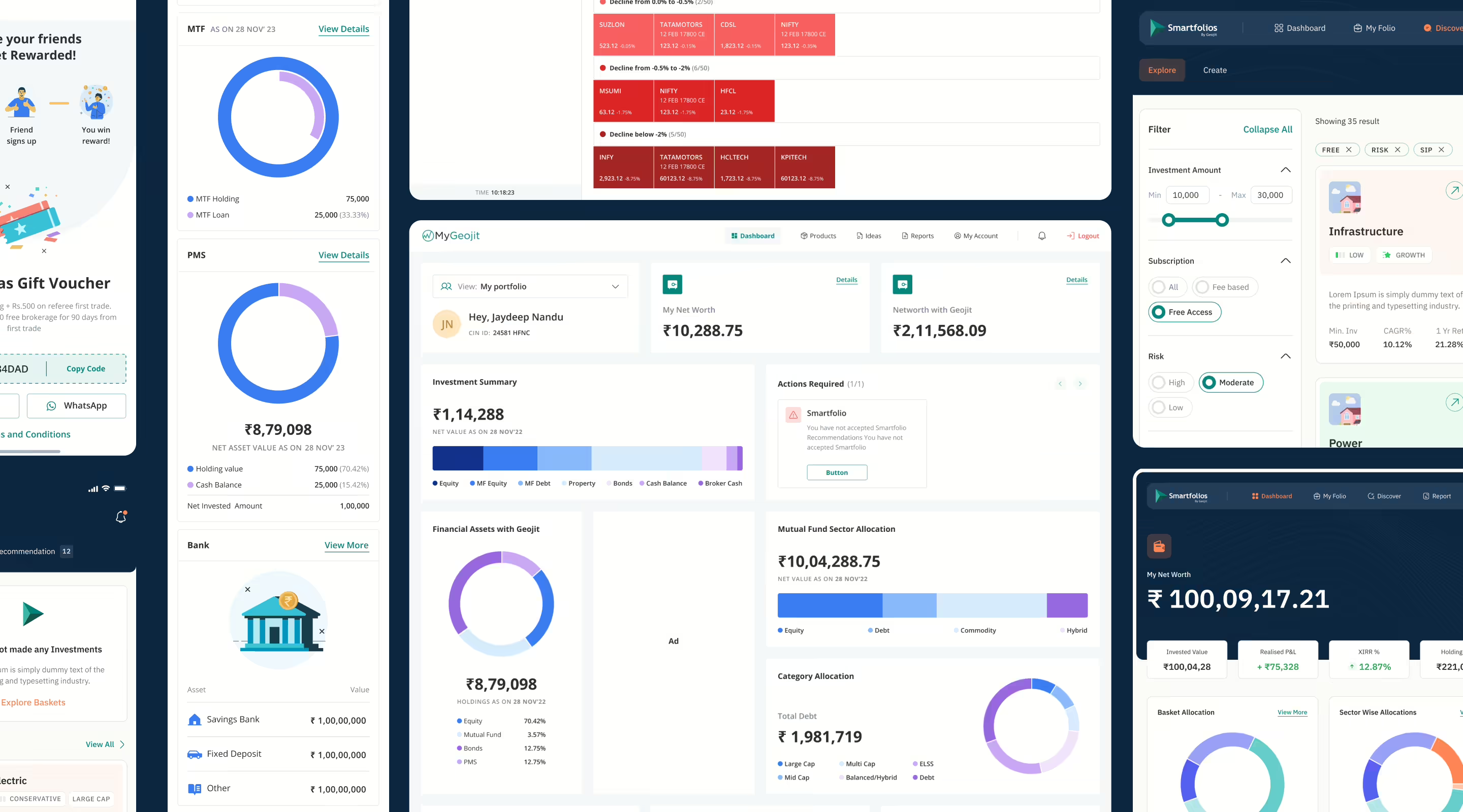
Geojit partnered with NetBramha to revamp four key financial products: Flip (Trading Platform), Smartfolios (Customised Stock Baskets), Geojit (Product Control Center), and Fundsgenie (Mutual Fund Super App). The aim of revamp the platform design was to ensure a contemporary and intuitive interface, enhance usability by optimizing the platform for easy navigation and efficient trading, and lower barriers to entry by making stock market trading accessible to a wider audience.

Challenge
Our objectives included creating a scalable and modular design language, developing digital financial products that offer unique value propositions, and differentiating them from competitors, all while bringing innovation to the financial domain. The biggest challenges were creating a cohesive experience for a massive user base & diverse personas, understanding trading protocols & user behavior on trading platforms.
Solution
We redefined Geojit’s entire range of financial products and created a digital ecosystem that satisfies various user needs. With a heavy focus on identifying emerging trends and opportunities for innovation, we emphasized user control, significantly minimizing the need for customer support.
Research
Through interactive sessions along with product walkthroughs with the Geojit team – including the head of online experience, head of digital product and the CTO – user needs and company goals were understood and addressed for the future build of the product. The in depth discovery workshops enabled us to gain an understanding of what the business goals were and how we could best align the business goals to the product goals.
Pain points discovered
Entry
barrier
Substantial entry barriers in the current platform for new users resulting in fewer people signing up
Overwhelming information
Technical jargon & information deluge for existing users for navigating trading, overwhelming existing users
Complex
navigation
Non-intuitive navigation structure leaving users confused & incapable of finding right features
Emotional
trading
Lack of educational resources on trading causing traders to take wrong decisions
Strategy
Once discovery workshops were completed, secondary and desk research was initiated to understand the trading ecosystem and how other brands tackled the same problem, what worked and what didn’t in their existing platforms. This information was used to validate our design decisions for the design process.

Competitor analysis
Thorough competitor analysis to position Geojit as a leading trading platform.

Design thinking
Integrating simplified features into the app for ease of use

Simplifying the complex
Helping Geojit attain their vision for simplified trading.
Design
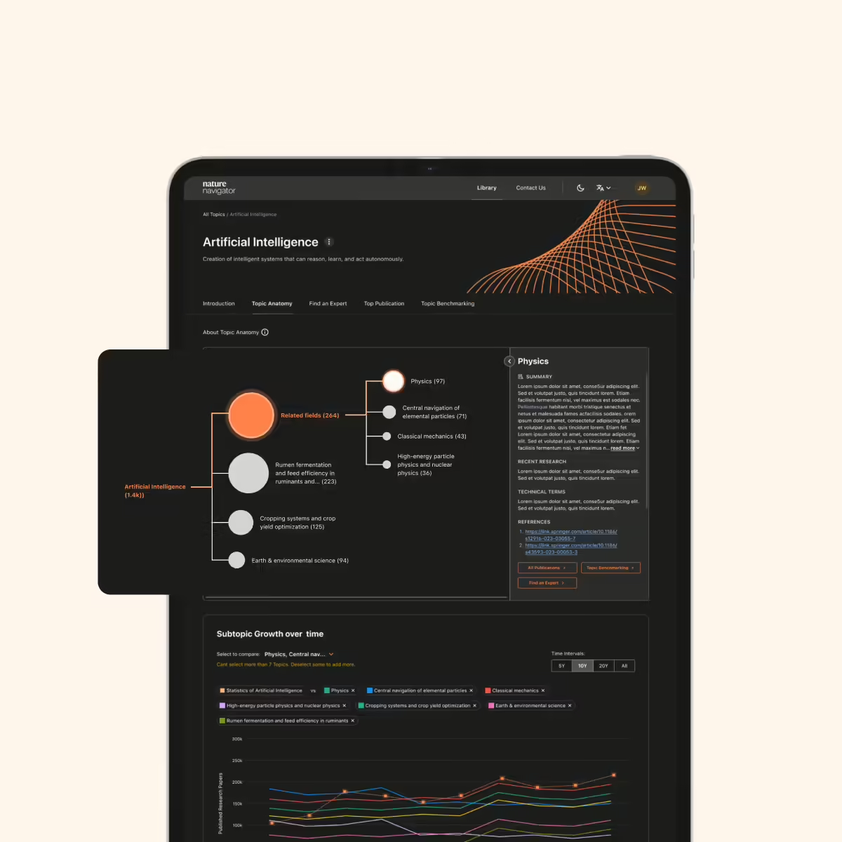
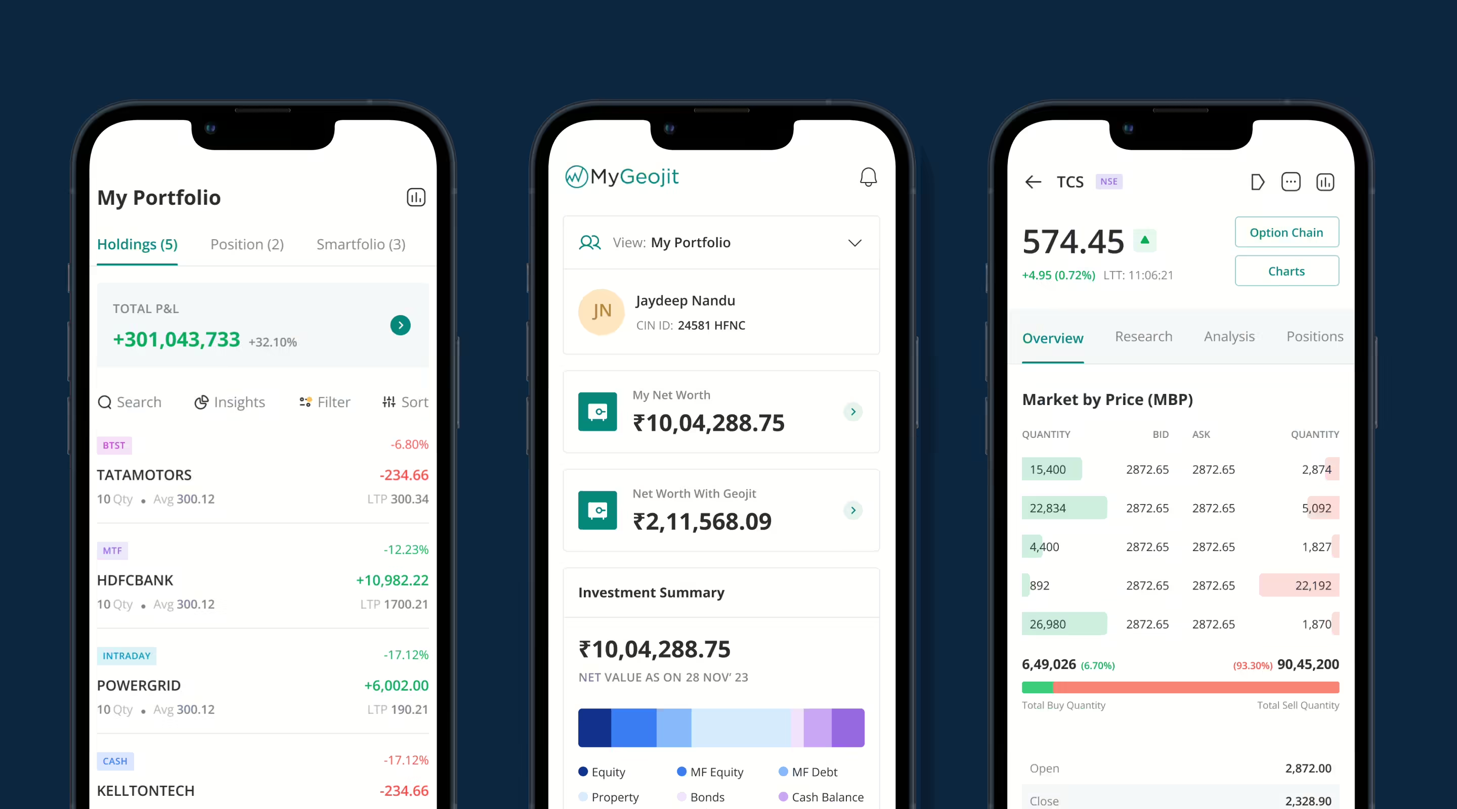
We developed a highly scalable, modular, and consistent design language that addressed the varied needs of retail users in the financial market, from buying mutual funds to changing options and maintaining investment portfolios. This comprehensive ecosystem was designed with all current user needs in mind.
To ensure our solutions remained at the forefront of the industry, we closely monitored competitors to identify emerging trends and opportunities for innovation, continually refining and improving our design patterns. Emphasizing user control, we minimized the need for customer support, making our products more intuitive and user-friendly.
Our designs were meticulously updated to comply with relevant financial market regulations, prioritizing transparency and user-centric principles to build trust. We also continuously gathered user feedback to iterate and enhance the products over time, ensuring they remained effective and reliable for our clients.
Information architecture
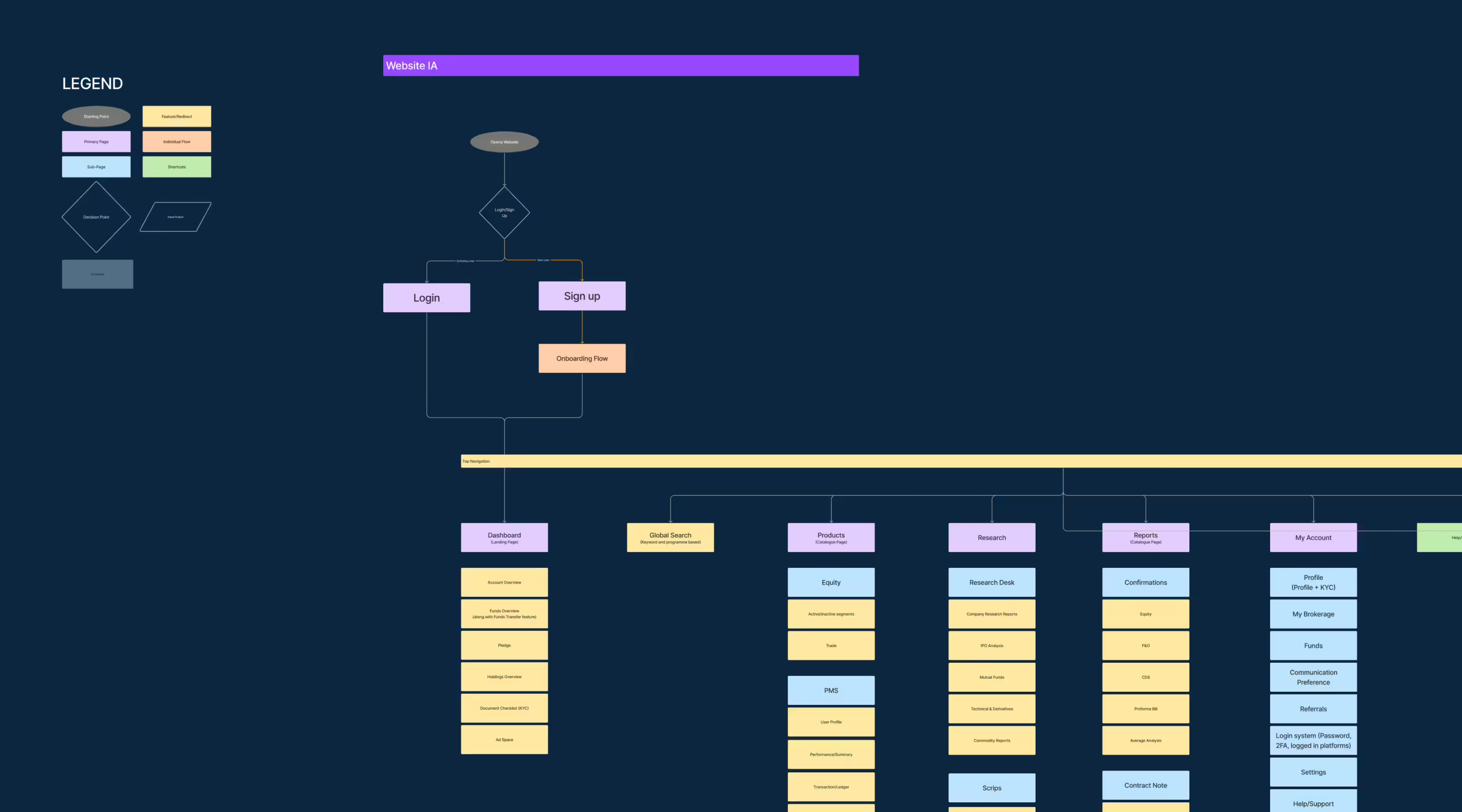
A central information architecture was created that acted as our starting point. The existing IA was restructured to account for newer features and keeping in mind a mobile first approach for the redesigned platform.
Wireframes
The process for wireframing that was followed was to create quick paper wireframes for explorations and then were converted digitally for the purposes of handovers and testing for user flows.
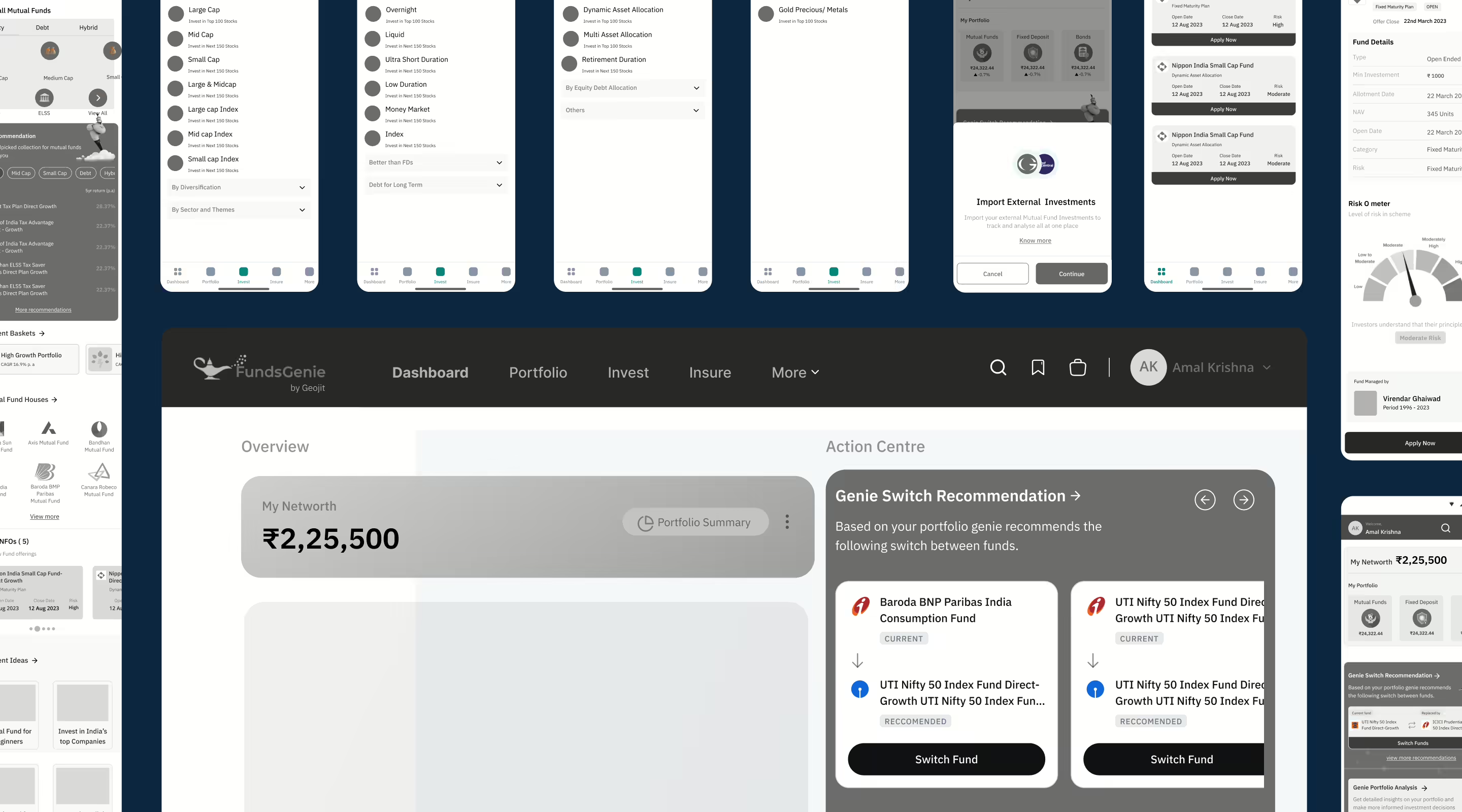
Visual design
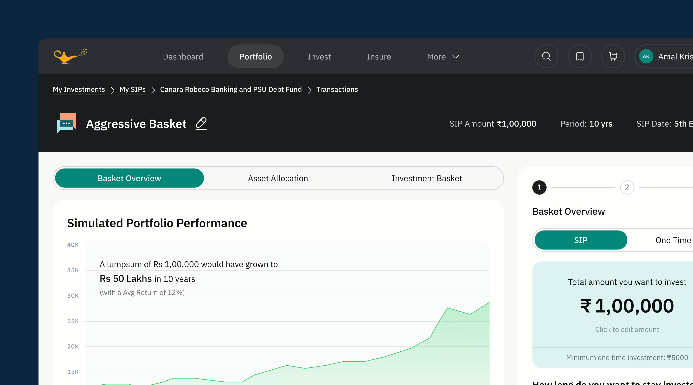
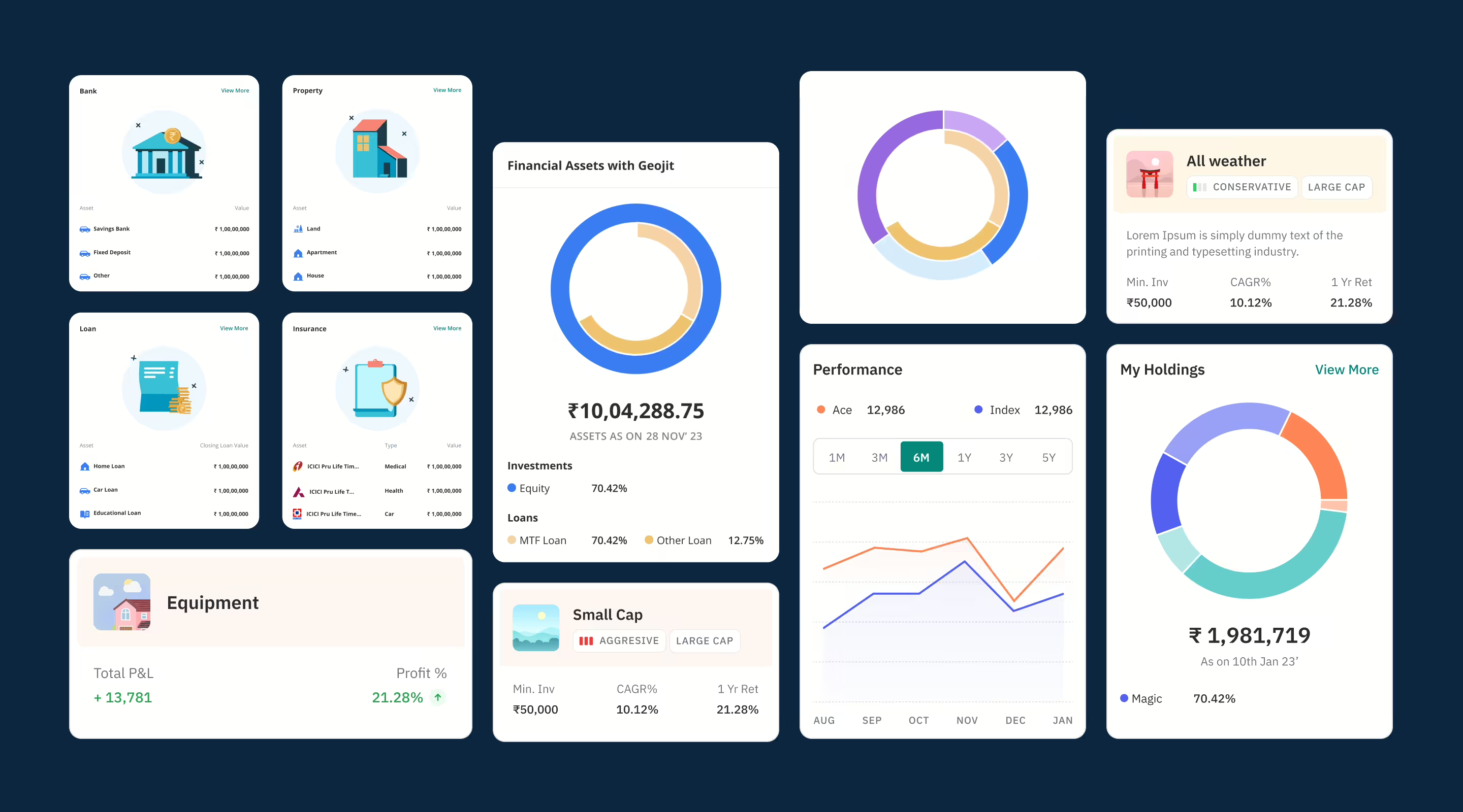
Creative yet consistent illustrations with unique visual representations across the interface. We created a unique custom design which was a mix of dark and light modes, a no-nonsense design that enabled superfast payment acceptance. We reimagined sign up experience for seamless sign up for all types of merchants along with delightful micro-interactions introduced at just the right moments to educate traders.

Outcome
Through testing validations, we made trading patterns for 10 lakh+ users improved and made clutter free. Information for all kinds of trading decisions was restructured for ease of use & made user friendly. We positioned Geojit as a unique trading platform in India with innovative solutions like technology, interactions & option chains. We designed a simple, intuitive & seamless journey for new users to start trading themselves, leading to an increase in overall user base and business for Geojit.
