SPAR is a global supermarket and hypermarket chain operating thousands of stores worldwide, offering groceries, fresh produce, and everyday essentials.
In India, SPAR operates as a large-format hypermarket with a growing digital presence, but faced complex navigation, fragmented journeys, and low product discoverability online.
Redesign SPAR’s ecommerce experience across web and mobile—improving product discovery, streamlining shopping flows, and unifying visual and interaction design.
by clear hierarchy and navigation enabled faster product discovery.
by simplified layouts and flows lowered cognitive effort and purchase friction.
using a consistent, modern visual language encouraged exploration.
by consistent patterns across app and web strengthened trust and continuity.
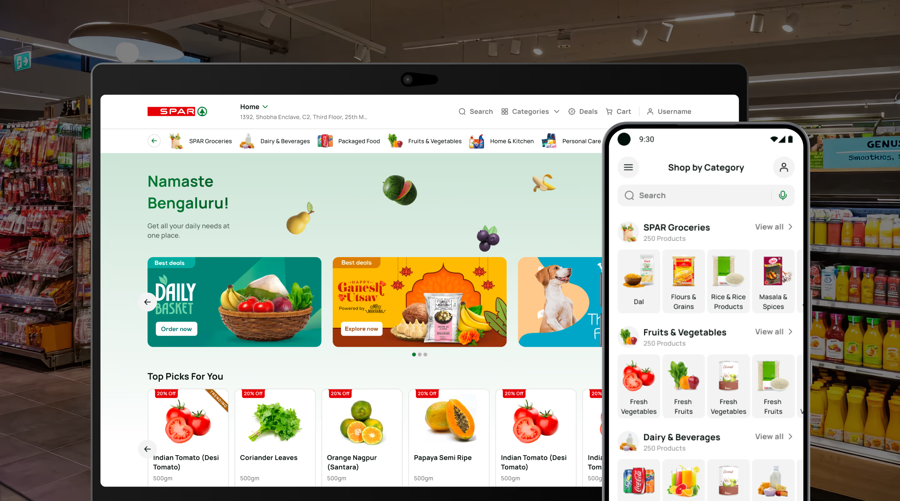
Homepage visual design enhancing browsing of fruits, vegetables, and everyday grocery product categories.
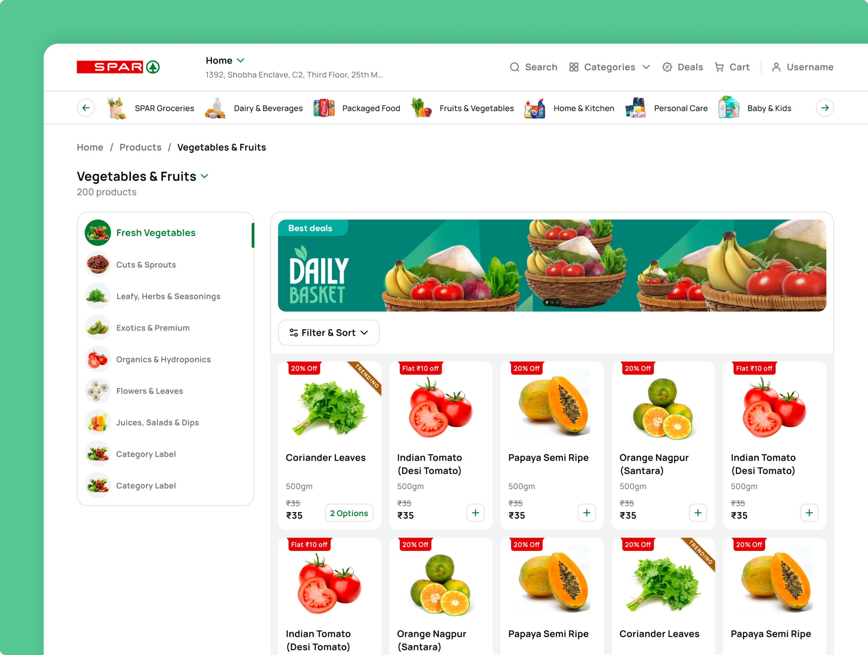
Clear layouts and improved data visibility enhanced accessibility, helping users understand information quickly and make faster, confident decisions.
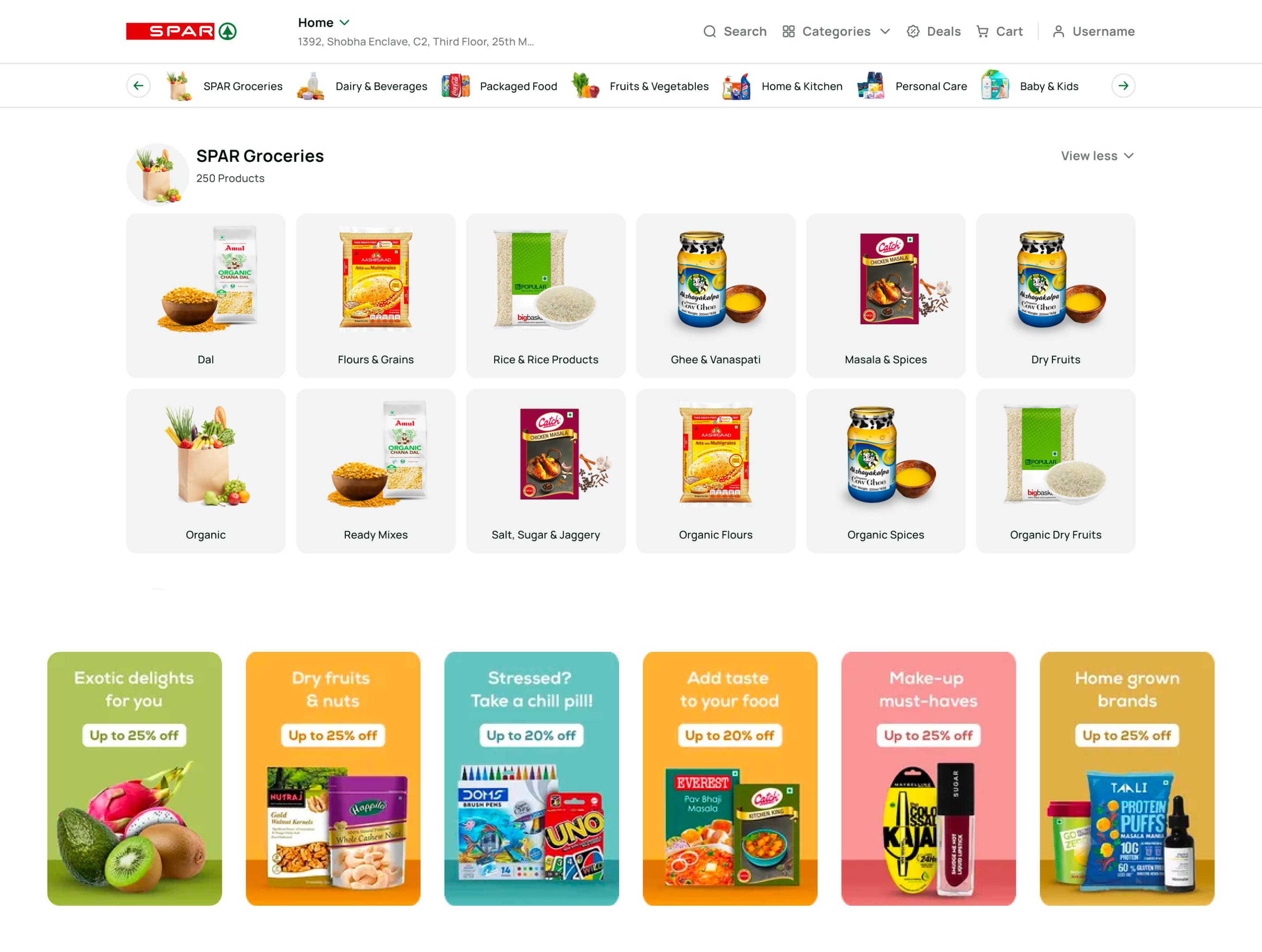
Groceries page visual design using structured product cards for clear browsing and category discovery experience.
A clean, brand-led visual system with clear typography and visual cues improved focus, readability, and ease of interaction.
Homepage visual design enhancing browsing of fruits, vegetables, and everyday grocery product categories.
Homepage visual design enhancing browsing of fruits, vegetables, and everyday grocery product categories.
Clear layouts and improved data visibility enhanced accessibility, helping users understand information quickly and make faster, confident decisions.
Clear layouts and improved data visibility enhanced accessibility, helping users understand information quickly and make faster, confident decisions.
Groceries page visual design using structured product cards for clear browsing and category discovery experience.
Groceries page visual design using structured product cards for clear browsing and category discovery experience.
A clean, brand-led visual system with clear typography and visual cues improved focus, readability, and ease of interaction.
A clean, brand-led visual system with clear typography and visual cues improved focus, readability, and ease of interaction.
We redesigned SPAR’s omnichannel retail experience to simplify product discovery, reduce shopping friction, and create a scalable foundation for future digital growth - serving millions of consumers across India.
omnichannel flows across devices.
that enables the platform to evolve seamlessly with changing business needs and future growth.
that enables a low-effort, seamless shopping experience.
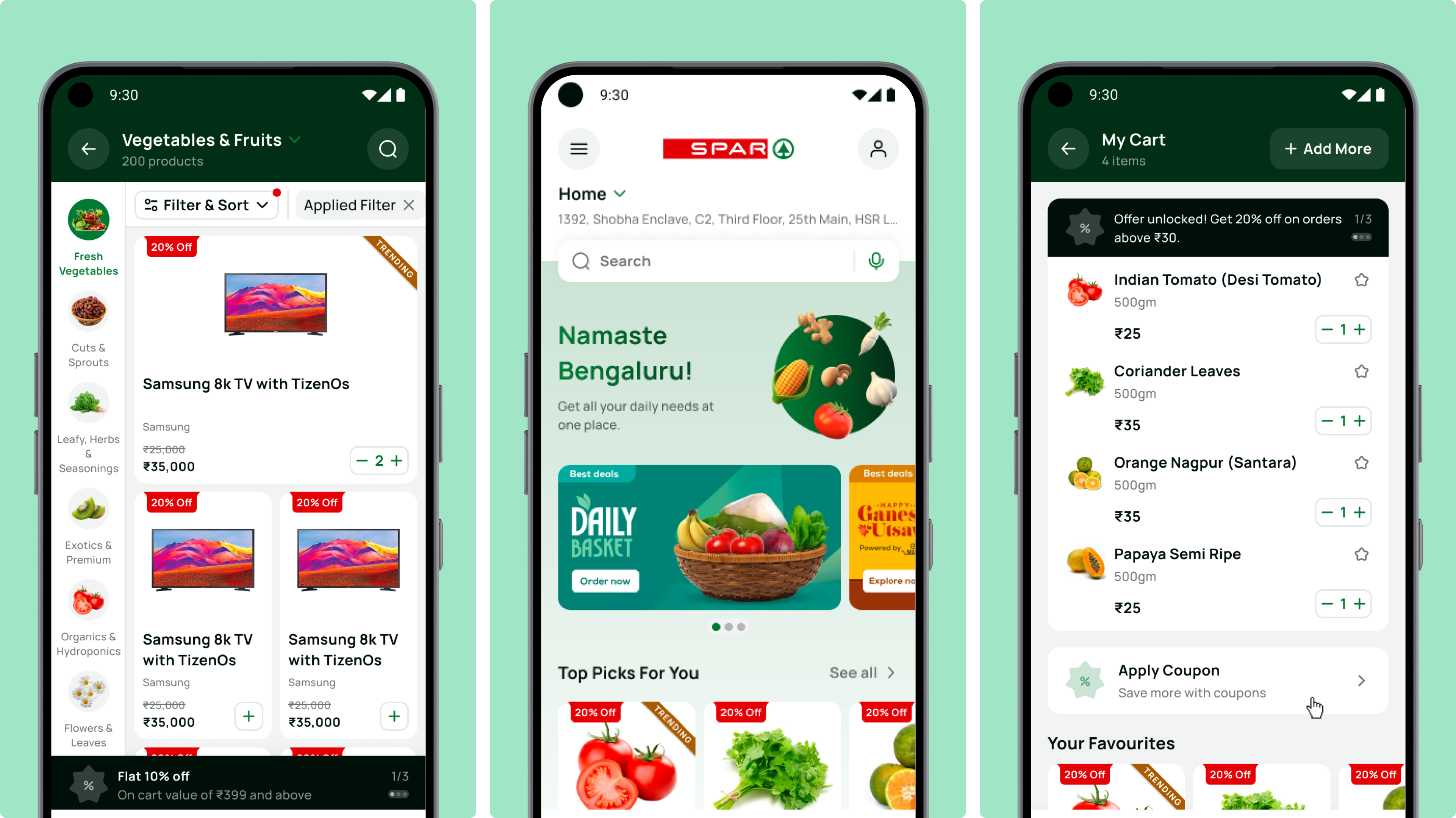
Redesigned mobile app for seamless product discovery and cart experience, reducing friction and minimizing cart abandonment.
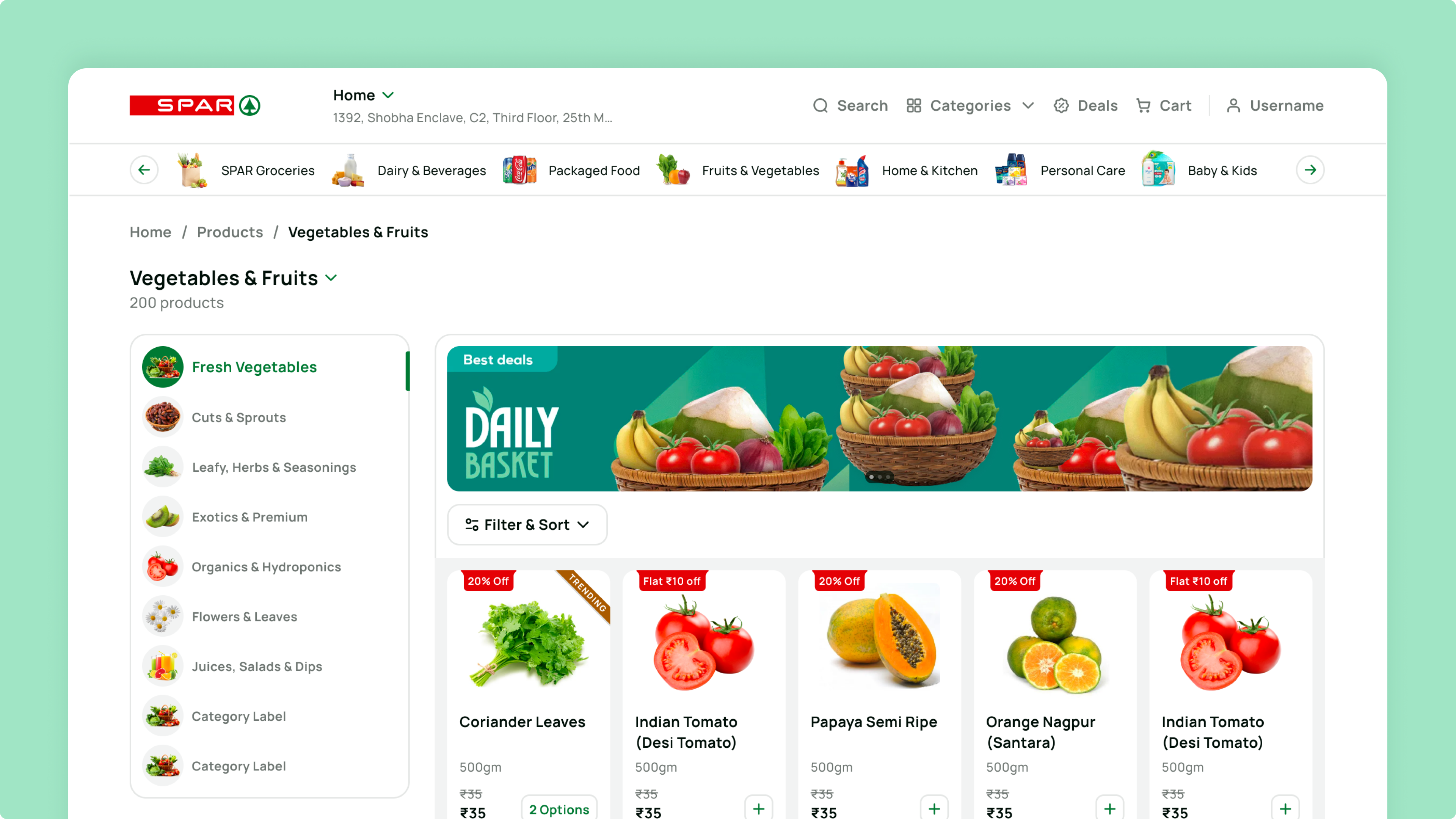
Redesigned the SPAR e-mart page with a vibrant, clean interface and clear navigation cues to enable faster browsing and effortless product discovery.
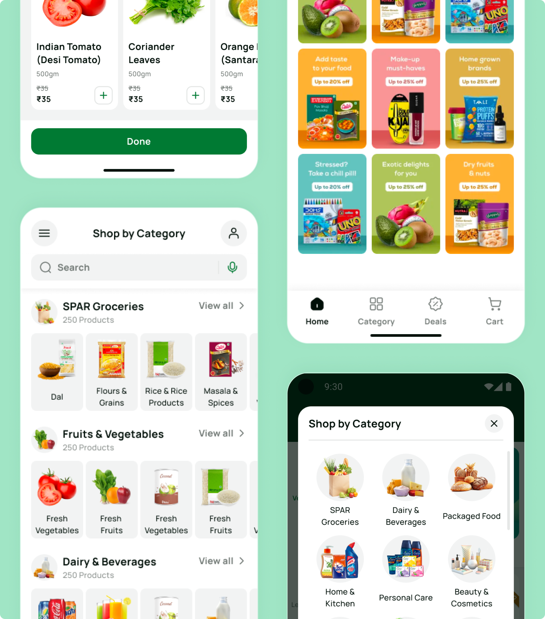
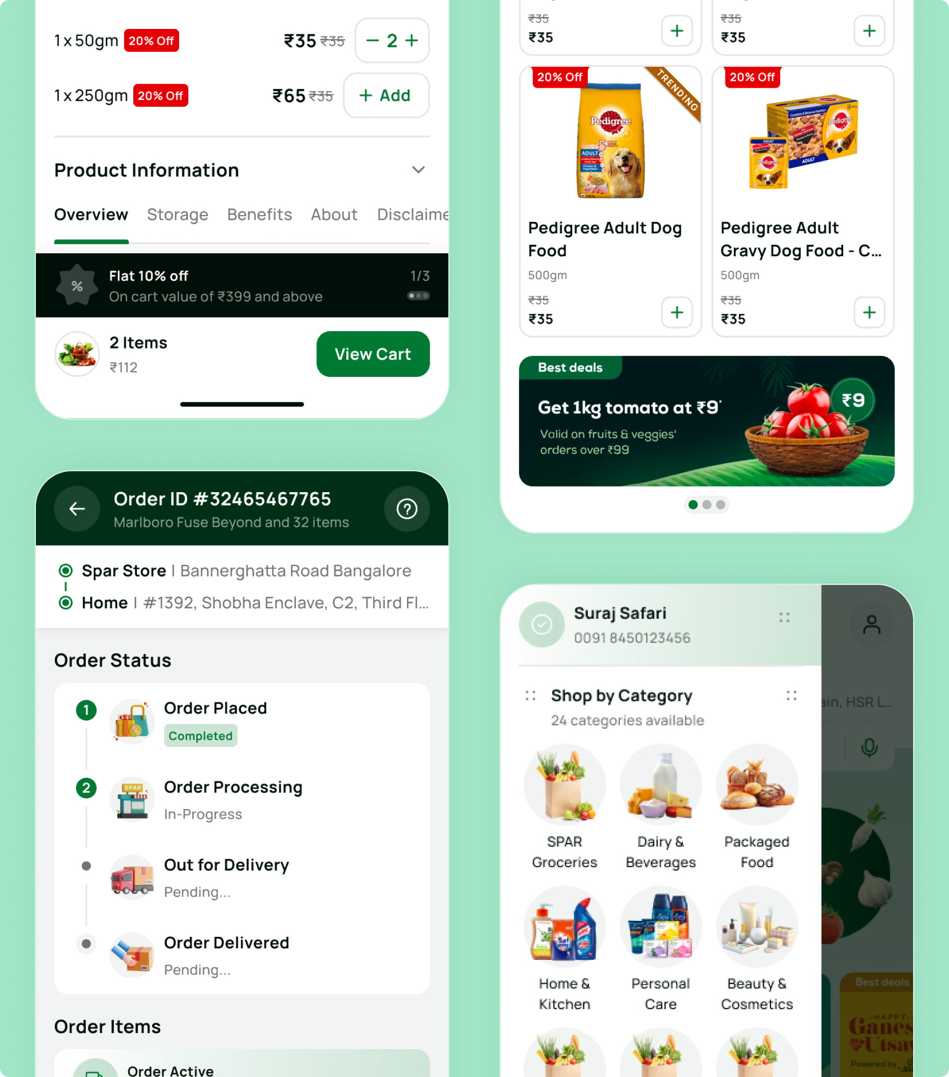
Mobile app visual design for ecommerce grocery experience, improving product discovery, hierarchy, and browsing clarity.
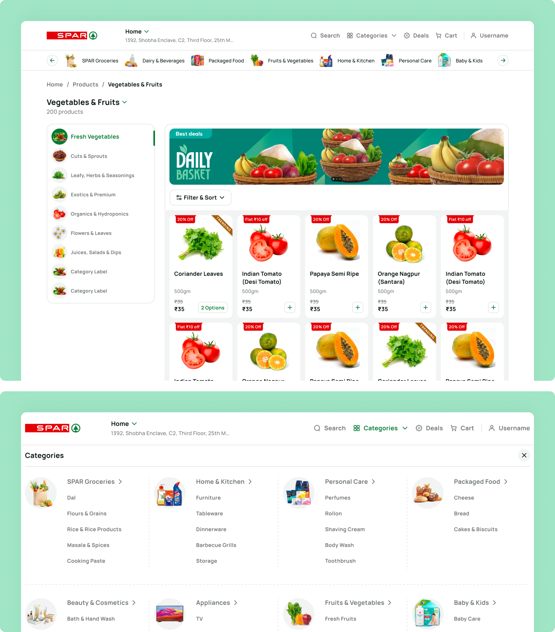
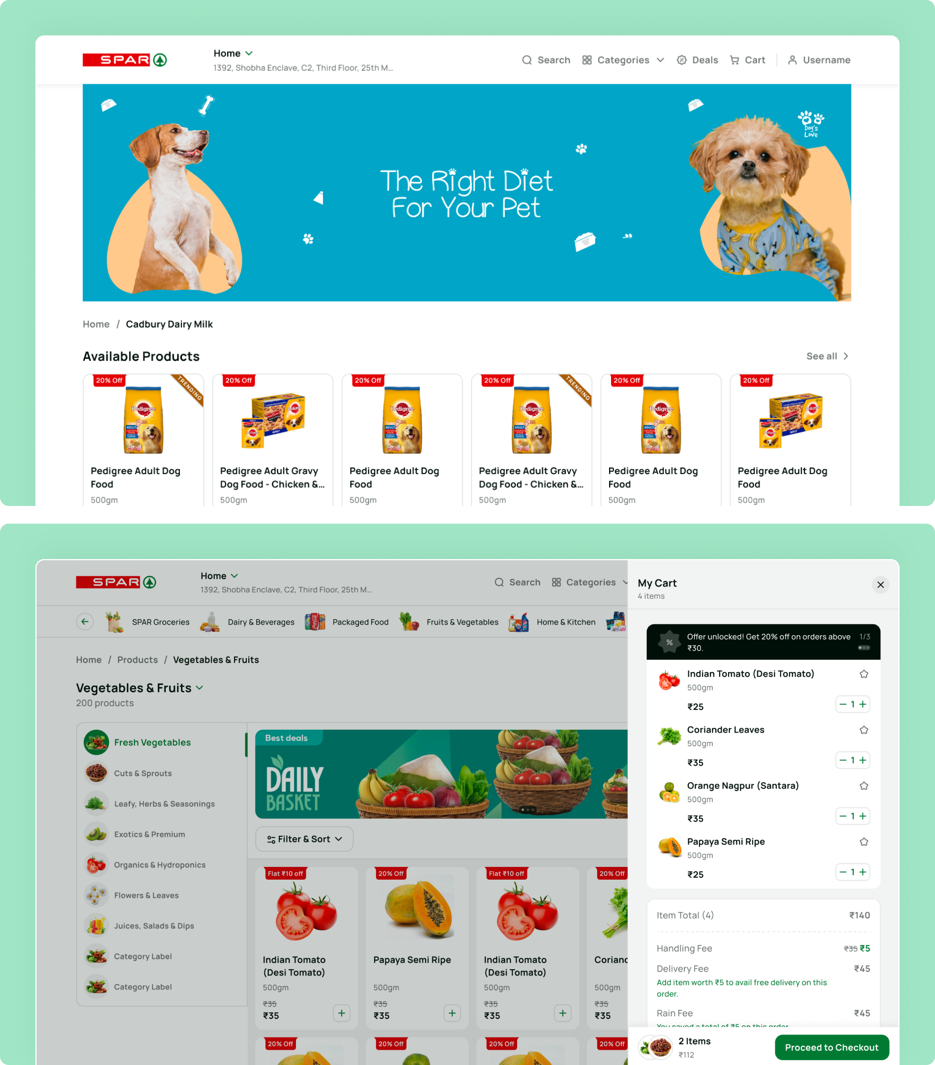
A clear web interface that simplifies product discovery and streamlines the cart for effortless checkout.
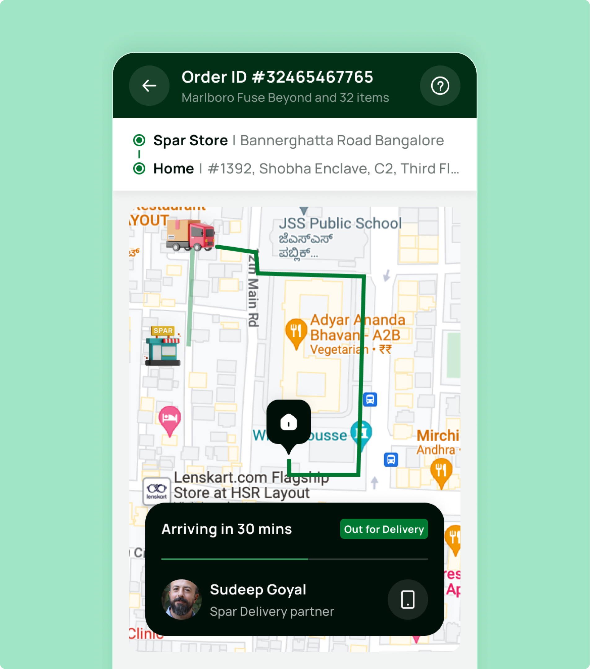
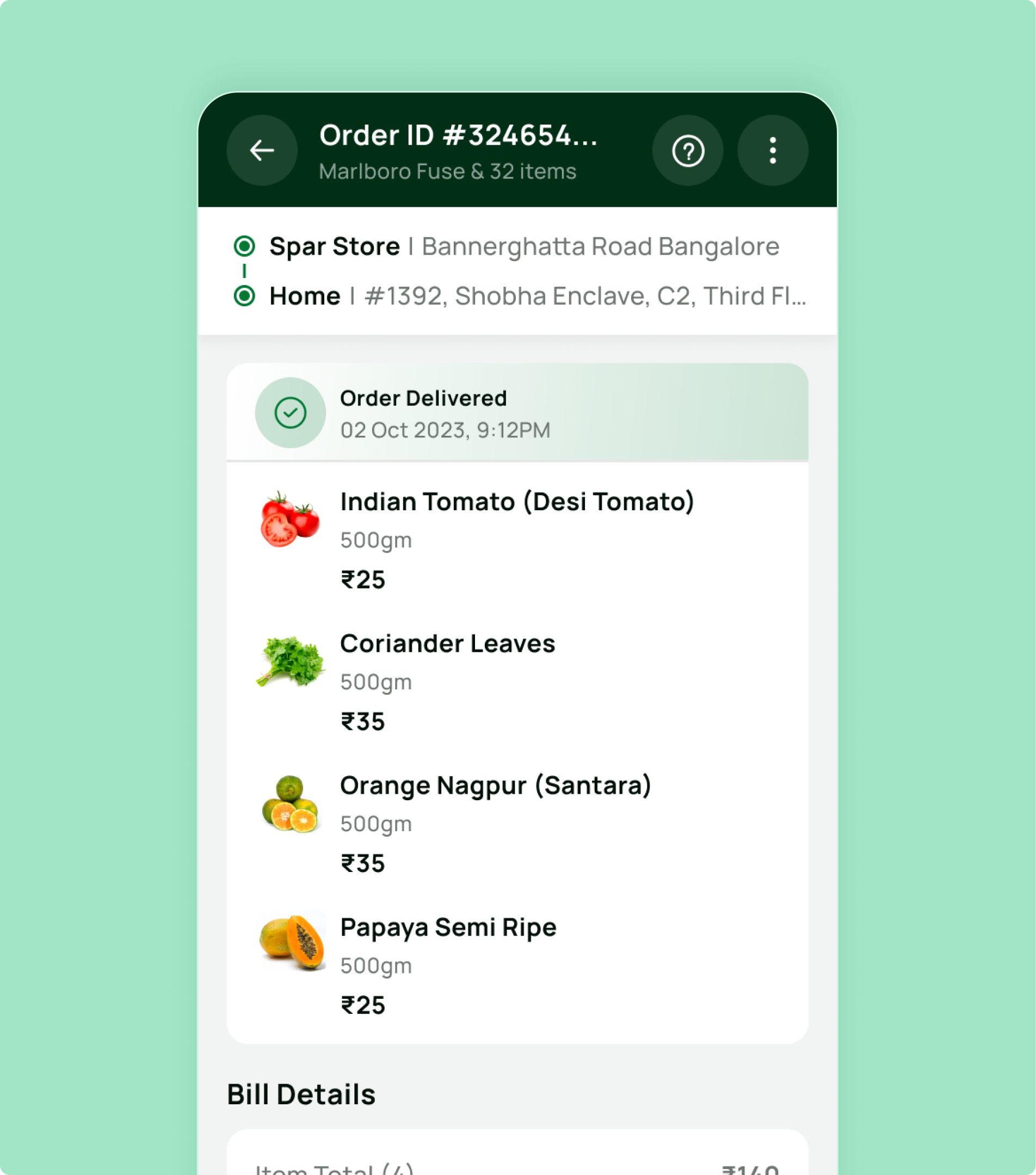
A clear and intuitive delivery tracking interface that keeps users informed in real time while simplifying access to all delivery details.
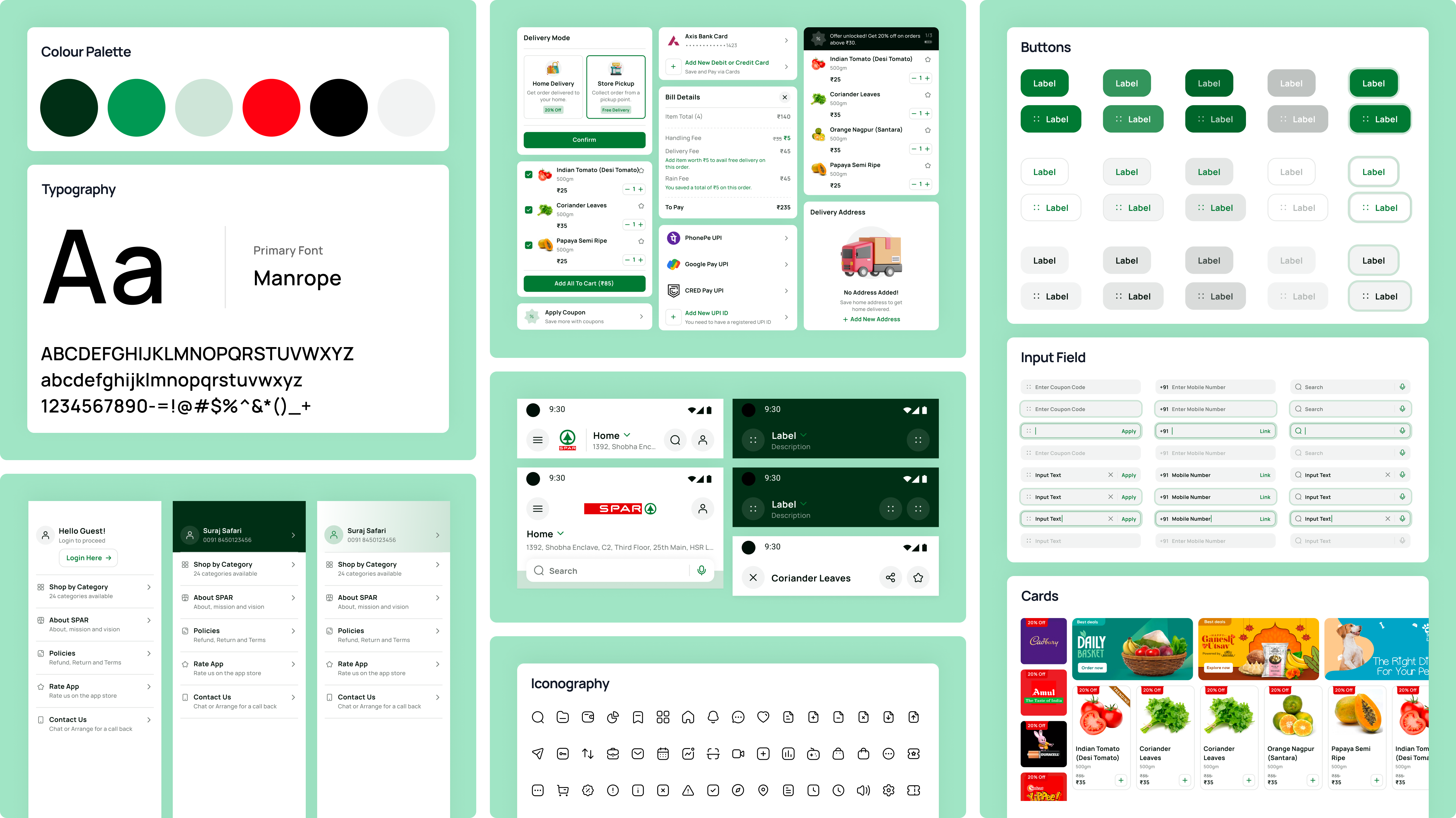
A unified design system that ensures consistency, scalability, and efficiency across web and mobile experiences.


SPAR is one of the world's largest voluntary retail chains, operating in 48 countries. NetBramha redesigned SPAR's India e-commerce experience, transforming a direct-to-consumer platform into a full omnichannel retail experience.
The D2C-to-omnichannel shift is a specific structural challenge: the platform had to start supporting cross-channel behaviours (browse online, buy in-store or vice versa) that a pure D2C site was never architected for.
Grocery shoppers are usually repeat-purchasing familiar items under time pressure, which makes speed and reorder simplicity the dominant design priority, unlike discovery-led categories like beauty or fashion.
That's the opposite design emphasis from Tira's beauty commerce platform, where discovery and visual confidence-building matter more than raw checkout speed - two retail projects, two different underlying user psychologies.
SPAR operates 13,600+ stores across 48 countries as an international retail brand, but its India operations run through the Landmark Group, meaning the redesign had to reconcile a globally recognised brand identity with locally specific shopping behaviours.
That global-brand-meets-local-market tension is a pattern in NetBramha's international client work; SIXT's redesign faced a similar challenge in reverse - one consistent international brand experience across 130+ different local markets simultaneously.
Nested product variants and unclear navigation were causing checkout drop-off, particularly on mobile, where the majority of SPAR's India traffic originates.
Mobile-first friction is a recurring theme across NetBramha's e-commerce and fintech work - the same mobile-traffic-dominant reality shaped design priorities on Razorpay Magic and IAMIN, where most transactions also happen on a phone rather than a desktop.
Yes - hypermarket catalogues run into tens of thousands of SKUs across dozens of categories, which makes navigation architecture and search the primary design problem, rather than the curated, editorial-style browsing that suits a smaller D2C catalogue.
That scale of catalogue complexity is closer to the information-density challenge NetBramha solved for Geojit's trading platform than to a typical single-category D2C storefront.
Recommended Next
Multiple digital initiatives driving growth for billion-dollar security enterprise