Geography
India
Domain
Retail & Ecommerce
Platform
Mobile & Website
Services
Research, Strategy, Design
An omnichannel beauty experience & seamless user journey
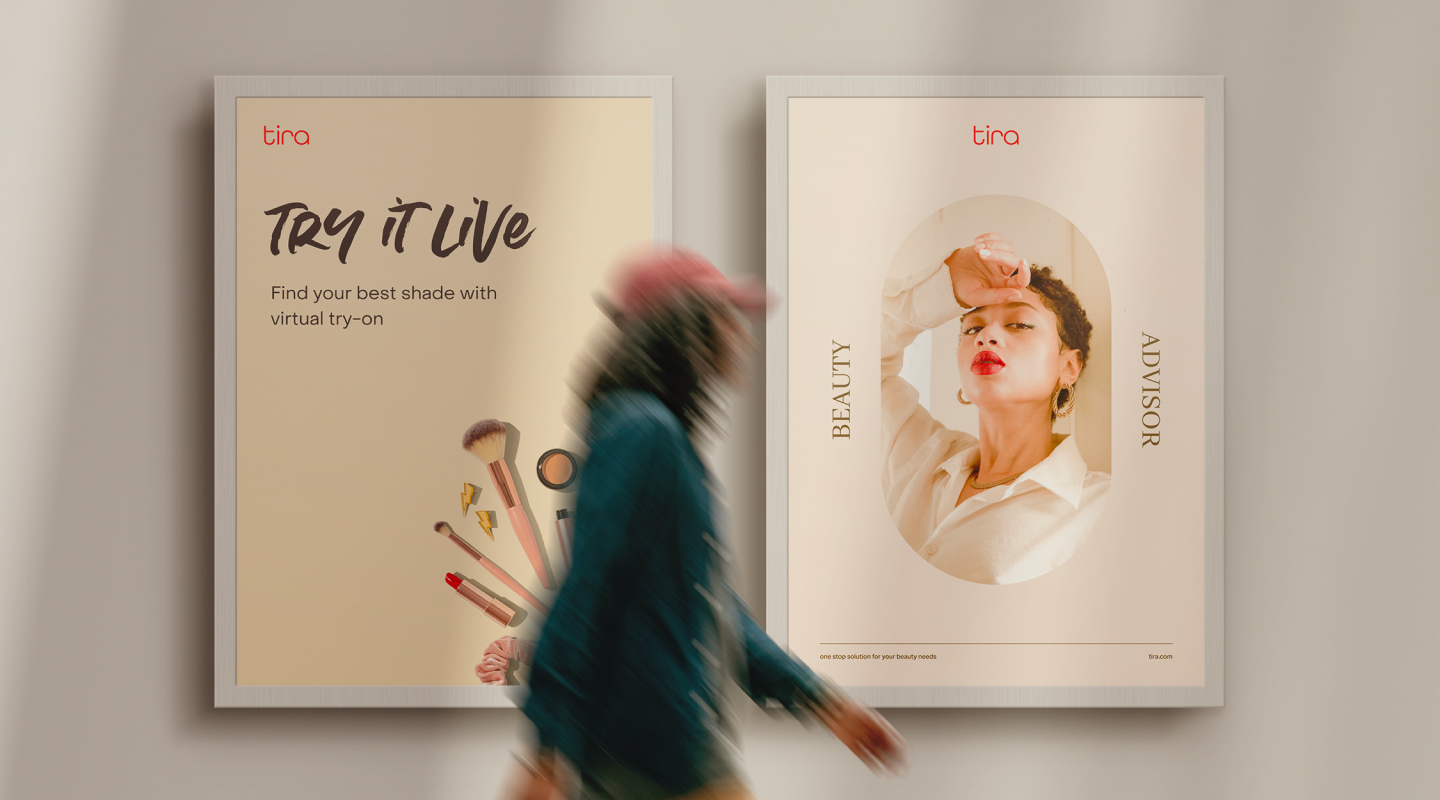
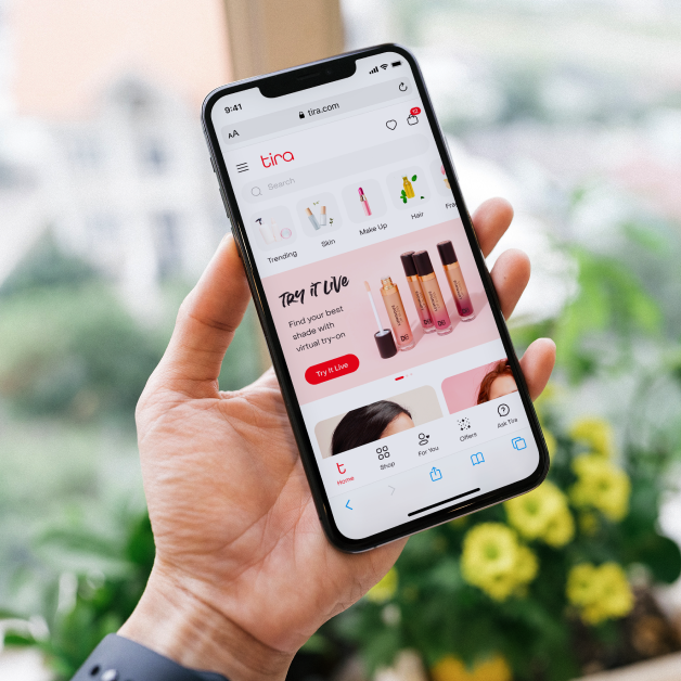
We designed an application (website & mobile) for Reliance’s debut, Tira. We aimed to create meaningful innovations using Beauty Tech that made the user journey more engaging & decisive & experiences that made Tira stand out from a sea of competitors. The objective was to create a digital-first user experience that provides users with better product discovery, a simple & intuitive experience & provide re-assurance & trust.

Challenge
Developing a beauty app that stands out in a competitive market posed several challenges, especially in a market already dominated by big names such as Nykaa, Mama Earth, Sephora, Purplle & so on. Catering to a diverse user base with varying preferences & needs required careful personalization & inclusivity. Integrating advanced beauty tech while ensuring data privacy & security added to the complexity. Additionally, staying ahead of rapidly evolving trends & technologies was essential for maintaining relevance & user engagement.
Solution
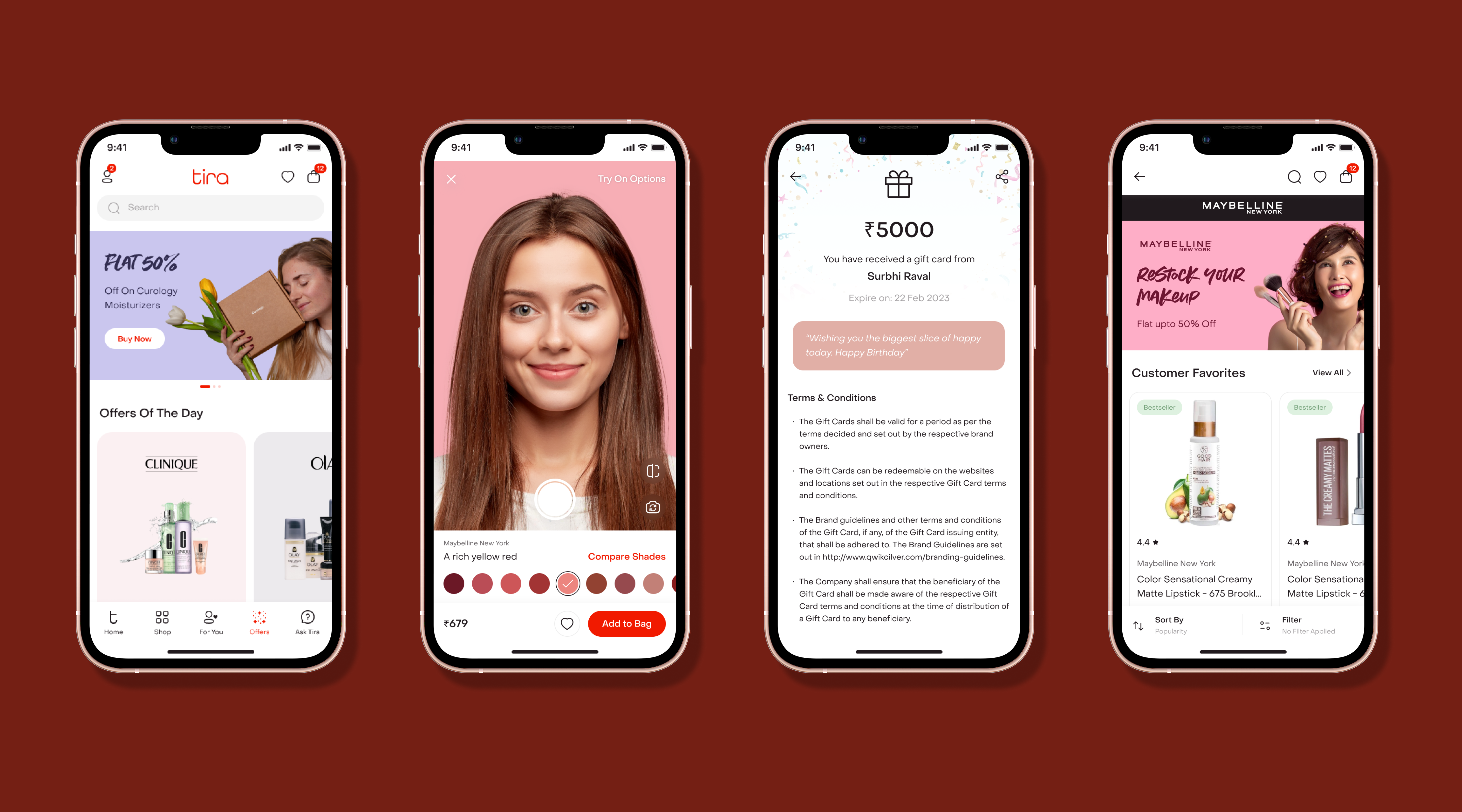
We designed an application & website to create meaningful innovations using Beauty Tech that will made the user journey more engaging & decisive. This includes unique features like Virtual Try-On, e-Beauty Advisor & Shop the Look. A one-stop-shop for all beauty needs, providing a seamless online experience complemented by an extensive offline store network. With useful resources such as curated Beauty Guides & a variety of influencer content, the entire beauty experience was made less cluttered, with users receiving curated, personalized information rather than being bombarded with scattered information & decision fatigue.
Research
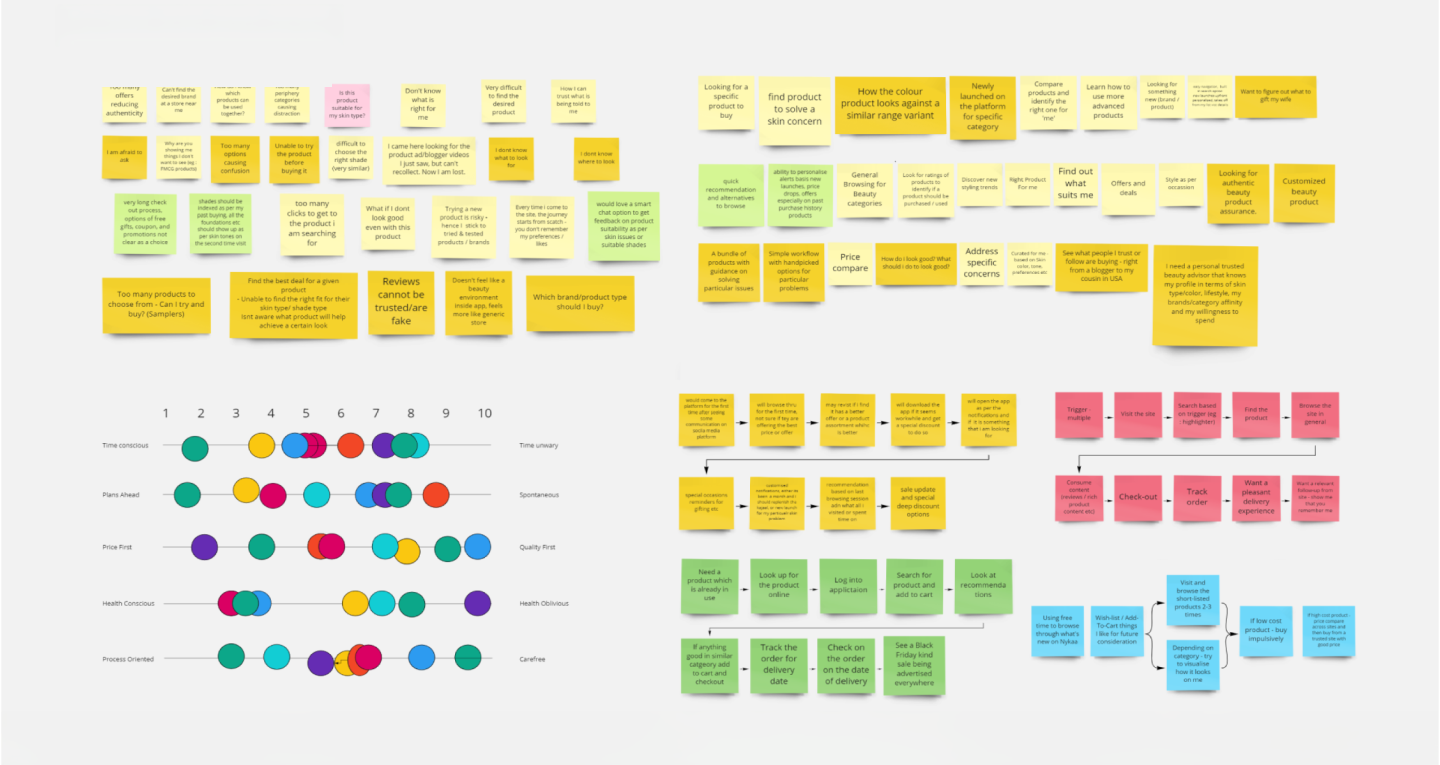
We conducted various discovery workshops which consisted of close to 10 – 12 stakeholders to gain a deeper understanding of the beauty & wellness industry. We segregated users into five distinct categories to understand the user preferences within different segments in the beauty industry. With the help of the findings collected from the discovery workshops, we created personalized workflows for different user personas & implemented targeted strategies for each, to optimize their user experience.
Pain points discovered
Choice
overload
Users face decision paralysis in a sea of beauty products & apps, struggling to find the best beauty product, that suits their specific needs
Information
overload
A surplus of details overwhelms users, hindering their ability to extract key insights & decide which products to buy.
Trust
deficit
Skepticism & hesitation arise as users question the credibility of provided information, such as the influencer content & beauty guides.
Personalization
gap
The absence of personalization left users disconnected, missing tailored suggestions aligned with their preferences & needs.
Strategy
Features listing based on user pain points such as lack of trust, personalization & an overwhelming amount of information by giving users personalized beauty experiences, for different user personas. Detailed IA created for diverse workflows facilitating better navigation, improved UX, supporting content model & searchability for 1000s of online products. We also ensured seamless & easy navigation through consistency across all platforms & reducing information overload.

Highly personalised
Resources & guides curated for different user groups

User personas
Workflows personalized for multiple personas
Simple & intuitive
Organizing overwhelming information & choices
Design
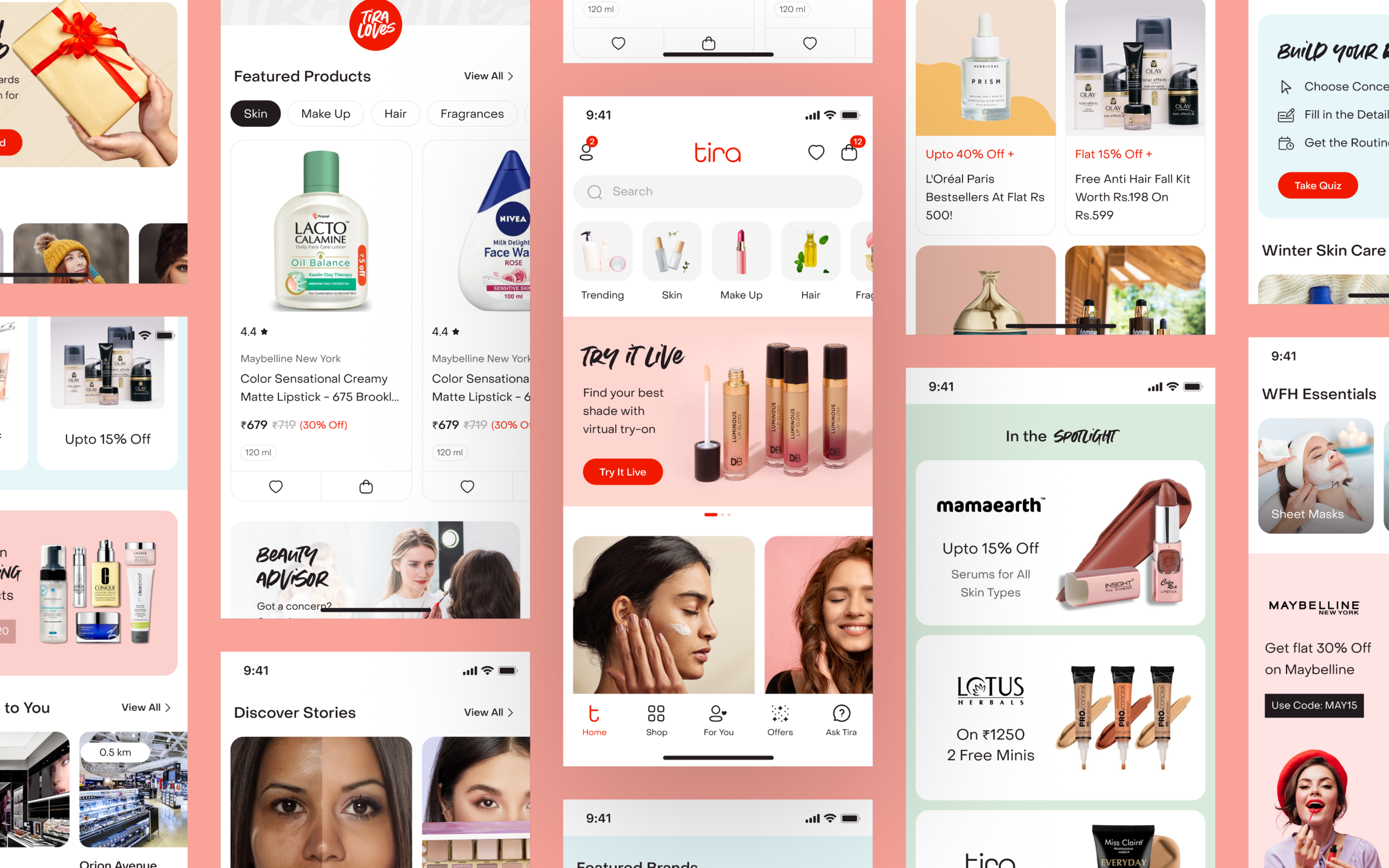
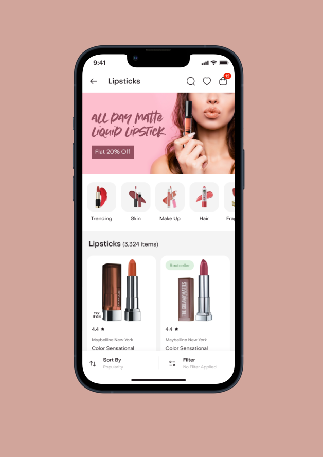
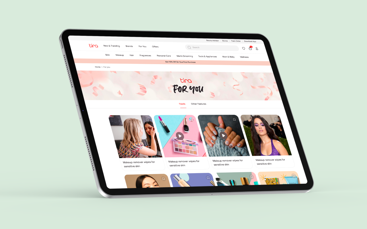
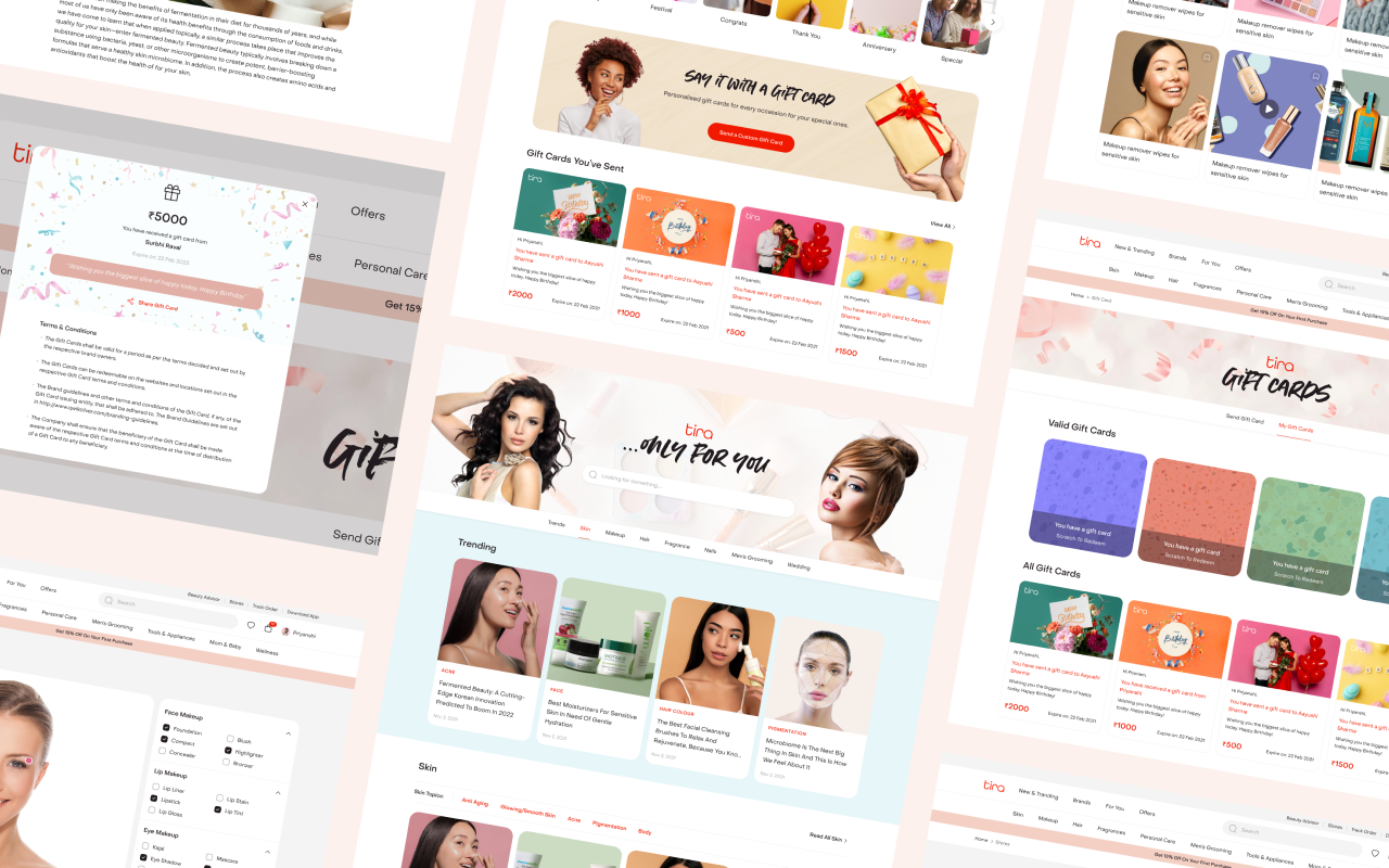
The design execution for Tira centered around crafting a clean, intuitive & personalized shopping experience that blended beauty discovery with trust. The redesigned interface prioritized personalization, offering curated recommendations, tailored content & relevant offers to boost engagement. By introducing less clutter & organizing navigation with precision, users could browse effortlessly & find what they needed without friction. Each touchpoint, from home screens to product detail pages – was optimized for clarity, emotional warmth & conversion. Beyond aesthetics, the experience was built to foster trust, connecting users with expert advisors & content that addressed real beauty & wellness needs, turning casual shoppers into confident loyalists.
Information architecture
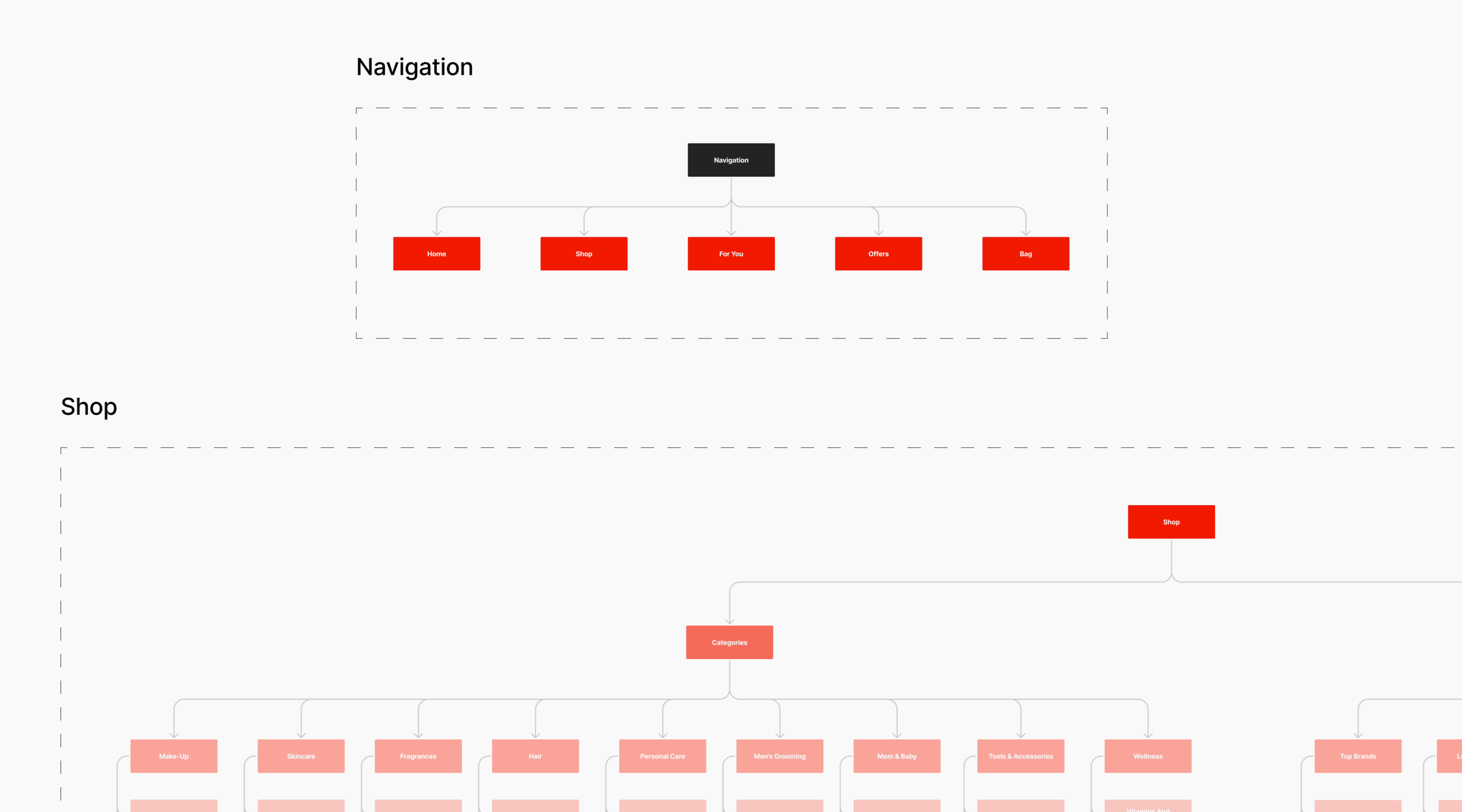
The Information Architecture for Tira was meticulously designed to support diverse user workflows while ensuring effortless navigation & discoverability. A detailed IA framework was built to enhance UX by simplifying product exploration & improving content hierarchy across thousands of SKUs. The structure supported an advanced content model that enabled faster search, better categorization & smoother transitions between related products & guides. This organized, scalable IA not only streamlined the shopping journey but also strengthened product visibility & engagement across Tira’s growing digital ecosystem.
Visual design
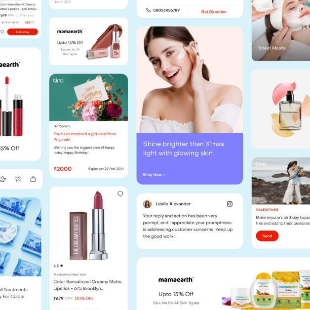
We enhanced visibility of the product offerings through muted light color palettes & custom visual design language. Primary color was chosen as Red (#F11A00) to grab attention along with adding essence of beauty & luxury. A combination of primary strong hues with light pastels created the right contrast for high visibility. Use of custom icons, modern fonts & delightfully engaging images across the platform, ensured a premium & seamless experience.

Outcome
Tira has the potential of reaching over 100 million customers leveraging Ajio’s & Reliance Retail’s extensive user base We built a one-stop-shop for all beauty needs, providing a seamless online experience complemented by an extensive offline store network & positioned Tira to become the leading beauty application in the country by including key differentiating factors as compared to industry leaders.
