Geography
India
Domain
Finance & Fintech
Platform
Mobile & Web App
Services
Research, Strategy, Design
TransUnion CIBIL, India’s leading information and insights company, manages over 5,000 members–including all leading banks, financial institutions, non-banking financial companies and housing finance companies–and maintain credit records of over 1000 million individuals and businesses.
They approached us to help design a platform that would provide consumers with quicker and more affordable access to credit and services. The project aimed to perform a comprehensive heuristic audit & usability testing of the credit report and dispute center, design a mobile-responsive page, and implement other design enhancements to improve user experience and functionality.
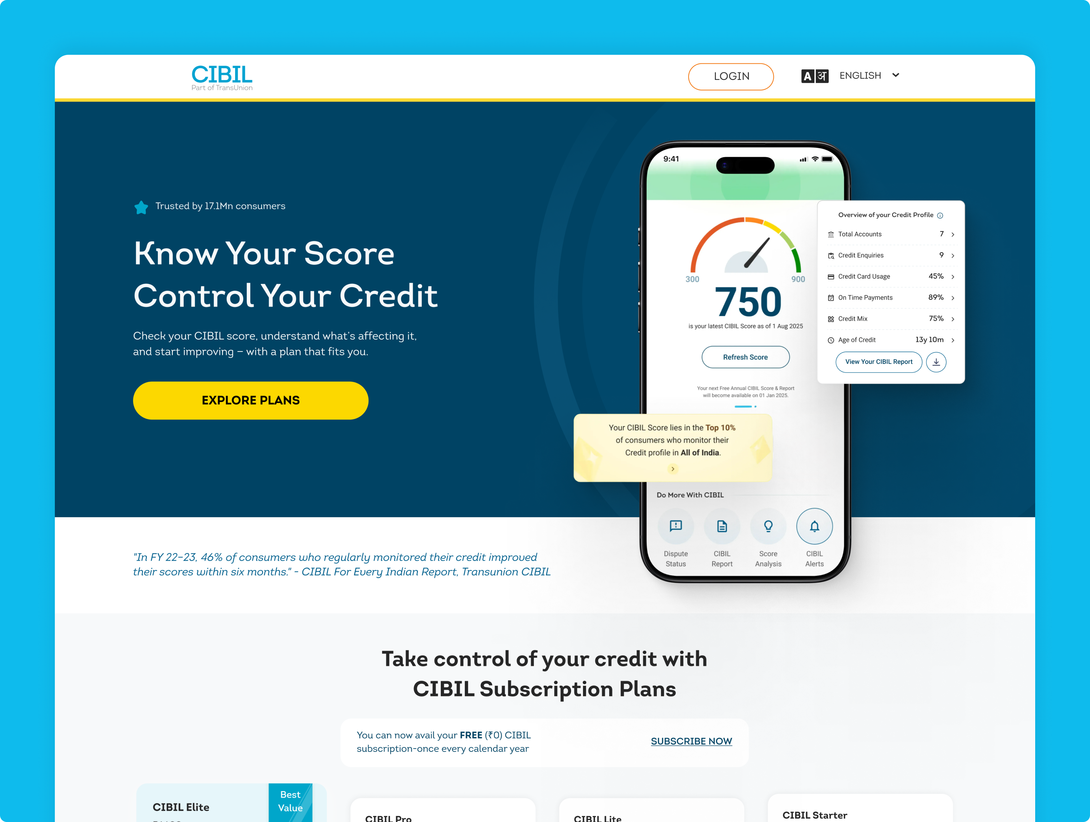
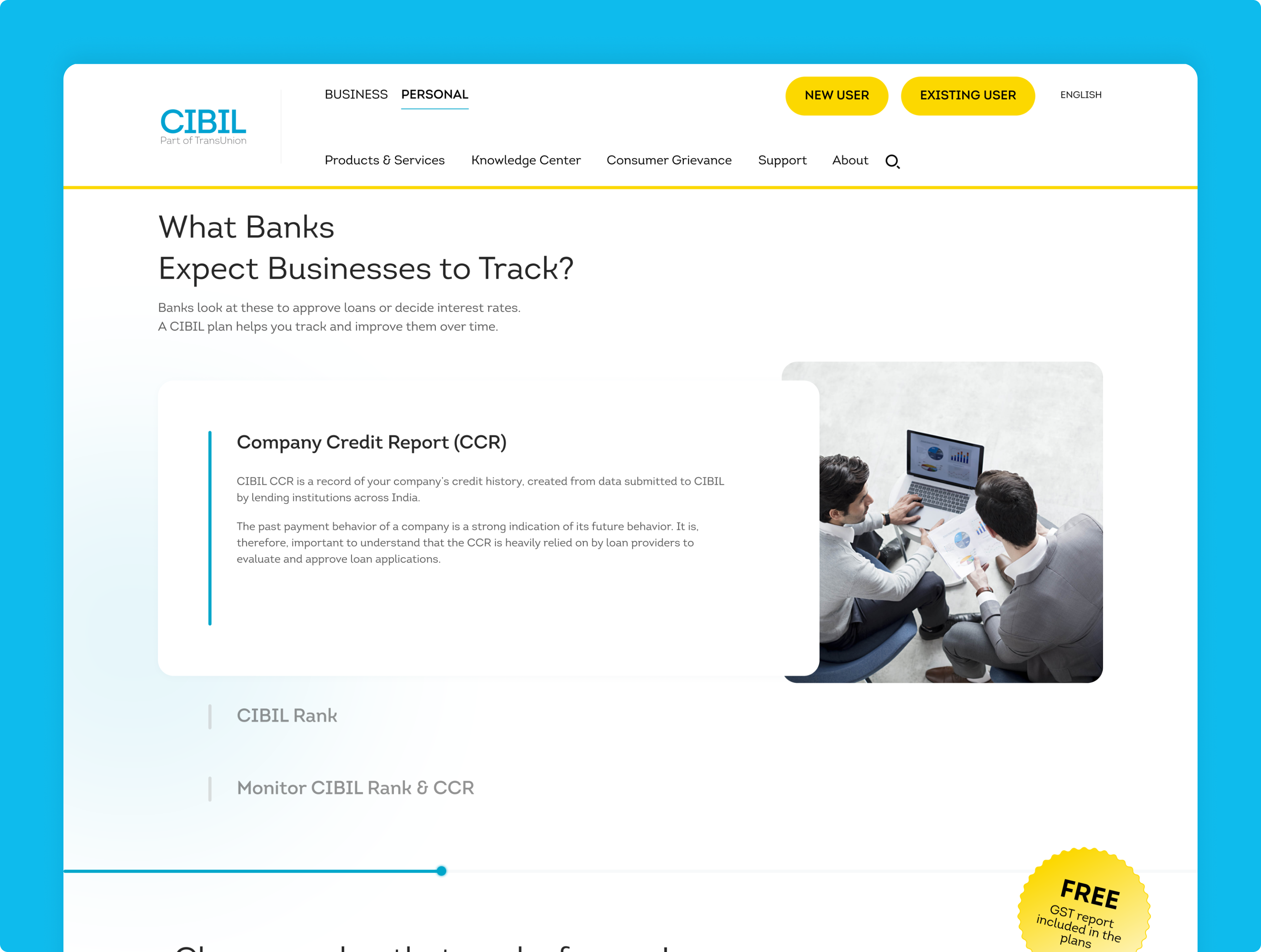
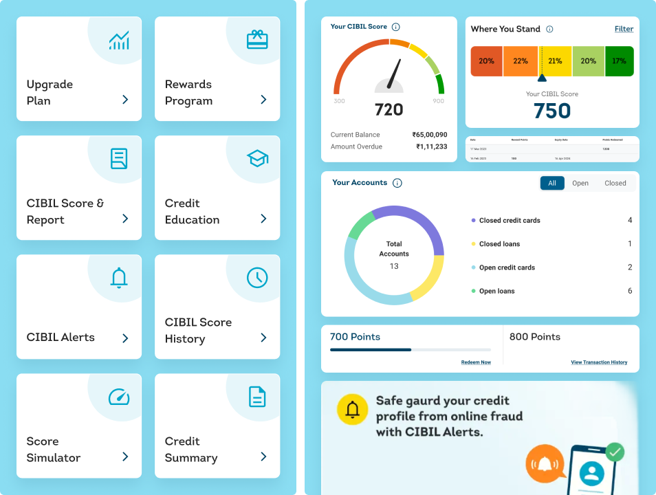
Our collaboration with TransUnion CIBIL involved three main areas: overhauling the dashboard, building the CIBIL app from scratch, and revamping the website. Additionally, we focused on enhancing marketing and sales features, ensuring a comprehensive revamp of specific processes such as marketing communication and dispute handling. This case study delves into our approach, challenges faced, and the solutions implemented to meet TransUnion CIBIL’s objectives.
Challenges
The project presented several significant challenges, starting with the existing design gaps, text-heavy content, and the absence of a consistent design system. Our primary goal was to simplify the entire process and enhance the user experience, making the customer journey—from sign-up to post-onboarding—seamless. One of our key challenges was reducing the rate of disputes by developing effective strategies that emphasized prevention over resolution. We also needed to improve users’ understanding of the dispute-raising process, ensuring it was clear and easy to navigate. Additionally, enhancing the usability of the dispute page itself was crucial, as it required a more intuitive and user-friendly design to facilitate a smoother experience for customers raising disputes.
Solution
We faced the challenge of designing an end-to-end solution that required a complete overhaul of multiple platforms. This included a full redesign of the mobile app, a revamp of the website’s design and content, and an extensive update to the dashboard. Additionally, we built a comprehensive mobile component library from scratch and conducted thorough in-house usability testing and heuristic evaluations. Crafting a post-onboarding email strategy was another key challenge, as we needed to develop distinct strategies for paid and free customers. Moreover, we ran multiple campaigns and integrated financial education delivery aspects into the platform to raise awareness, adding another layer of complexity to the project.
Our Research
We conducted extensive in-house usability testing, with three rounds of research carried out over a span of three months. Candidate sourcing was managed internally to ensure relevant participant selection. The research was centered on understanding user behavior, identifying pain points, and gathering suggestions for both the app and the website. This comprehensive research effort resulted in hundreds of design recommendations, out of which over 80 were finalized and implemented.
Pain points discovered
Complex
Website
The website was complicated, difficult to navigate, and burdened with text-heavy content
Outdated
Mobile App
The mobile app was outdated and involved lengthy, cumbersome processes.
Ineffective
Communication
Marketing communication lacked clarity and needed a complete overhaul, in terms of content design
Inaccessible
Features
Specific features were inaccessible and difficult to understand, requiring significant improvements.
Our
strategy
Our strategy was guided by competitive benchmarking and focused on a comprehensive overhaul of the app, with a strong emphasis on content and marketing improvements while simplifying the overall design. We aimed to simplify complex processes and incorporated financial education elements to break down these processes and reduce drop-offs. By addressing all issues from the start to the end of the user experience, our strategy sought to redefine how users interact with credit reports, transforming the experience into a more engaging and enjoyable one.
Simplification
Simplifying complex flows for a mobile-responsive experience
Transformation
Overhaul dispute raising process into a smooth, seamless flow
Communication
Improve marketing communications across emails
Design
execution
The project was a significant undertaking, requiring a complete overhaul of the brand guidelines and a comprehensive redesign of the entire user experience. We began by developing a new set of brand guidelines to ensure consistency and cohesion across all touchpoints. A key element of the redesign was the creation of an extensive mobile component library, which provided a unified set of design elements for seamless integration across the app and website.
In collaboration with the development team, we focused on minimizing roadblocks and ensuring the effective implementation of the design system. This involved regular coordination to address any technical challenges and optimize the design for performance. The result was a well-executed design system that enhanced user experience and facilitated a smooth, efficient development process.
Rebranding: Completely redesigned brand guidelines to ensure a fresh and cohesive visual identity.
Marketing Communications Overhaul: Revamped all marketing messaging to enhance clarity and engagement with users.
Intuitive Design: Developed a user-friendly design system that simplified navigation and improved the overall experience.
Built email marketing strategy: Created a comprehensive set of email templates and strategies to support effective communication with users.
Wireframes
The wireframes were designed to guide users with clear upfront instructions on how to navigate the process. Key information about accounts is displayed in a collapsed format for clarity, and users can access detailed information by selecting a specific account. The information is read-only to prevent accidental changes, and users can only proceed once they interact with the interface. Dispute type dropdowns are conveniently placed for each field, allowing users to select and edit as needed. The ‘Continue’ button remains disabled until user interaction, ensuring that all necessary steps are completed before moving forward.
Visual design
We established a new brand language, crafting a cohesive visual and verbal identity that aligned with the project’s goals. This included the development of a comprehensive mobile component library, providing a consistent set of design elements for both the app and website. Additionally, we created a holistic illustrations library along with marketing collaterals to enhance user engagement and communication. These efforts ensured a unified and impactful presence across all platforms, contributing to a more streamlined and effective user experience.
The
outcomes
The redesigned user experience substantially enhanced user satisfaction by clarifying and simplifying the dispute resolution process, making it more intuitive and easier to navigate, expanding reach to over 50 Million+ users. Efficiency improved through clear instructions, well-organized information, and user-friendly interfaces, which saved users time and effort in resolving credit-related disputes. This streamlined approach led to increased engagement and higher completion rates, as users found the dispute flow more accessible and engaging.
The mobile app has launched successfully, with 70% increase in mobile responsiveness & performance, while the web dashboard has been significantly uplifted in design and usability. Successful marketing campaigns have expanded the customer base and increased engagement, creating positive awareness about credit. The redesign also effectively reduced drop-offs during conversion stages, resulting in a more seamless and effective user experience.