Unveiling the Artistry: 7 Examples of Exceptional UX Design in Digital Products

Introduction
User experience (UX) design, in the ever-evolving landscape of digital products, stands as the artistic brushstroke that paints the canvas of seamless interaction. It’s the amalgamation of aesthetics and functionality that transforms mere software into an immersive, user-centric journey. This article delves into the intricacies of digital UX design, exploring its definition, and the importance it holds, and presenting seven stellar examples from the realms of ClearTax, Festivals from India, CloudNine, Razorpay Magic, Google, Microsoft, and Instagram.
Cleartax: Intuitive Navigation
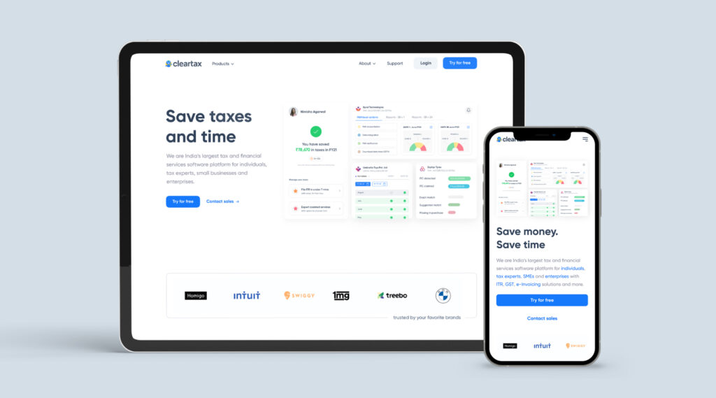
The heartbeat of any digital interface lies in its navigational ease. Picture an app or a website where finding what you need feels as natural as breathing. ClearTax, a tax filing platform, exemplifies this seamlessly. With a user-friendly interface, it guides users effortlessly through the intricate process of tax filing. ClearTax’s design ensures that users don’t get lost in the labyrinth of financial jargon, making the daunting task of filing taxes a breeze.
ClearTax’s homepage welcomes users with a clean layout, presenting essential options prominently. The navigation bar is intuitively categorized, with labels that make sense even to first-time users. The step-by-step process of filing taxes is visually represented, eliminating confusion. This simplicity in navigation enhances user experience by reducing cognitive load, ensuring users can focus on the task at hand without feeling overwhelmed.
Festivals from India: Minimalistic Design
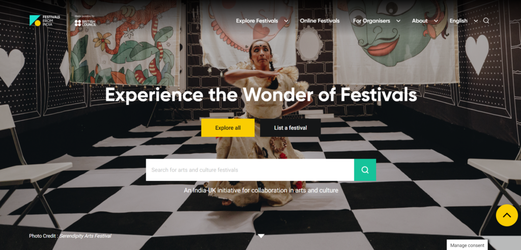
In a world inundated with information, minimalistic design emerges as the unsung hero. Festivals from India, a digital platform showcasing the cultural extravagance of Indian festivals, exemplifies this with grace. The website adopts a clean and clutter-free interface, allowing users to immerse themselves in the vivid celebrations without distraction. By stripping away unnecessary elements, Festivals from India crafts an experience that is both visually pleasing and easy to navigate.
The minimalistic design of Festivals from India allows users to explore various festivals with ease. The use of ample white space not only adds elegance to the design but also ensures that the user’s attention is directed towards the rich visuals and content. The navigation is intuitive, with clearly defined categories and a search function that simplifies exploration. Festivals from India proves that sometimes less is indeed more, creating an environment where users can appreciate the essence of festivals without any digital noise.
CloudNine: Responsive and Adaptive Layouts
As users traverse through an ever-expanding array of devices, responsive design becomes paramount. Enter CloudNine, a healthtech platform specializing in maternity and childcare. CloudNine’s website seamlessly adapts to various screen sizes, ensuring that whether you’re on a desktop or a mobile device, the information is presented with clarity and coherence. The responsiveness enhances the overall user experience, making health-related information accessible on the go.
CloudNine’s commitment to responsive and adaptive layouts is evident in its fluid design. Whether users are browsing articles on prenatal care on a laptop or seeking information about pediatric services on a tablet, CloudNine ensures a consistent and enjoyable experience. The images resize gracefully, and the text remains legible, creating a seamless transition between devices. This adaptability not only caters to user convenience but also reflects a dedication to inclusivity, acknowledging the diversity in users’ technological preferences.
Razorpay Magic: Effective Use of Color and Typography
The visual aesthetics of a digital product can evoke emotions and drive engagement. Razorpay Magic, a platform revolutionizing payment solutions, employs a vibrant color palette and typography that resonates with its tech-savvy audience. The strategic use of color not only enhances the brand identity but also guides users’ attention to key elements. Razorpay Magic’s design ensures that the user’s journey is not only functional but visually stimulating.
Razorpay Magic’s interface is a canvas of energetic colors and modern typography. The color scheme is not just visually appealing; it serves a purpose. Call-to-action buttons pop with contrasting colors, directing users towards the next steps in their payment journey. Typography is clear and readable, contributing to a seamless reading experience. The design choices not only reflect Razorpay Magic’s brand personality but also play a crucial role in user engagement, creating a visually dynamic environment that keeps users actively involved.
Microsoft: Seamless User Onboarding Process
First impressions matter, especially in the digital realm. Microsoft, a behemoth in the tech industry, excels in providing a seamless onboarding experience. Whether you’re setting up a new Windows device or creating an account for Microsoft 365, the onboarding process is intuitive and user-friendly. By simplifying the initial steps, Microsoft ensures that users can swiftly access the plethora of services without stumbling through a convoluted setup.
Microsoft’s commitment to a seamless onboarding process is evident from the moment a user interacts with their products. The initial setup wizard provides clear instructions, guiding users through essential configurations without overwhelming them with unnecessary details. The language used is user-friendly, and the steps are logically organized, creating a sense of familiarity even for users new to the Microsoft ecosystem. This emphasis on a smooth onboarding experience sets the tone for a positive user journey, fostering trust and encouraging continued exploration.
Google: Personalization and Customization Options
The era of one-size-fits-all is long gone. Personalization adds a layer of comfort and familiarity to the user experience. Google, the tech giant that needs no introduction, exemplifies this with its suite of products. From personalized search results to customized app interfaces, Google tailors the user experience to individual preferences. The subtle yet powerful personalization touches enhance user engagement and loyalty.
Google’s personalization extends across its ecosystem. The search engine remembers user preferences, offering tailored search results based on past interactions. Google Maps suggests routes based on individual travel patterns, and Gmail categorizes emails for a more organized inbox. By understanding user behavior, Google creates an environment where users feel understood and valued. The emphasis on personalization not only streamlines user interactions but also contributes to a sense of ownership, making the digital experience feel uniquely tailored to each individual.
Instagram: Consistent and Coherent Branding
In the vast digital landscape, creating a brand that users can identify and trust is crucial. Instagram, the social media powerhouse, is a prime example of consistent and coherent branding. The familiar interface, iconic logo, and unified design elements across platforms create a cohesive brand identity. Instagram’s commitment to branding not only facilitates easy recognition but also contributes to a sense of reliability for its users.
Instagram’s branding consistency is evident in every pixel of its interface. The iconic logo, the color scheme, and the overall design language remain unchanged, creating a seamless transition for users across various devices. This consistency not only reinforces the brand’s identity but also establishes a level of trust. Users feel at home in the familiar Instagram environment, knowing what to expect and how to navigate effortlessly. Instagram’s dedication to maintaining a consistent brand image contributes significantly to its status as a social media giant.
Conclusion
In the grand tapestry of digital products, good UX design emerges as the thread that weaves together functionality and aesthetics. The seven examples explored in this article – ClearTax, Festivals from India, CloudNine, Razorpay Magic, Google, Microsoft, and Instagram – showcase the diverse ways in which digital products can elevate user experience.
From intuitive navigation to minimalistic design, responsive layouts to effective use of color and typography, seamless onboarding to personalization options, and consistent branding, each element plays a pivotal role in shaping user satisfaction and, consequently, the success of a product. As we navigate the digital landscape, let’s appreciate the artistry behind these designs, recognizing the impact they have on our daily interactions and experiences. In the end, it’s not just about pixels on a screen; it’s about crafting a journey that users will remember and return to.