Top 10 fascinating designs in the world #100daysofdesign - February Edition
Top Picks #100daysofdesign
We’re back with the second edition of the best designs in the world as part of our #100daysofdesign series. In the January edition we saw a mix of logo designs, service designs, food designs, product designs etc.
As February comes to an end, let’s look back on the top 10 designs we’ve handpicked from around the globe, spotlighting their innovation and impact. Don’t worry if you missed some of the highlights- we have compiled an overview to keep you updated.
We have compiled a wide variety of designs in February, ranging from service designs, product design, logo designs, sustainable designs, game designs & more. Let’s delve into the best 10 designs of February!
Best in Logo Design: Our Pick of The Month
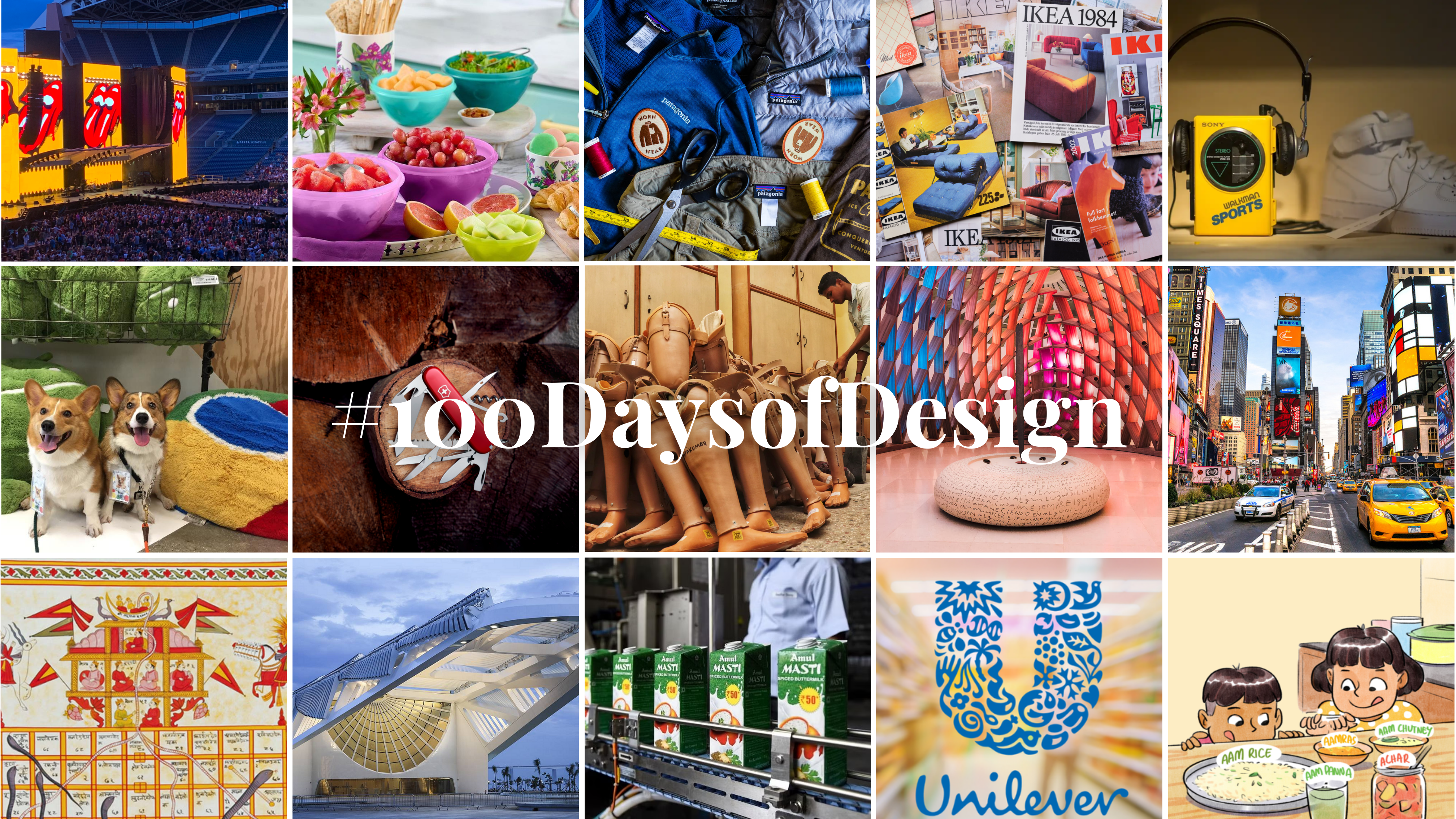
Rolling Stones: The most identifiable logo design
The Rolling Stones logo, you know, those famous lips and tongue? Well, it’s not actually Mick Jagger’s mouth. But in 1970, something truly groundbreaking happened when a student named John Pasche from the Royal College of Art caught the attention of The Rolling Stones.
They were in search of a symbol that could capture their rebellious spirit. What emerged from Pasche’s imagination was the Tongue & Lips logo—a fusion inspired by the powerful imagery of Goddess Kali, the harbinger of destruction.
This logo wasn’t just visually striking; it was functional too. Its bold and provocative design easily conveyed the essence of The Rolling Stones across various mediums, from print to digital.
So, what lessons can designers learn from this legendary logo?
- Keep it simple: The minimalist design ensures instant recognition.
- Be unique: Draw inspiration from unexpected sources to create visually arresting imagery.
- Stay relevant: Make sure your logo resonates with your audience and embodies your brand’s essence.
- Embrace creativity: Don’t be afraid to think outside the box and draw inspiration from unlikely places.
In essence, the Tongue & Lips logo is a masterclass in logo design—a timeless example of how creativity and cultural resonance can come together to create something truly iconic.
Best in Product Design: Our Monthly Pick
Tupperware: A case study in product design

Tupperware, synonymous with food storage convenience, traces its roots back to the ingenious mind of Earl Tupper, a chemist by profession. In the 1940s, armed with comprehensive knowledge of plastics, Tupper conceptualized and crafted a novel plastic material with an air-tight lid, revolutionizing food preservation.
His innovative use of Polyethylene Plastic catapulted Tupperware into the spotlight, capturing attention not only at Tupperware parties but also amid the groundbreaking Apollo Missions by NASA.
But why does the design of a seemingly ordinary airtight box hold such significance?
- Addressing user needs: Tupperware identified a common pain point—food spoilage—and engineered a solution to combat it effectively.
- Balance of strength and weight: The design struck a perfect equilibrium, being both sturdy and lightweight, ensuring user convenience.
- Trust and longevity: Backed by a lifetime warranty, Tupperware instilled unparalleled trust in its customers, fostering long-term relationships.
- Storage efficiency: The stackable and modular design transformed storage into a seamless experience, optimizing space utilization.
- Aesthetic appeal: Vibrant colors added a visual charm, enhancing the appeal of Tupperware products in kitchen spaces.
Moreover, Tupperware’s commitment to sustainability is noteworthy. From introducing eco-friendly products to promoting sustainable practices, the brand remains dedicated to minimizing its environmental footprint.
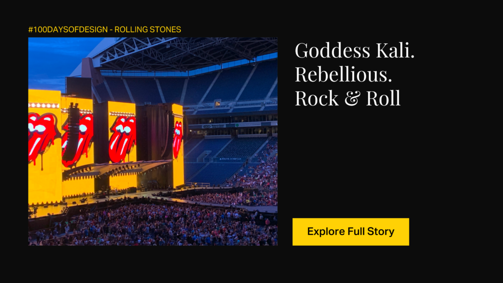
Swiss Knife: A sharp case study in product design
You know, that handy tool we all associate with Switzerland, actually started as a German import back in the late 1800s. The Swiss Army needed a pocket knife for their soldiers to crack open canned food and tinker with their rifles. So, they ordered 15,000 knives from a German company. In 1891, Karl Elsener, a Swiss guy running a company that made surgical gear, thought, “Why not make these knives ourselves?”
He took over production and, in 1896, came up with a game-changing design. Instead of one side, he mounted tools on both sides of the handle using a nifty spring mechanism, doubling the features. That’s the birth of the modern Swiss Army Knife!
The term “Swiss Army knife”?
That came from American soldiers who couldn’t wrap their tongues around the original German name. Its compact, foldable design, combined with an array of functions, turned it into a must-have tool for various situations.
And here we are, with over 100 different models of these cool pocket tools every day, sending them off to more than 100 countries.
Sanitary Napkins: An empowering case study in product design
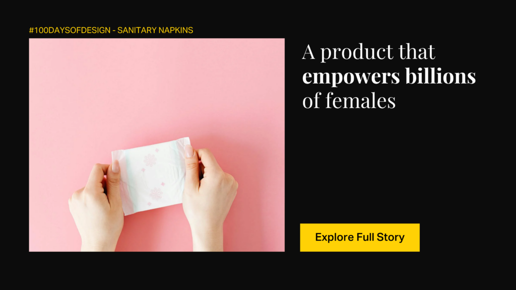
From traditional materials like cotton and wool to modern tracking apps, menstrual care and hygiene have undergone significant evolution.
Historically, materials like cotton and wool were commonly used for menstrual hygiene across cultures. However, the modern sanitary napkin began to take shape in the early 20th century.
During World War I, Cellucotton, a highly absorbent material used for surgical dressings and bandages, was developed and later repurposed for civilian use by Kimberly-Clark, an American paper company. This led to the creation of the first-ever sanitary napkin brand, “Kotex.”
Kimberly-Clark’s innovative approach to repurposing Cellucotton into a menstrual hygiene product revolutionized the industry for several reasons:
- Innovative functionality: Kotex was the first commercial product designed to address the unique needs of women during menstruation.
- User-centric design: The product focused on providing comfort, discretion, and ease of use for women, addressing key concerns of its users.
- Portability: The product was designed to be easy to carry, handle, and dispose of, fitting easily into purses or bags for on-the-go use.
- Cultural impact: The introduction of disposable sanitary napkins marked a significant shift in cultural attitudes towards menstrual health. It contributed to increased awareness and openness about menstruation, empowering women to lead more flexible and liberated lives.
- Kimberly-Clark’s innovative approach to menstrual hygiene not only improved women’s lives but also played a role in shaping cultural perceptions and discussions around menstruation.
Best in Service Design: Our Top Pick of The Month
IKEA: A service design
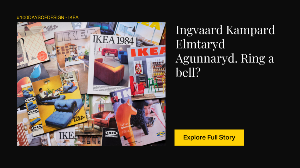
Ingvar Kamprad, the founder of IKEA, started a small mail order business that would later evolve into a globally recognized brand known for exceptional service design.
The core of IKEA’s design philosophy lies in simplicity, functionality, and affordability. Kamprad envisioned well-designed furniture that could be easily transported and assembled by customers, leading to the creation of the flat-pack concept, a revolutionary approach to furniture transportation and assembly.
What sets IKEA apart is its commitment to providing a holistic customer experience, starting from innovative product designs to unique in-store experiences. Here’s how IKEA continues to excel in providing an end-to-end user experience for its vast global customer base:
- Flat-Pack Concept: Reduces costs and environmental impact by enabling efficient transportation and assembly.
- Self-Service Model: Encourages customers to explore the showroom and products at their own pace.
- Room Settings: Realistic room settings help customers visualize how products will look in their own homes.
- Product Range: Offers a wide range of products, from furniture to kitchenware, under one roof.
- Clear Signage: Makes it easy for customers to navigate through the showroom and find what they need.
- Swedish Food Offerings: The in-store restaurants serve traditional Swedish meatballs, adding to the overall experience.
Best in Telemedicine Service Design: Our Pick of The Month
Practo
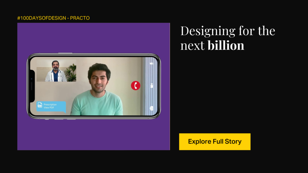
Designing a healthcare app, especially for a population exceeding a billion in India, is an immense challenge. The task involves navigating diverse languages, cultural contexts, varying levels of digital penetration, and the critical yet essential nature of healthcare services. Reimagining doctor-patient interactions and numerous other healthcare experiences is no easy feat.
Despite these challenges, Practo has emerged as a leading healthcare app with over 4 million users and more than 50 million appointments booked annually.
How did Practo manage to bridge the gap between the average Indian and the wide array of healthcare products available?
- Robust Research: Practo revamped its app by starting the design process from scratch, conducting extensive user research. This resulted in more insightful user personas, user stories, and experience maps.
- Empathy-driven Designs: Building trust is crucial in healthcare apps. Practo ensured that it developed user journeys and features aligned with Indian perspectives on healthcare and their expectations.
- Convenient Healthcare: Practo offers quality healthcare at the tap of a button. The app makes it easy to book appointments, access health records, make informed insurance purchases, and more.
Practo’s success can be attributed to its focus on user research, empathy-driven designs, and its commitment to providing convenient healthcare solutions for its users.
Best in Automobile Design: Our Pick of The Month
Auto Rickshaw
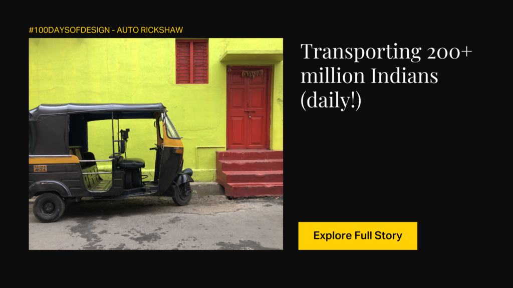
Pigeon, Lapa, Tuk-Tuk, Bao-Bao, Tukxi—these are just a few of the many names used to refer to the iconic desi transportation, the autorickshaw.
Combining the maneuverability of a two-wheeler with the seating capacity of a four-wheeler, the humble auto rickshaw completes a staggering 229 million passenger trips every day, with this number accounting for India alone.
As old as independent India, auto rickshaws were introduced in 1947 when Bajaj Auto began manufacturing them, drawing inspiration from the Japanese Mazda Go.
However, India is not the only country to embrace these low-cost, flexible transportation systems. From South Asian nations like Bangladesh, Nepal, Pakistan, and Sri Lanka to countries as far-reaching as Iran, Iraq, Israel, Nigeria, and even South Africa, various regions have their own versions of these rugged “autos.”
What makes this beloved mode of transportation an iconic design?
- Cost-Effectiveness: Auto rickshaws are more affordable than cars and safer than two-wheelers, making them a popular choice for short-distance travel, especially in congested urban areas.
- Widespread Availability: These vehicles are widely available, providing a convenient mode of transportation for millions of people daily.
- Maneuverability: Their small and compact size makes them well-suited for navigating narrow streets and congested urban areas.
- Distinctive Design: The three-wheel design of auto rickshaws provides a unique look and offers stability while allowing for tight turns and efficient movement through traffic.
- Tourist Attraction: In many tourist destinations, auto rickshaw rides are a popular activity, offering tourists a unique and immersive experience of local transportation.
- Steering Mechanism: Many auto rickshaws use a unique steering mechanism where the front wheel is directly connected to the handlebars, similar to a motorcycle.
- The auto rickshaw’s design combines affordability, safety, maneuverability, and cultural significance, making it an iconic mode of transportation in many parts of the world.
Best in Sustainable Design: Our Pick of The Month
Patagonia
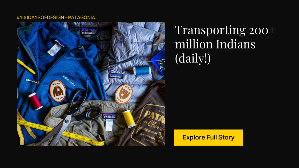
Patagonia, founded in 1973 by Yvon Chouinard, a passionate climber and environmentalist, is a unique brand with a deep commitment to sustainability. Inspired by his love for the outdoors, Chouinard started the company to provide high-quality gear for climbers, initially selling hand-forged climbing gear.
The brand’s philosophy is based on three core principles: “Build the best product. Cause no unnecessary harm. Use business to inspire and implement solutions to the environmental crisis.”
Patagonia’s commitment to environmental advocacy is evident in its practices and products:
- User Behavior: The Worn Wear program encourages customers to repair and reuse their clothing, aligning with the brand’s ethos of minimizing waste.
- Product Innovation: Patagonia has developed innovative materials like recycled polyester and organic cotton to reduce its environmental footprint. They also offer repair services and encourage customers to resell or donate their used Patagonia gear.
- Product Life-Cycle Considerations: The company carefully considers the environmental impact of its products throughout their life cycle, from sourcing materials to end-of-life disposal.
- Unconventional Marketing: Patagonia’s marketing campaigns often challenge consumerist culture, urging people to buy less and make more sustainable choices.
- Environmental Grants: Patagonia donates a portion of its profits to support grassroots environmental organizations and projects, totaling millions of dollars over the years.
Patagonia’s commitment to sustainability and environmental stewardship has made it a pioneer in creating strong, sustainable products and inspiring others to follow suit.
Best in Game Design
Pacman
For most, the first video game they ever played will be the quintessential Pac-man. How did it gain popularity?
Probably, because it appealed to a global audience (instead of just young males).
Probably, because it was an antidote to overwhelming violent themes.
Pac-Man was created in the 70s by the Japanese game designer Toru Iwatani and developed by Namco. He aimed to create a game that steered away from the war themed games and made it colorful, and easy to understand.
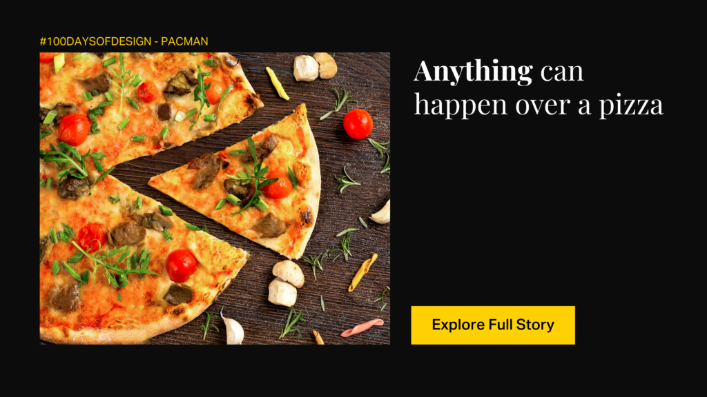
The concept of Pac-Man came to Iwatani during a meal.
He looked at a pizza with a missing slice and got the idea for a game where a character would eat through a maze. This concept evolved into Pac-Man, with the character navigating through a maze while being pursued by colorful ghosts.
How did Itawani & Namco design a game that changed arcades forever?
- Character of Pac-Man designed to be round, friendly-looking, and easily recognizable
- Bright, cheerful colors chosen for visual appeal
- Four ghosts (Blinky, Pinky, Inky & Clyde) with distinct personalities and behaviors
- Intuitive gameplay, cute characters, and innovative design captivated players globally helped popularize video games and became a cultural phenomenon
When Pac-Man was released in 1980, it became an instant hit. Pac-Man’s success not only helped to popularize video games but also cemented its place in pop culture history.
Today, Pac-Man remains one of the most iconic and beloved video game characters of all time.
Stay tuned as we continue this exciting journey for the coming months, unraveling new stories behind great designs and exploring the ways in which they resonate across time and countries. In case you’ve missed out on some designs we’ve uncovered in February, you can check them out on our Instagram and LinkedIn!