Domain
Edtech & Learning
Geography
USA, Global
Platform
WebApp
Services
Research, Strategy, Design
Award
Red Dot Award 2024
A dynamic ecosystem empowering millions of researchers worldwide.
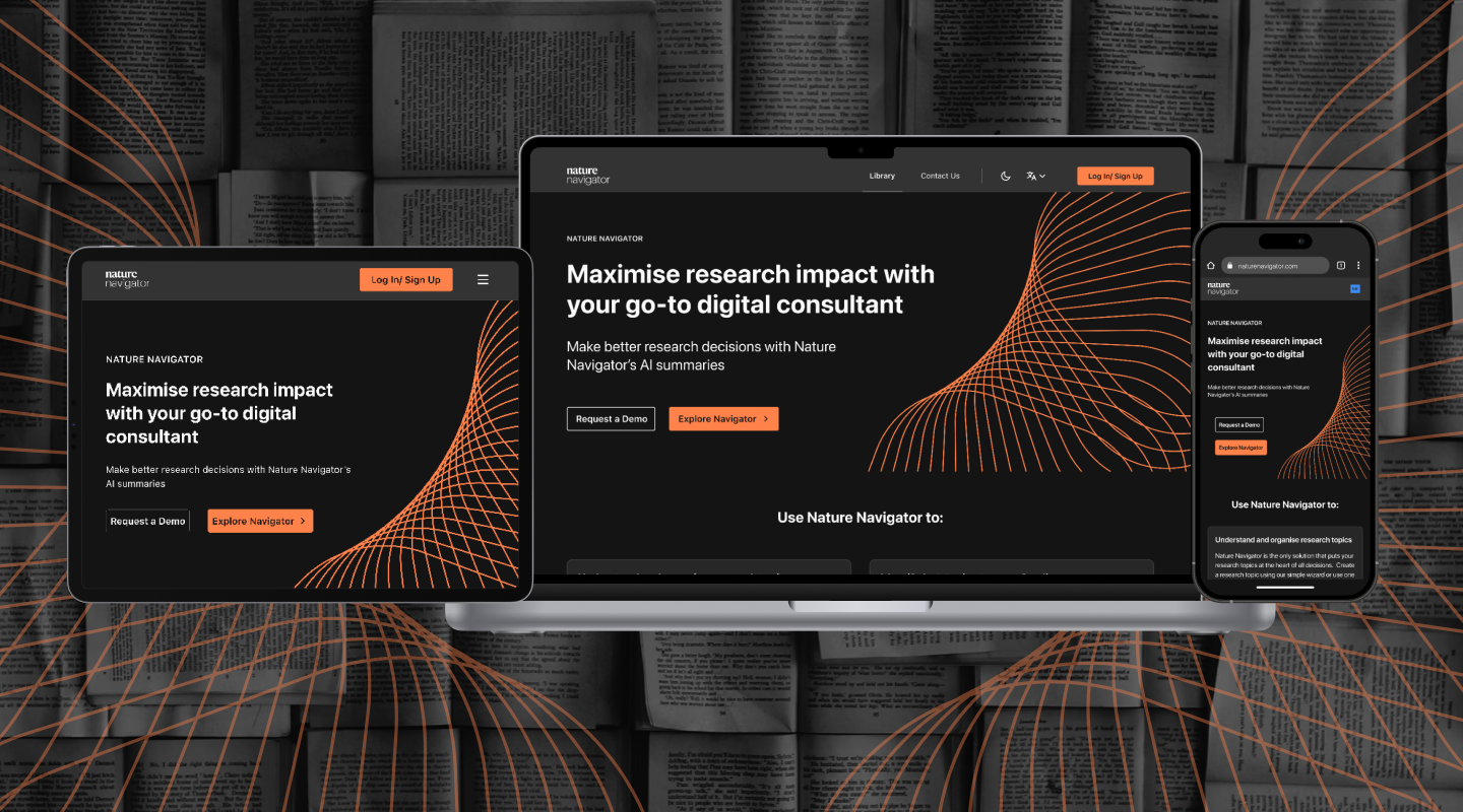
Springer Nature is the world’s leading academic publishing platform, with 180+ years of shaping global research. Springer empowers millions of researchers every year, including 200+ Nobel laureates & 1000s of prominent scientists & innovators. Springer sought our expertise in Design thinking & UX Design for their product Nature Navigator, in resolving how groundbreaking research is curated & presented, accelerating scientific discoveries that solve global challenges.

Challenge
Some key challenges were surrounding common issues encountered by researchers. Limited access to information posed a significant barrier, with 70% of researchers struggling to reproduce another scientist’s work & 50% failing to replicate their own. Incomplete or biased analysis was another challenge, as lack of access to relevant data often led researchers to inadvertently introduce bias. All of these pose serious risk to the quality & speed of research, that can have global repercussions.
Solution
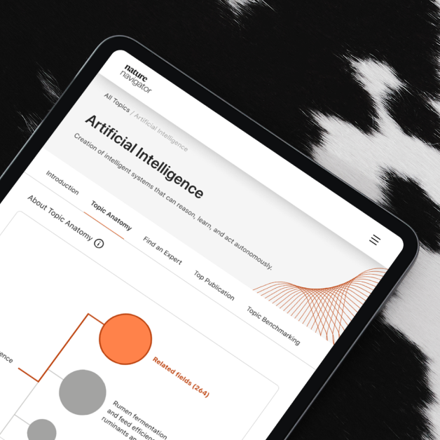
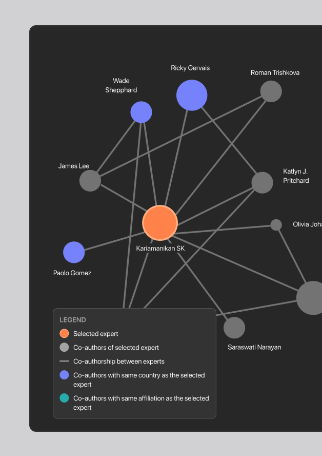
Reimagining Research Exploration for Nature Navigator included a detailed information architecture, enhancing findability of information, interactive interfaces, data visualizations & features such as “Find an expert”, “Network graph” & “Build a topic”. The features foster collaboration, insights & decision making for users of any expertise, ultimately democratizing research to a wider audience. Our approach also aimed to increase engagement & retention, fostering a more robust scientific thinking environment. Additionally, we streamlined content consumption, making it more efficient for researchers & academicians to access & utilize information.
Research
In our discovery & research phase, we focused on uncovering the primary pain points experienced by our platform’s users, primarily researchers. We identified several key challenges: users struggled with navigating through an overwhelming number of online articles, often questioning their authenticity. Information was scattered across various sources, lacking a centralized research space. Researchers also had difficulty locating experts & colleagues for assistance & knowledge acquisition. Additionally, accessing in-depth details about topics beyond surface-level information proved challenging. Addressing these pain points was crucial for developing a more effective & user-friendly platform.
Pain points discovered
Discoverability
Issues
Complex navigation, scattered information & visual overload, hindering discoverability & platform engagement.
Reduced
conversions
The platform failed to retain new users, indicating a poor onboarding experience, confusing navigation or lack of value proposition.
Credibility
concerns
Users expressed doubts about the accuracy & reliability of the information presented, as research appeared isolated/scattered
Lacking
centralization
There was a severe lack of comprehensive platform for research publishing where users could get end-to-end support & resources
Strategy
Our goal was to create a streamlined, comprehensive platform that serves as a single, organized space for in-depth research. We aimed to facilitate discovery in a way that promotes knowledge exchange & fosters collaboration among users. Additionally, we focused on building authenticity to ensure that users could trust the platform & rely on it for accurate & reliable information.

Aiding Research
Enhancing discoverability of research with minimum clicks

Building communities
Bridging the gap between researchers aiding collaboration

Creating hubs
Designing one comprehensive platform for all researchers’ needs
Design
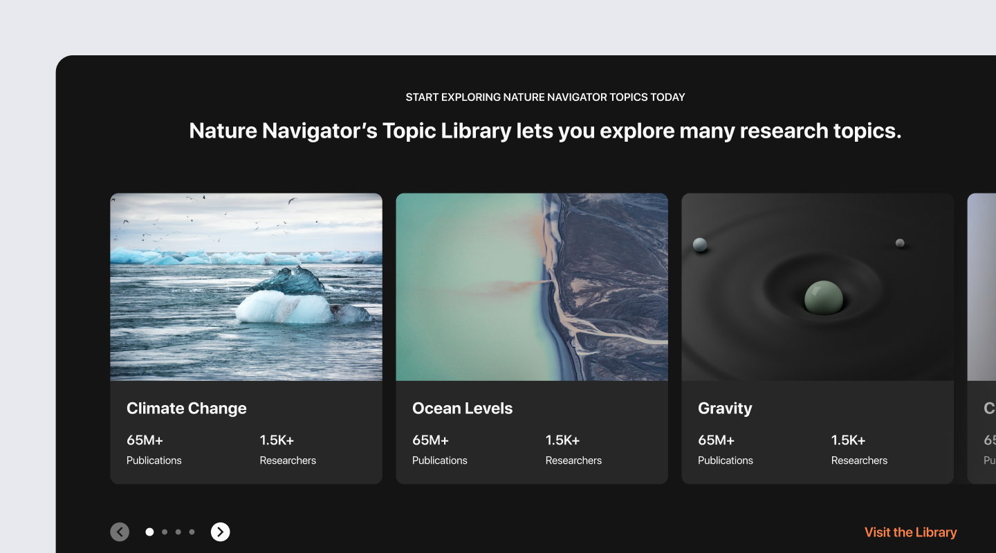
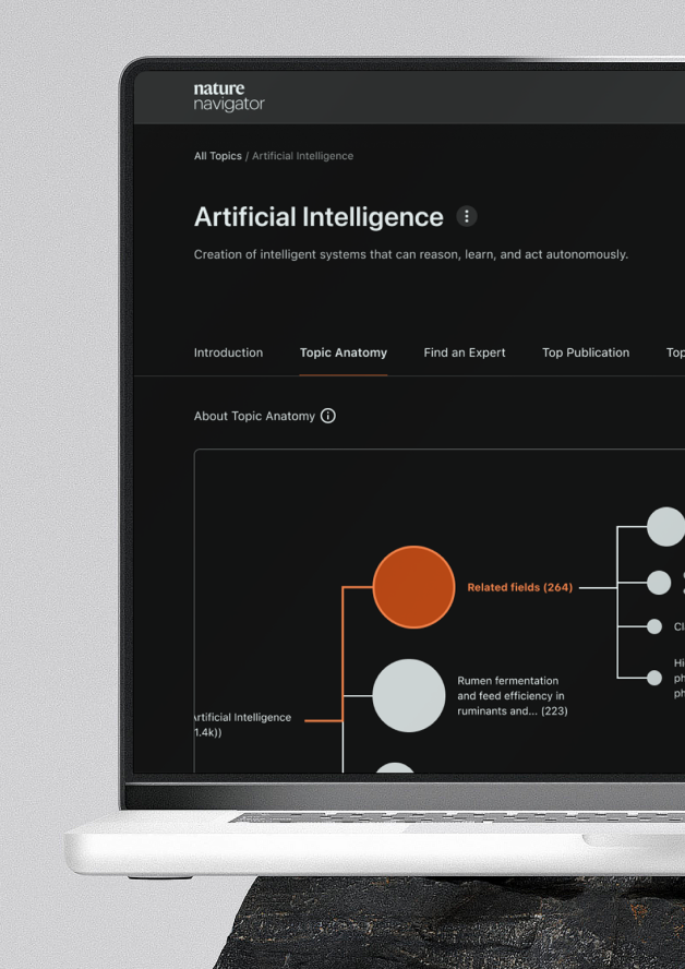
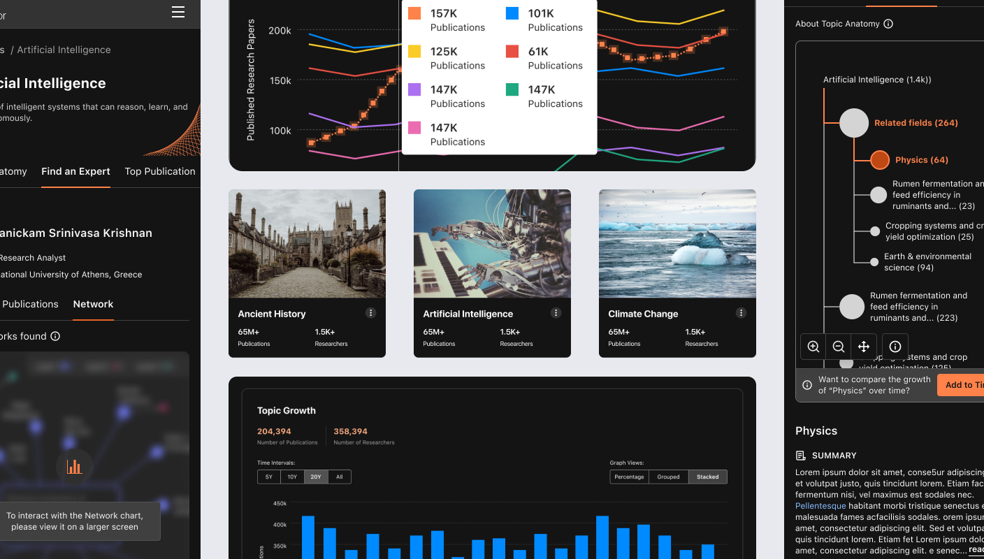
We focused on key design principles – Evoking curiosity, Engaging, Enhancing discoverability, Warm & Friendly tone, instant gratification & Simplicity – based on key user pain points. We wanted to engage & retain users on the platform, enhance discoverability of papers with easy navigation. With interactive graphs, engaging imagery across categories, network connection & features such as “Find An Expert” we brought down the cognitive load for the target users. We empowered researchers with quick finds & wins, instant connects, deep-dives into topic & many more wins that has the potential to streamline research for millions of users.
Visual design
Use of dark mode, high contrasting colors, we evoked a sense of engagement & curiosity. Delightful images that resonated with each of the many category, growth graphs with vibrant hues, easy-to-scan growth analysis graph, interactive graphs facilitating deep dives into topics without overwhelming users – all of these contributed to a largely seamless, immersive & engaging platform with a hint of delight.

Outcome
Reimagining research exploration for Nature Navigator heightened accessibility by democratizing scientific knowledge through user friendly flows. We reimagined a complex research hub into a simplified, hassle-free platform for deeper engagement & strong collaboration across research community. The extensive curation of papers streamlined scattered data, bringing down the time taken for research drastically, accelerating research for world’s largest academic publishing platform.
PS: Our work for Springer Nature: Nature Navigator won us our 2nd Red Dot Award!
