Top 10 Fascinating Designs in The World - January Edition
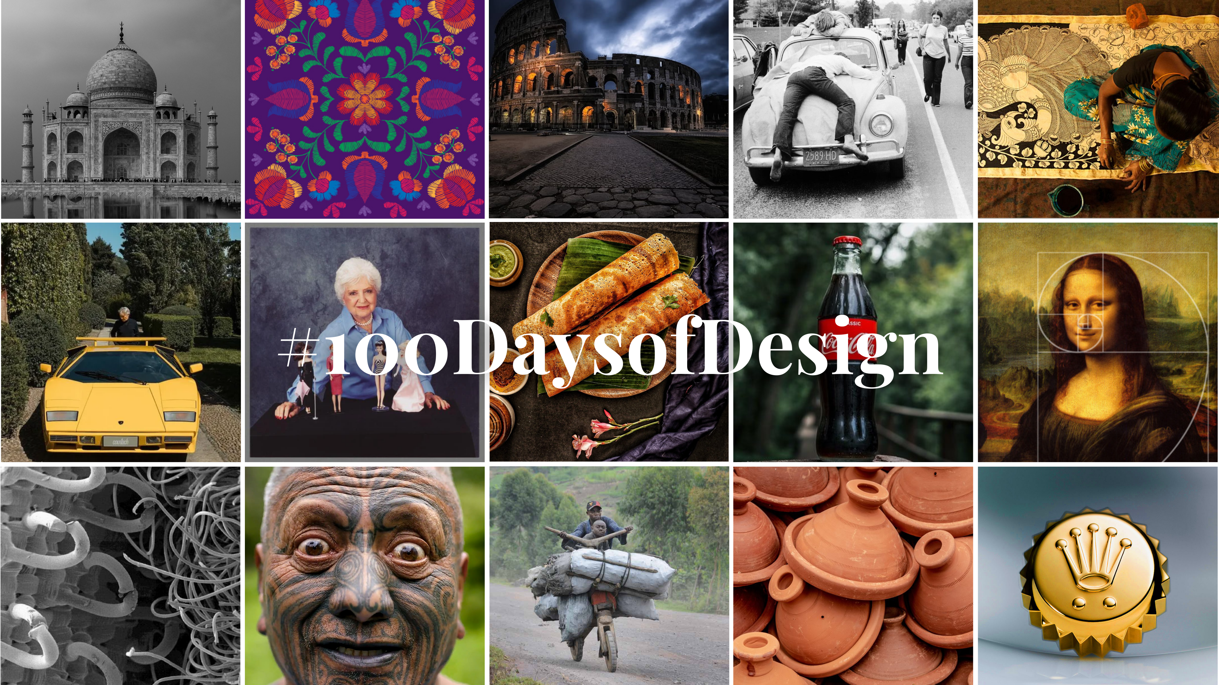
Top Picks #100daysofdesign
As we embark on the first 100 days of 2024, our focus is on showcasing the transformative influence and universal appeal of Design across temporal, cultural, and geographical boundaries. Our curated collection delves into captivating narratives, enlightening insights, and intriguing trivia surrounding the designs that shape our everyday experiences, ranging from the commonplace to the extraordinary.
As January draws to a close, let’s reflect on the top 10 designs we’ve handpicked from around the globe, spotlighting their innovation and impact. Whether you’ve been following along or missed a few highlights, don’t worry– we’ve compiled an overview to keep you in the loop.
We curated a wide variety of designs in January, ranging from service designs, food design, product design, logo designs, map designs, & more. Let’s delve into the best 10 designs of the first month of 2024!
Best in Service Design: Our Picks of the Month
Mumbai Dabbawala – A Service Design Case Study

A 130-Year Tradition of Smart Service Design
For well over a century, Mumbai’s Dabbawalas have upheld an extraordinary legacy – the seamless delivery of 130,000 homemade lunches daily with unparalleled precision. This enduring tradition traces its roots back to an 1885 request from a banker, evolving into a system efficiently managed by over 5,000 semi-literate individuals. The ingenious “spoke and hub” distribution method, centered around train stations as dispatch hubs, has been the epitome of their success.
Long before FedEx’s hub-and-spoke model was implemented, the Dabbawalas achieved their success, relying on a standardized marking system on metal tins for the sorting and dispatching of lunches. This distinct service, intricately tailored & personalized to Mumbai’s cultural and geographical nuances, remains a challenge to replicate elsewhere.
Armed with Six Sigma certification, the Mumbai Dabbawalas have solidified their reputation for operational excellence, with just one mistake occurring in 16 million lunch boxes.
At the heart of the Dabbawalas’ triumph lies a robust work ethic, cultural acumen, and a profound sense of duty. This century-old service unfolds as a valuable case study for service designers, demonstrating the importance of cultural context to the conception of lasting public services. The Dabbawalas epitomize an inherently intelligent service design, demonstrating how great urban solutions can organically sprout from the community itself, deeply rooted in local culture and tradition.
Airbnb : Service Design in Travel Industry
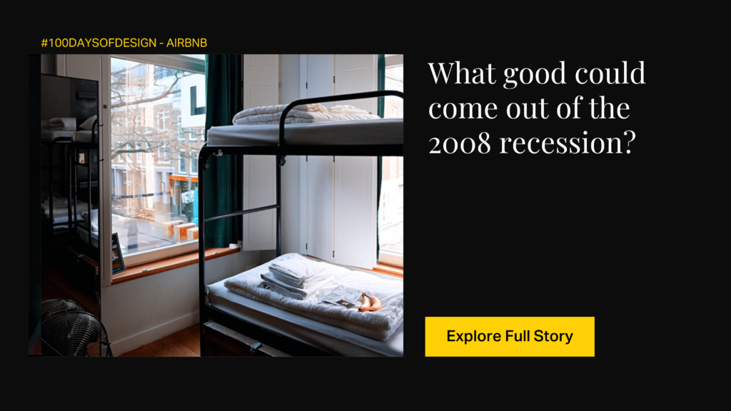
From mattresses to holistic experiences
Brian Chesky and Joe Gebbia, two pals struggling to pay rent, hatched a genius plan during a design conference. That makeshift solution on airbedandbreakfast.com turned into the global sensation we now call Airbnb.
The company’s commitment to service design became apparent early on, addressing challenges like property damage with initiatives like the “Host Guarantee,” fostering a user-centric approach.
In 2014, Airbnb underwent a transformative design shift, moving away from a corporate aesthetic to embrace a warm and inviting feel centered around the concept of “belonging.” The redesigned logo, known as the Bélo, symbolized this shift, reflecting the company’s dedication to creating a sense of community and connection for hosts and guests alike.
But Airbnb didn’t stop at just crash pads. They rolled out Airbnb Experiences, letting you do way more than just stay in a place. Now you could take cool classes or join epic city tours. By diversifying their offerings and exploring new ventures beyond accommodation, Airbnb showcased how a well-designed service ecosystem can redefine industry norms.
Airbnb’s impact on the industry underscores the profound influence of service design in shaping not just products but entire user experiences.
Best in Logo Design: Our Pick of the month
Fedex: Logo Design Case Study
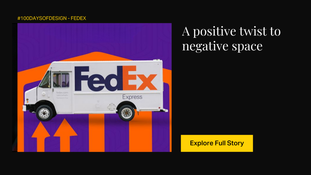
The hidden arrow.
Crafted by Lindon Leader, celebrated for his notable work with Motorola and Disney, the iconic FedEx logo boasts an original and ingenious design. Leader’s distinctive touch is evident in the “d” seamlessly attached to the “E” with a striking color contrast. This logo stands out as a stellar example of utilizing negative space, the empty area around logo elements, to craft the iconic hidden arrow. Lindon Leader adeptly combined Univers 67 and Futura Bold fonts to achieve this effect.
Exploring various color options like black+grey and grey+orange, the ultimate choice settled on a blend of orange and violet. This color fusion, representing prosperity and prestige, further elevates the logo’s visual impact.
The FedEx logo’s clever incorporation of negative space and the iconic hidden arrow has left an indelible mark on the design landscape. It serves as a global reference for designers, highlighting the effectiveness of leveraging negative space to convey concealed messages or symbols within a logo.
Lindon Leader’s innovative approach to merging typography and creating a subtle arrow has shaped how designers approach and experiment with letterforms in logo design. Despite being almost three decades old, the current FedEx logo maintains its strength as a symbol of professionalism and digital adaptability, radiating a timeless appeal.
Pinterest: What makes its logo so unique?
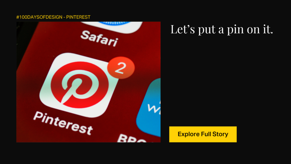
Pinterest’s logo evolution, transitioning from a black cursive script in 2010 to the iconic red and white circular emblem in 2011, reflects a deliberate shift towards minimalism. The 2016 update refined the logo, maintaining the circular emblem but introducing a bold sans-serif font for the brand name, achieving a harmonious blend of tradition and modernity.
Now, let’s talk about the secrets behind its iconic design.
The design elements are strategically crafted to resonate with Pinterest’s core purpose. The stylized “P,” symbolizing a pin, visually and conceptually connects to the act of pinning images on virtual boards. The red and white color palette embodies the platform’s essence, representing love, passion, and curiosity within its creative community. The subtle design choice of stylizing the elongated tail of the “P” as a needle adds depth, reinforcing the platform’s functionality and enhancing its storytelling aspect.
Despite facing controversy over logo similarities with Path, Pinterest’s logo stands as a pinnacle of success, not just for its aesthetic appeal but for its ability to effectively communicate the brand’s essence. As an iconic visual identity, it demonstrates the nuanced art of design, balancing simplicity, functionality, and adaptability.
Best in Product Design: Our Picks of the Month
Barbie: A Design Case Study
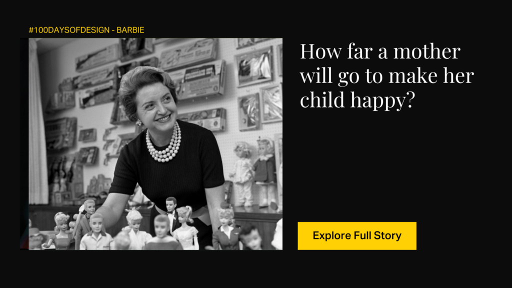
The dream of billions
Three Barbie dolls are sold every second. This means that approximately 1 billion dolls have been sold since Barbie arrived in 1959.
Ruth Handler, the brain behind Barbie, had a lightbulb moment in 1959 at the American International Toy Fair. But what sparked this iconic vision? Well, it all began with Ruth’s daughter playing with paper dolls. Ruth wanted more – a three-dimensional, grown-up figure that could light up creativity. Back then, dolls for girls were all about babies or homemakers. But Ruth saw a shift – girls weren’t just aiming to be moms; they wanted more. Barbie became a symbol of breaking free from the traditional mom role.
During a European trip, Ruth discovered the German Bild Lilli doll, which sparked the idea for Barbie’s initial design. Barbie’s early days featured a chic swimsuit, high heels, and a stylish ponytail, reflecting a sophisticated and aspirational image. Fast forward, and Barbie’s design has evolved significantly, embracing diversity and changing societal norms.
The attention to detail in her outfits, accessories, and hairstyles showcases the dedication to craftsmanship that has kept Barbie at the forefront of design for decades.
In essence, design has been the driving force behind Barbie’s cultural resonance. It goes beyond aesthetics, influencing how people perceive beauty, fashion, and career possibilities.
Vespa: An Automotive Design Case Study
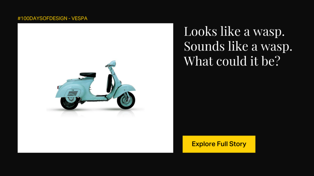
The Wasp’s Tale
The Vespa’s history unfolds in post-WWII Italy, a nation grappling with the aftermath, much like Germany and Japan.
Enrico Piaggio’s forward-thinking choice to develop a sleek, affordable, and efficient mode of transportation laid the groundwork for the Vespa’s design principles.
Guided by Corradino D’Ascanio’s six core tenets:
- easy handling
- lightweight construction
- protection from the elements
Vespa’s unique design triggered a revolution in personal mobility.
Beyond its utilitarian features, the enduring allure of the Vespa stems from its embodiment of a harmonious blend of form and function. The inventive repurposing of airplane components added an innovative touch to its design narrative. The moniker “Vespa,” inspired by the scooter’s wasp-like engine sound, captures the essence of Italian design brilliance. The Vespa’s triumph isn’t just measured in sales but in its elevation to a cultural icon, symbolizing the seamless fusion of practicality and aesthetic sophistication that defines timeless automobile design.
Eiffel Tower: Designing World’s Most Recognized Structure
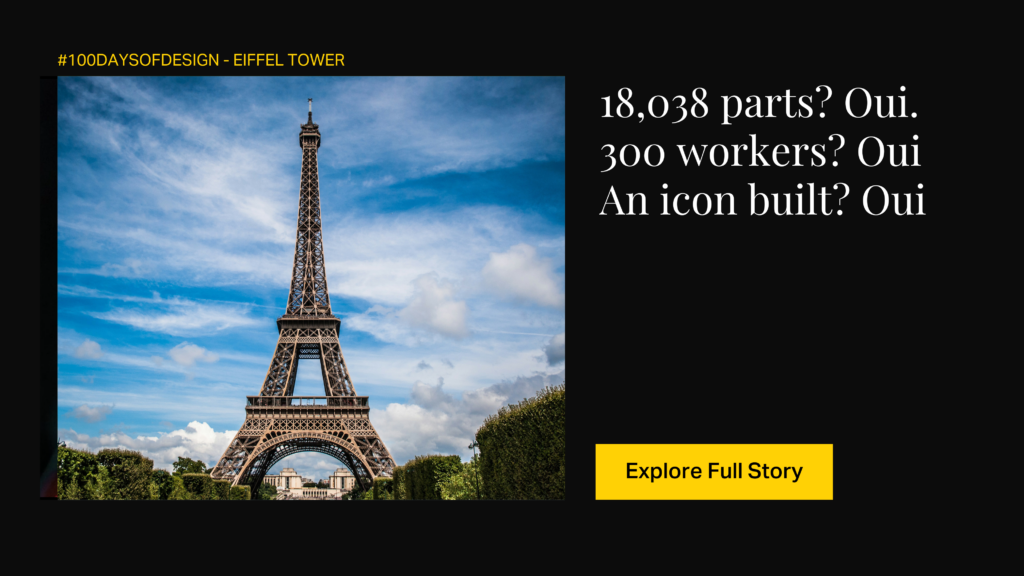
2 years 2 months 5 days
Designed by Gustave Eiffel and engineers Maurice Koechlin and Emile Nouguier, the tower’s blueprint was selected from 107 projects. In a race against time, they birthed a metallic marvel in just 2 years, 2 months, and 5 days!!!
Hold your breath because here come the numbers – 18,038 parts, 2,500,000 rivets, and a squad of 150 to 300 workers on the assembly line. The Eiffel Tower wasn’t just reaching for the sky but beyond.
Now, back to 1889. The tower’s critics, silenced by its completion, were replaced by two million wide-eyed visitors at the World’s Fair.
Despite initial opposition from artists and writers, including figures like Maupassant and Verlaine, the Eiffel Tower became an enduring symbol of Paris, showcasing both strength and beauty.
Gustave Eiffel defended his creation, emphasizing the tower’s engineering brilliance and its appeal in size and design.
Today, the Eiffel Tower isn’t just a structure, it’s the Mona Lisa of architecture. An enduring symbol of French flair, it stands tall, unapologetically flaunting its strength and beauty.
Ray Ban Aviators: A Design Case Study
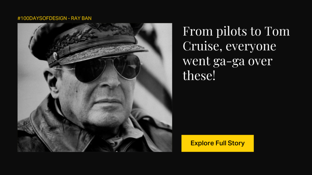
Pilot’s glasses
You know the name but do you know the story?
The Ray-Ban Aviator sunglasses, born from a challenge faced by pilots, have earned a lasting place in history. In the 1920s, pilot Shorty Schroeder’s fogged goggles during a test flight prompted John Macready to join forces with Bausch & Lomb in the 1930s. This collaboration gave rise to the world’s inaugural aviator sunglasses, meticulously crafted to address issues like glare, visibility problems, and altitude sickness. The teardrop shape, inspired by pilot goggles, not only served a practical purpose but also evolved into an enduring design symbol.
But here’s the twist – how did they gain popularity and scale globally?
The indelible mark of Ray-Ban Aviators in popular culture owes much to Hollywood. Despite facing competition from the Wayfarer model in the 1950s and 1960s, Aviators found favor on the faces of cinematic legends such as James Dean and Audrey Hepburn. The 1970s and 1980s witnessed a resurgence, with rock stars and celebrities like Michael Jackson and Tom Cruise embracing the timeless design.
The design journey of Aviators illustrates how solving a specific problem can birth a product that resonates across diverse audiences, influencing trends and surpassing its original purpose.
Best in Typography: Our pick of the month
Helvetica: The Design Story of a Typeface
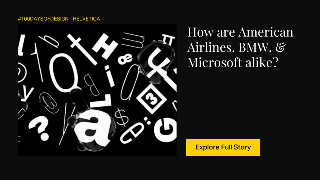
The typeface seen everywhere
Ever come across Helvetica? If fonts are on your mind, it’s likely the first one that flashes in your thoughts. Rewind to 1957, and it starts as Neue Haas Grotesk, a brainchild of Max Miedinger and Eduard Hoffmann from Switzerland’s Haas Type Foundry. They aimed for clarity, neutrality, and versatility. Fast forward to 1960, and it becomes Helvetica, riding on Switzerland’s reputation for modern design.
Now, the twist, Helvetica drew inspiration from Akzidenz-Grotesk, an older font from 1898. Hoffmann’s notes show how they meticulously compared Helvetica test proofs with bits of Akzidenz-Grotesk. The surprise? Helvetica stole the spotlight, overshadowing its inspiration and ruling the font world for half a century.
What’s the magic? Helvetica effortlessly radiates a clean, no-nonsense vibe with precise spacing and boldness, earning its stripes as a headline champion. The tall x-height adds to its charm, ensuring it’s a visual treat even from a distance. But, a heads-up: those narrow gaps might throw a curveball in small print or on screens.
In the grand tale of fonts, Helvetica is that steadfast friend—always stylish, a touch quirky. It’s an icon, cherished by designers, and a timeless classic. Here’s to the ever-enduring charisma of Helvetica.
Best in Food Design: Our pick of the month
Filter Kaapi/ Filter Coffee: The Design of an Indian Breakfast Staple
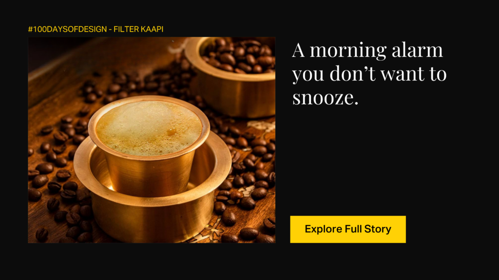
The iconic degree coffee
Since the 1600s, coffee has flourished in India, brought by Sufi Saint Baba Budan from Yemen. Mainly grown in South Indian states such as Karnataka, Tamil Nadu, Kerala, and Andhra Pradesh, the beloved Arabica and Robusta beans are medium-roasted and blended with chicory.
The wafting aroma of brewing coffee at home often serves as a morning alarm, rousing you from sleep.
A unique brewing process involves a metal filter device, resembling two cylindrical cups with a pierced bottom, facilitating the gradual dripping of hot water through coffee grounds. This technique, known as “Degree Coffee,” intensifies flavor and strength. Traditionally, it is enjoyed by blending the decoction with boiling milk, and the cultural significance of South Indian Filter Coffee has transcended regional boundaries, becoming an icon across India.
The coffee, typically sipped from a tumbler, is frequently cooled using a “davarah,” a broad metal saucer with lipped walls. This meticulous cooling ritual enhances the sensory experience of savoring this cherished brew. The design of the filter and the careful preparation ritual contribute to the unique and delightful characteristics of Indian Filter Coffee.
Stay tuned as we continue this exciting journey for the coming months, unraveling new stories behind great designs and exploring the ways in which they resonate across time and countries. In case you’ve missed out on some designs we’ve uncovered in Januaru, you can check them out on our Instagram and LinkedIn! Come back in 29 days for the February edition, featuring 29 fresh designs from around the world.