.png)
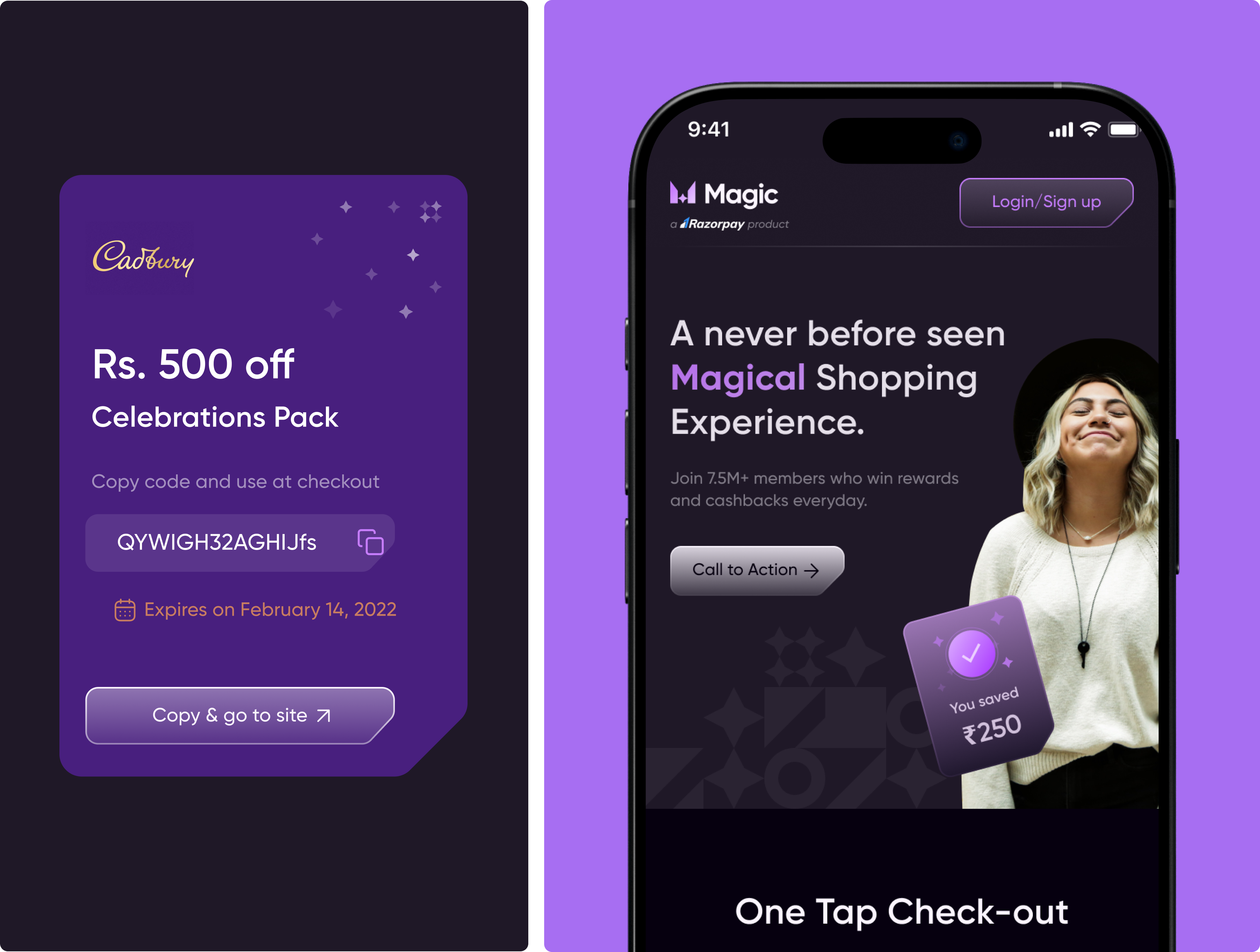
Razorpay Magic is a one-click checkout payment solution that streamlines online payments by securely using pre-saved customer data - such as addresses and preferred payment methods - to enable faster digital transactions.
By eliminating checkout friction, the platform reduces cart abandonment, improves conversion rates, and delivers a smooth, high-performance checkout experience for businesses and consumers alike.
Our mission was to redesign the Razorpay Magic checkout experience to improve usability, optimize mobile digital payments, and deliver a seamless, conversion-focused payment flow that reduces friction at every step of checkout.
by streamlining the one-click flow to eliminate friction and reduce time-to-pay.
through a simplified, intuitive digital payments experience.
by removing checkout friction and improving completion rates.
with a mobile-optimized, consistent checkout across devices.
Razorpay Magic was designed with focused UX enhancements and payment innovations to optimize end-to-end checkout and enable reliable payments.
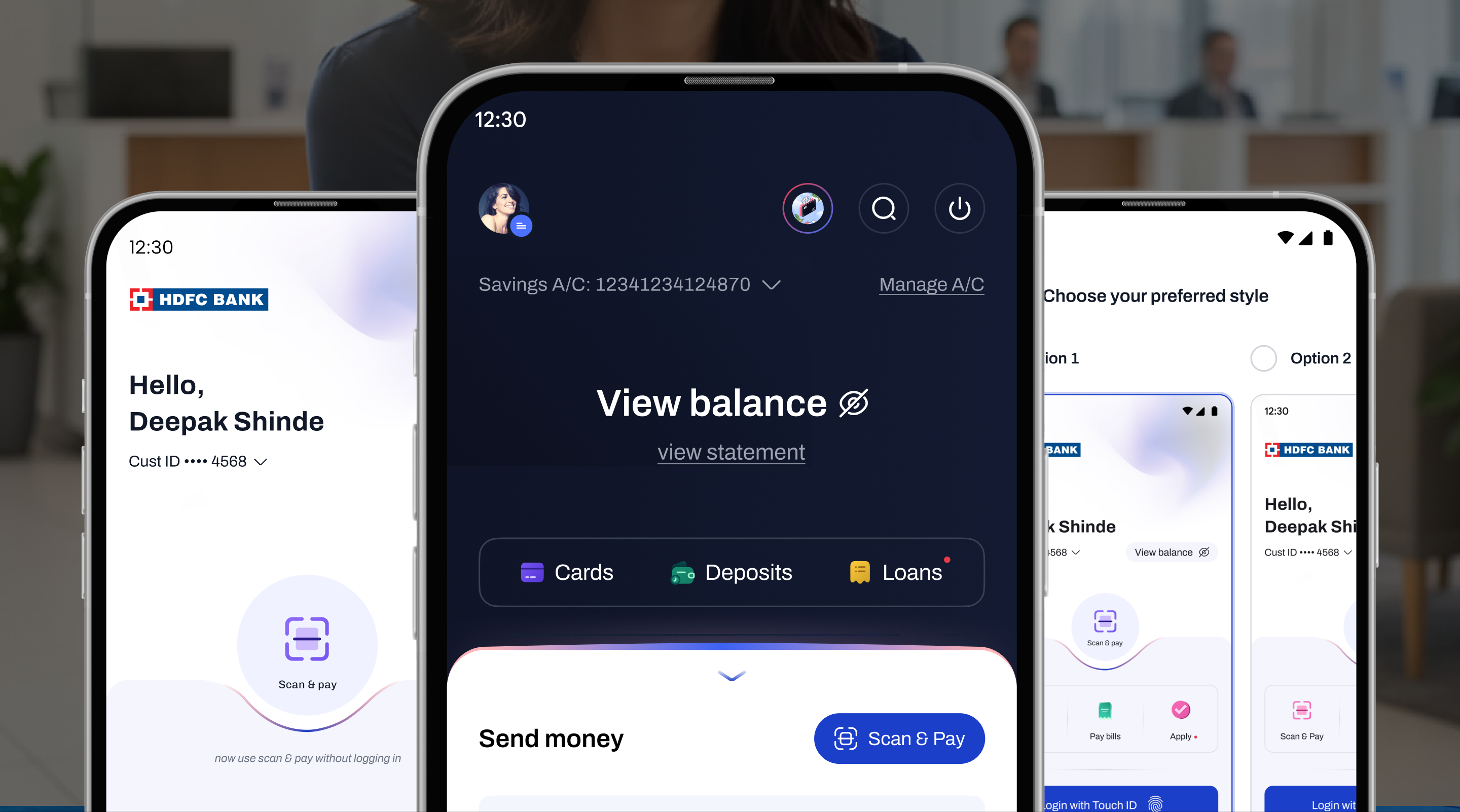
Persona-led flows enabled a pre-filled checkout using saved addresses, payment methods and coupons, reducing friction and time-to-pay.
Icons, color systems and typography enhanced usability while reinforcing a professional, trustworthy visual identity across checkout.
A visually intuitive interface was designed to prioritize clarity, simplicity, and ease of use - allowing users to complete payments quickly.
Razorpay Magic was designed with focused UX enhancements and payment innovations to optimize end-to-end checkout and enable reliable payments.
Razorpay Magic was designed with focused UX enhancements and payment innovations to optimize end-to-end checkout and enable reliable payments.
Persona-led flows enabled a pre-filled checkout using saved addresses, payment methods and coupons, reducing friction and time-to-pay.
Persona-led flows enabled a pre-filled checkout using saved addresses, payment methods and coupons, reducing friction and time-to-pay.
Icons, color systems and typography enhanced usability while reinforcing a professional, trustworthy visual identity across checkout.
Icons, color systems and typography enhanced usability while reinforcing a professional, trustworthy visual identity across checkout.
A visually intuitive interface was designed to prioritize clarity, simplicity, and ease of use - allowing users to complete payments quickly.
A visually intuitive interface was designed to prioritize clarity, simplicity, and ease of use - allowing users to complete payments quickly.
For Razorpay Magic, we simplified a complex checkout into a fast, intuitive payment flow - reducing friction and driving conversions.
improved via a low-friction, streamlined checkout interface.
strengthened with awareness of user preferences and context.
reinforced with clear visual markers, iconography, color systems, and typography.
Visual design established a clean, modern, user-friendly aesthetic with clear hierarchy, chosen colors, typography and icons to enhance usability.
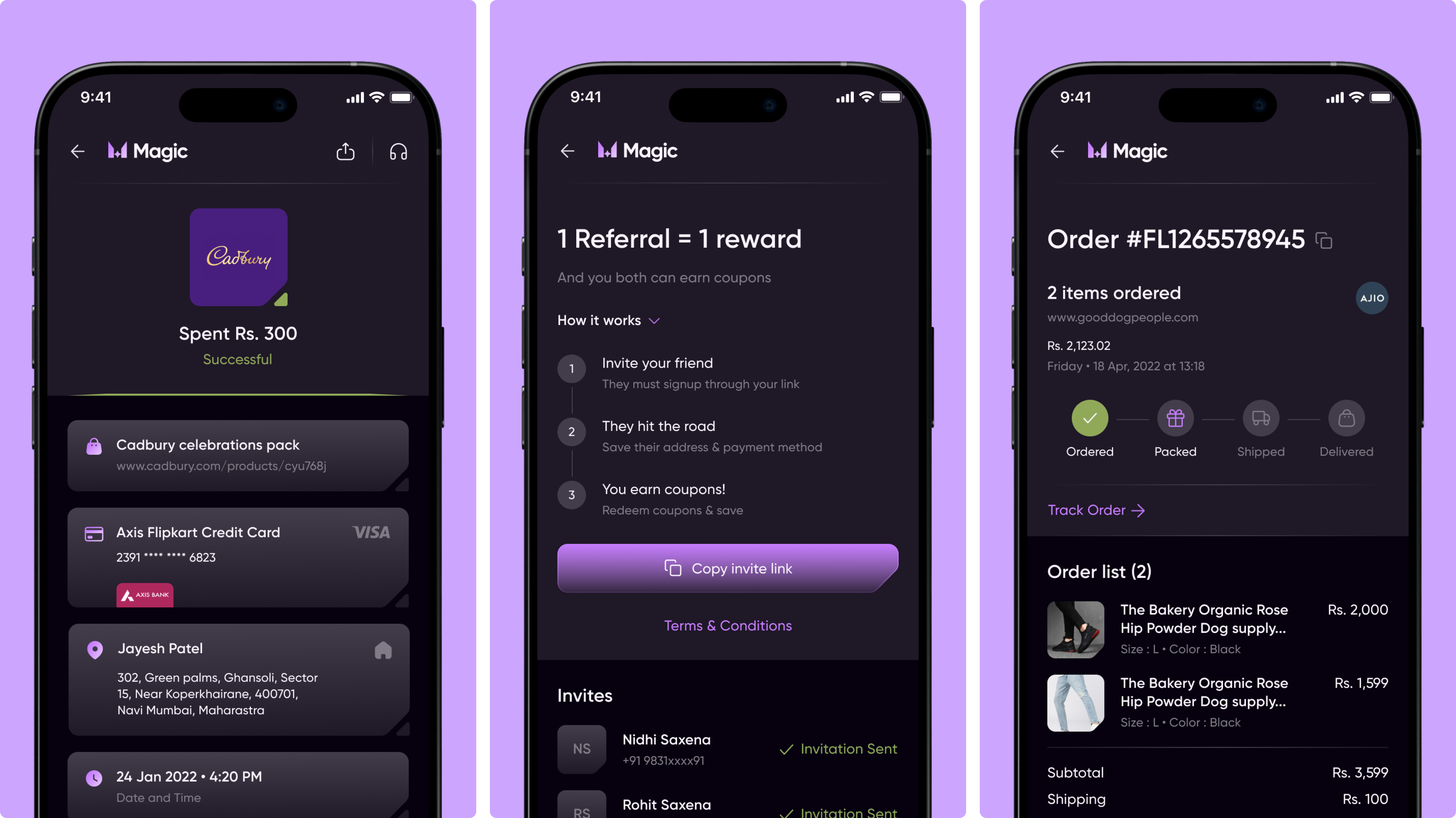
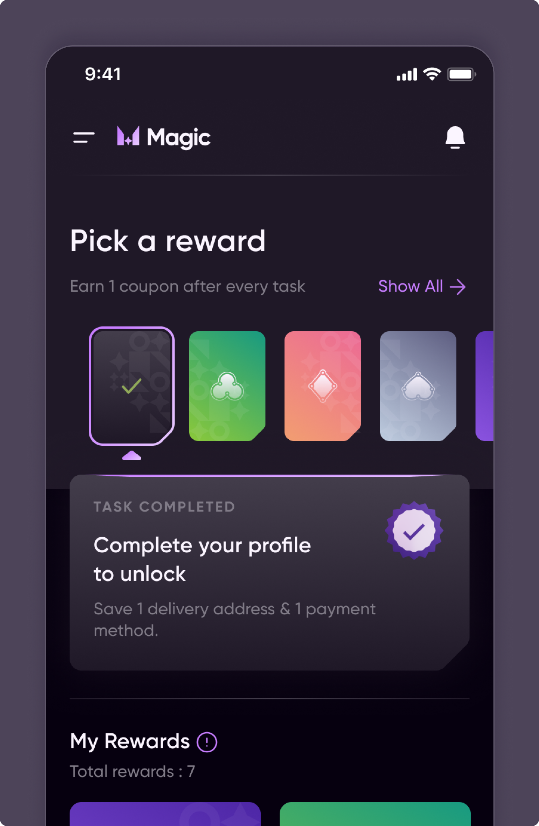
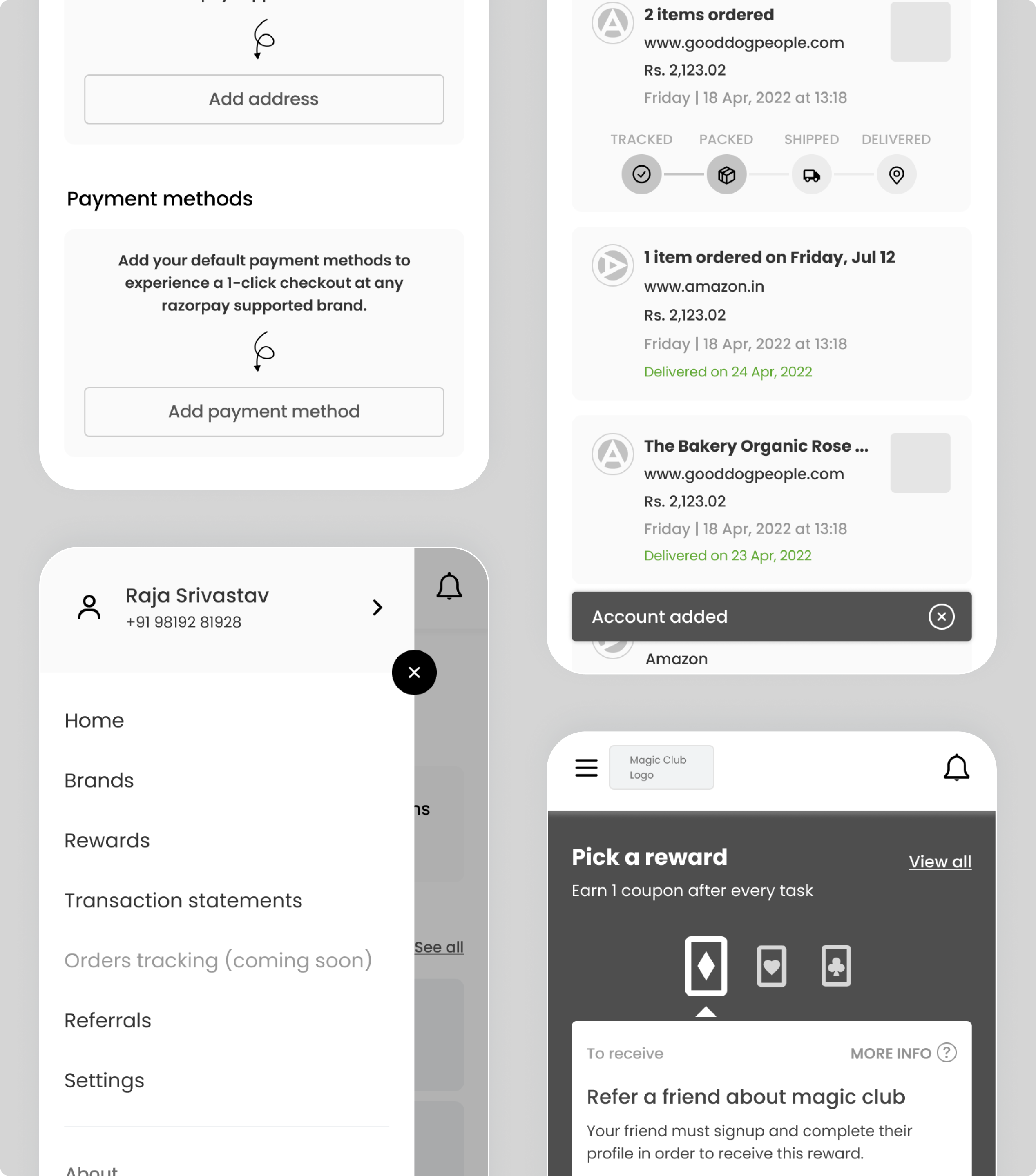
Mobile app UX and visual design enabling rewards, referrals, and order summaries for seamless checkout experience.
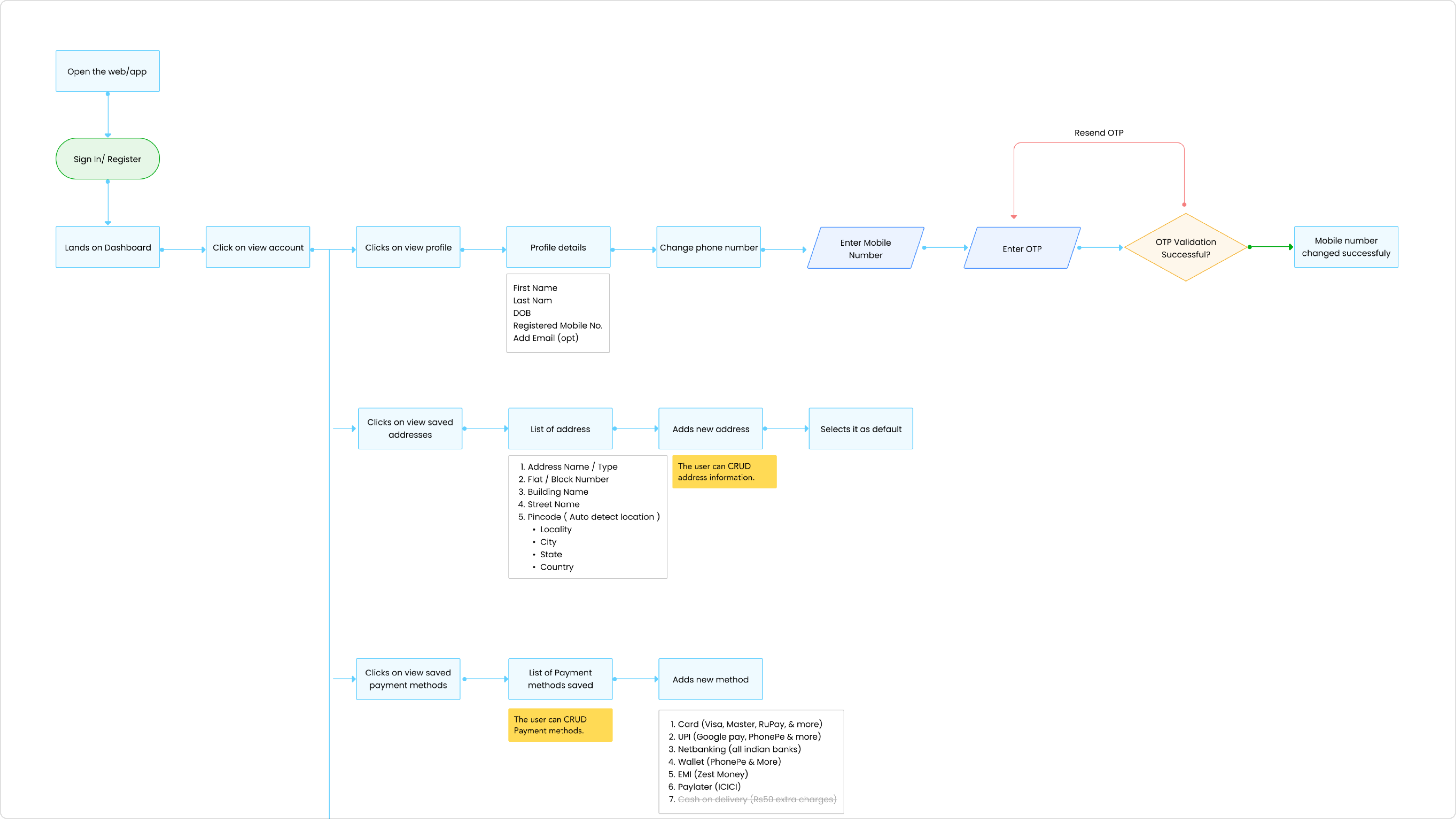
Defined a detailed information architecture mapping the end-to-end journey from login to checkout, simplifying complex payment flows.
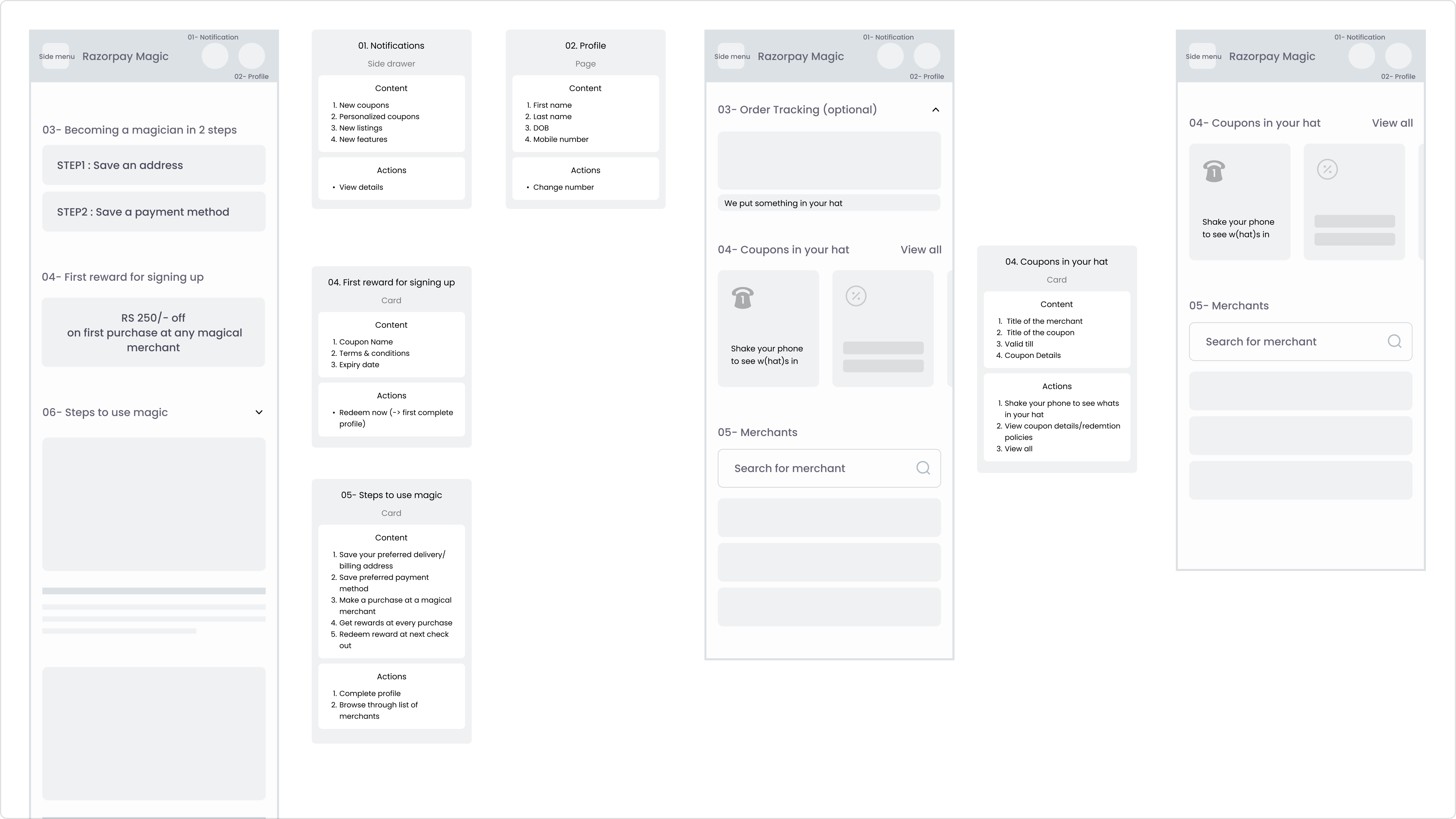
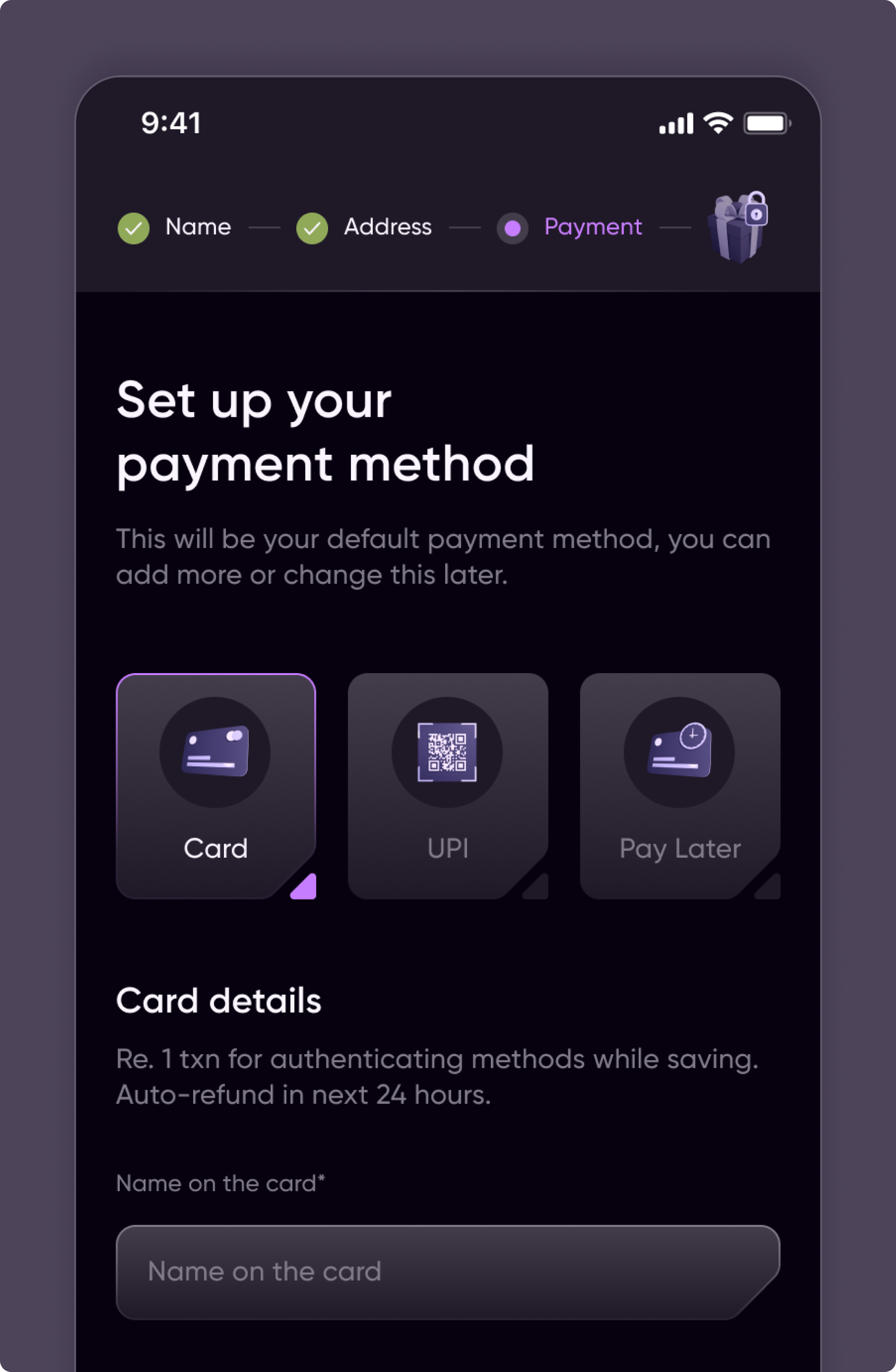
Previsualized with coupon application wireframes to reduce friction and improve clarity during checkout.
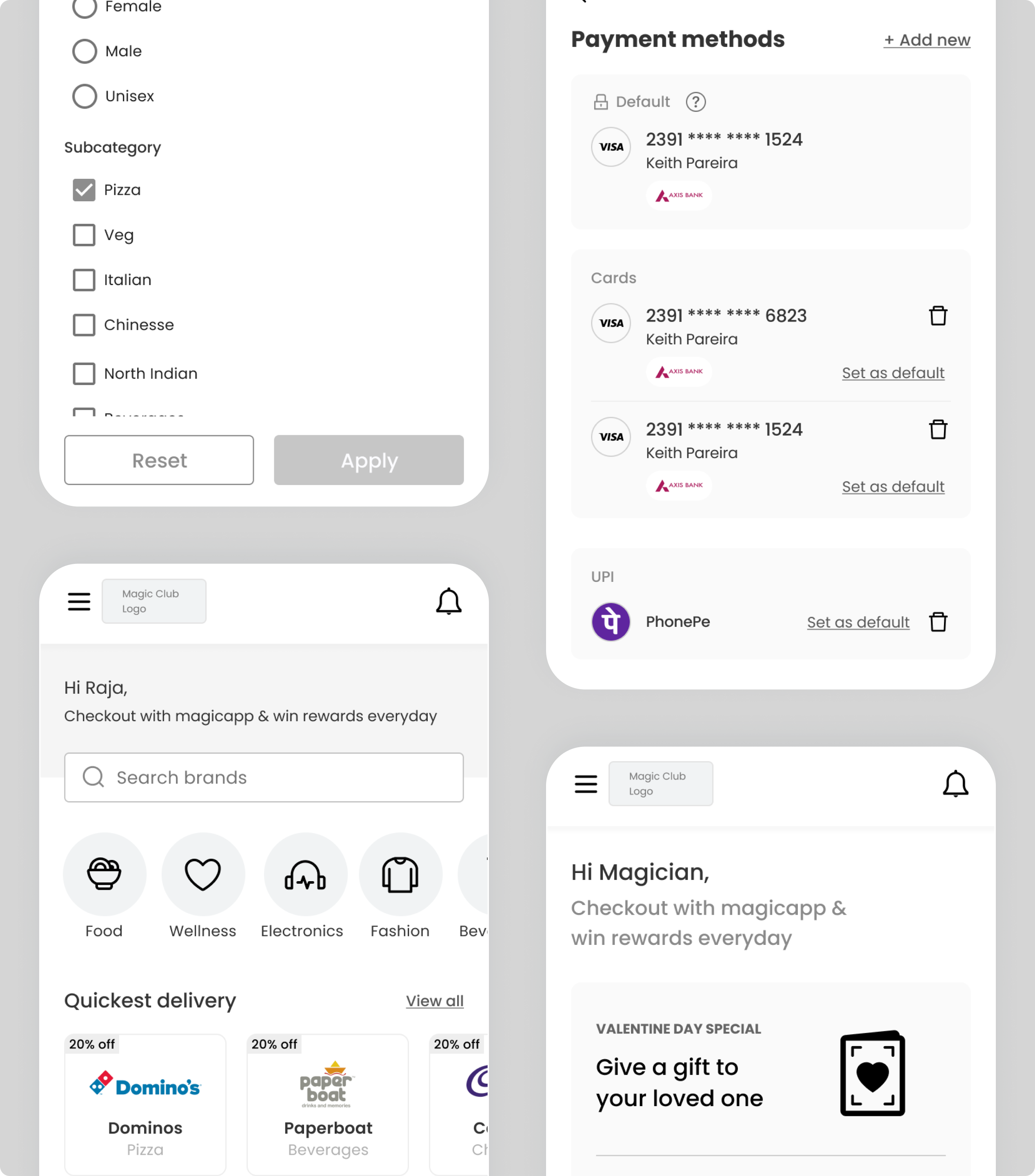
Created mobile-optimized wireframes for selecting and managing payment methods to ensure fast, consistent transactions across devices.
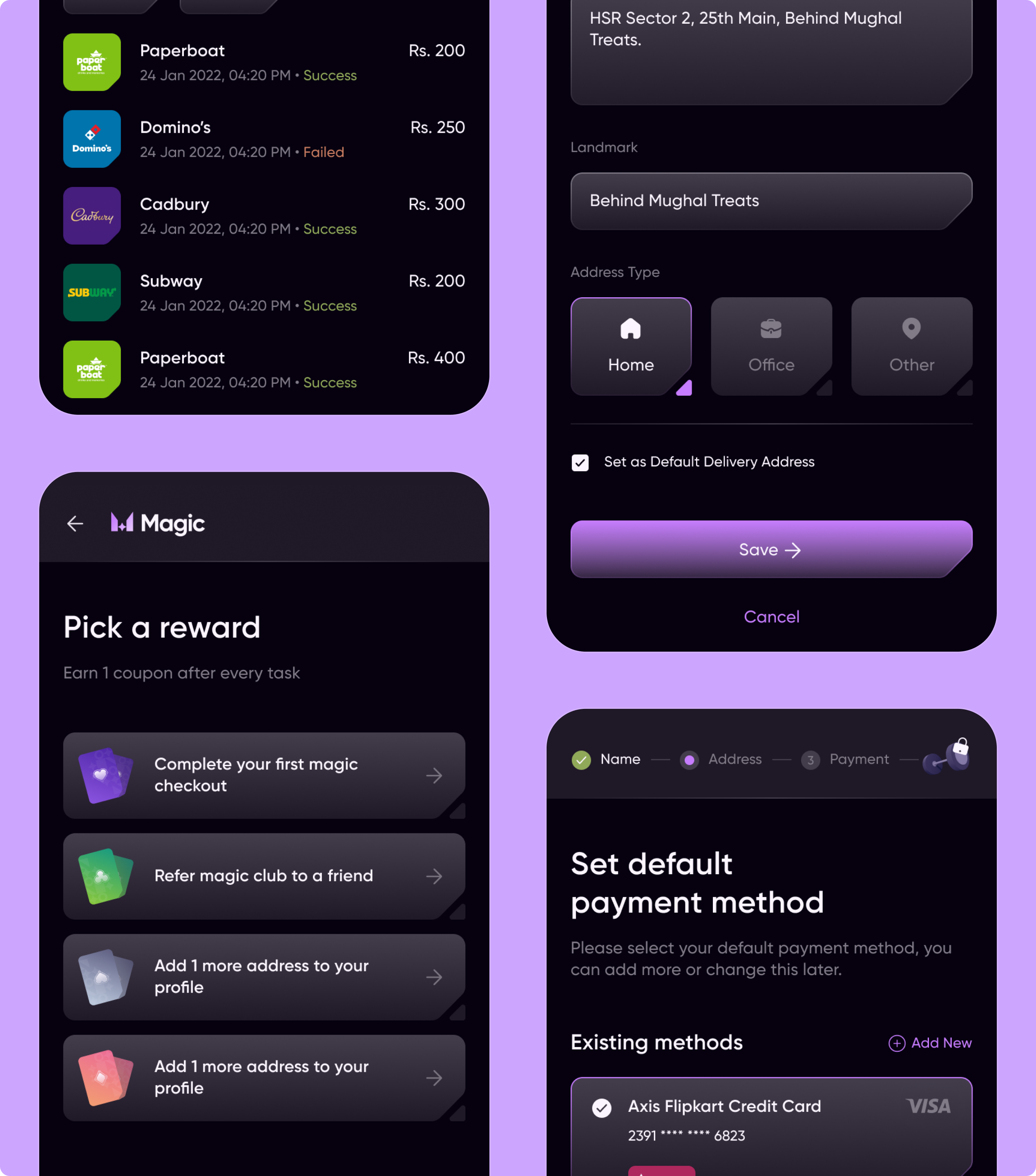
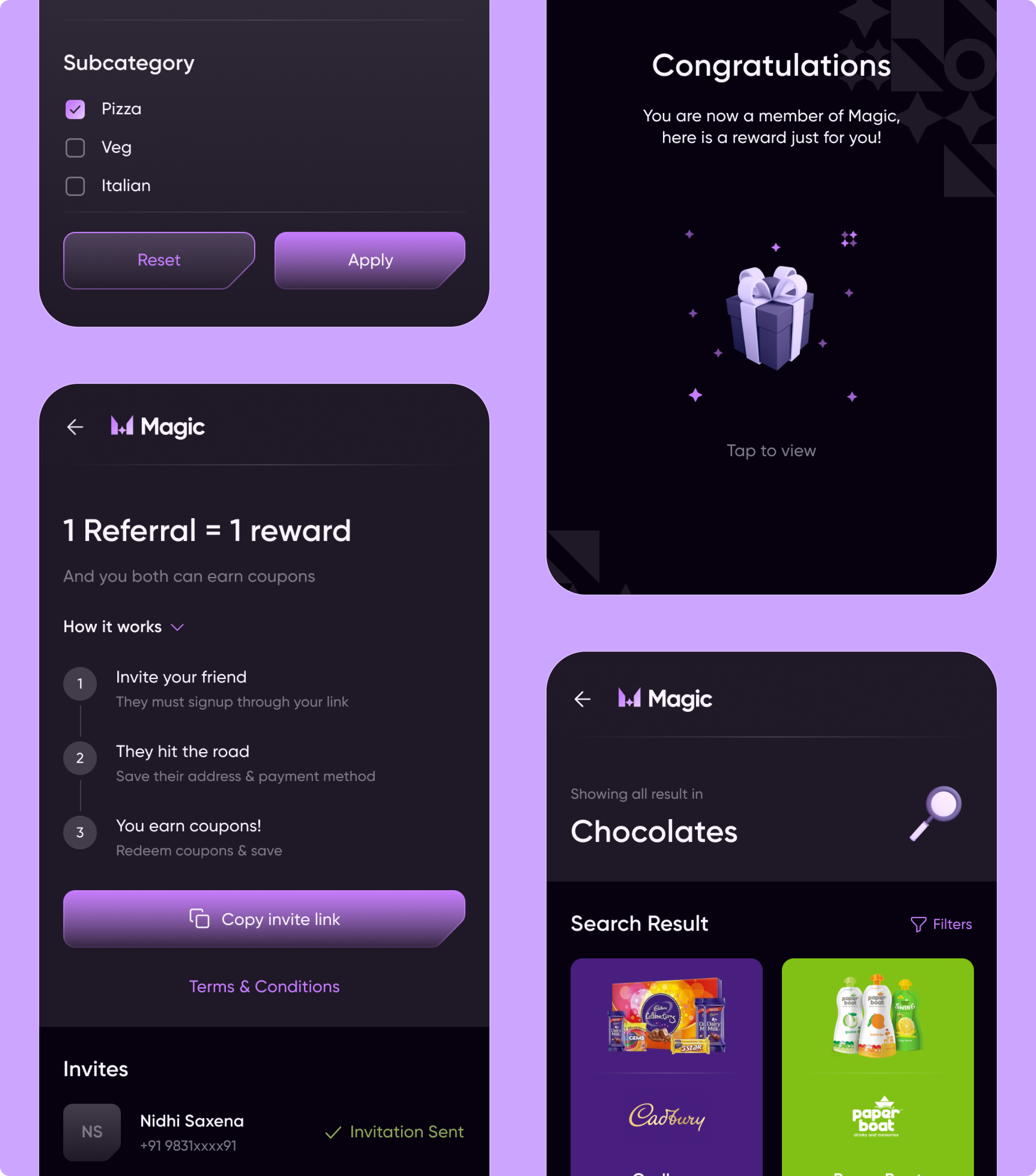
Designed end-to-end checkout and engagement experiences (rewards, referrals, address & payment setup, search & discovery) to enable faster, frictionless transactions.
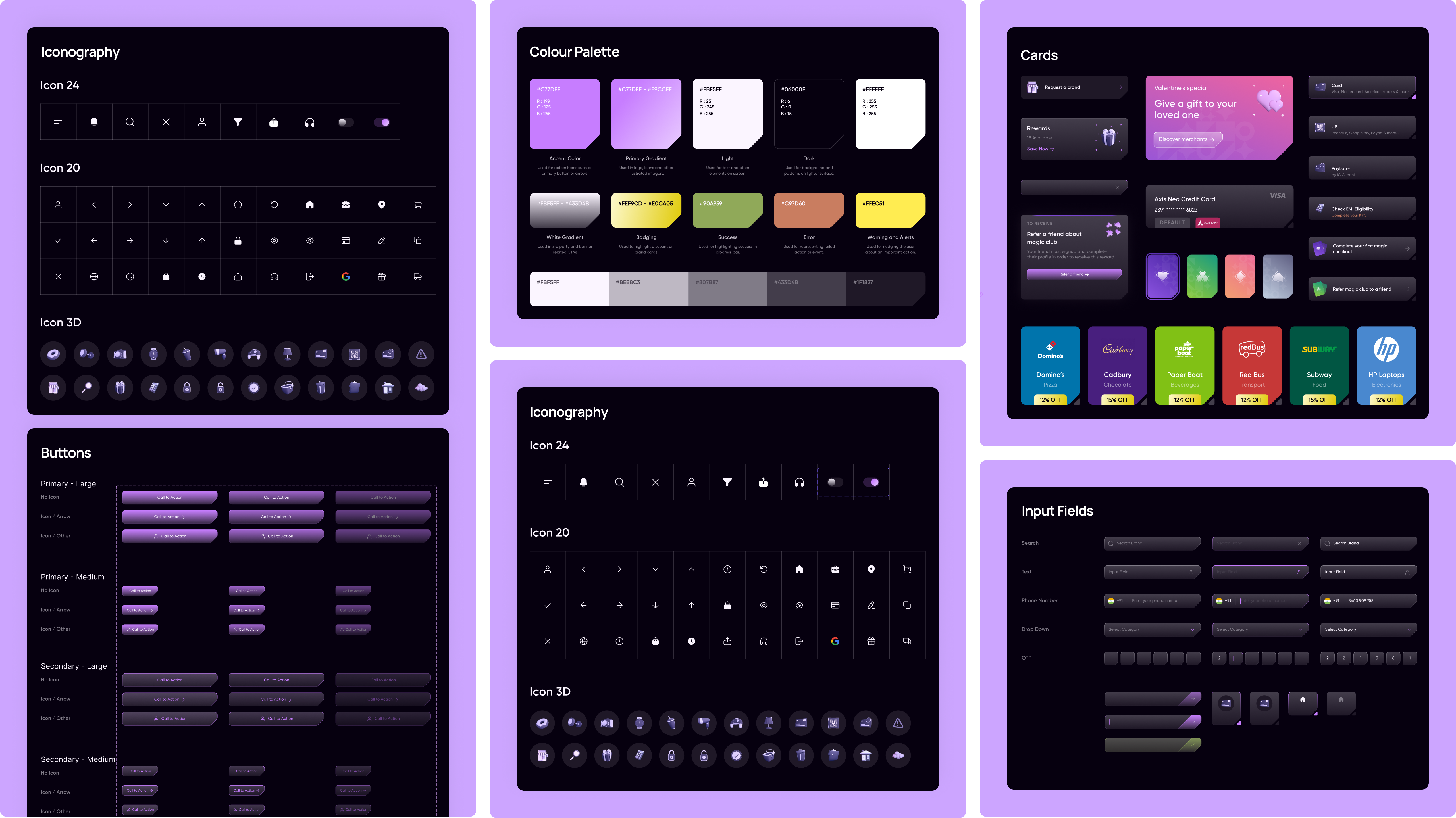
Built a scalable design system (color palette, iconography, cards, buttons, input fields) to ensure visual consistency and streamline product scalability.
Recommended Next
Designing a seamless mobile banking experience for 60M+ HDFC users