HoABL - House of Abhinandan Lodha is a next-generation real estate platform focused on virtual sales through engagement and conversions across its digital ecosystem.
The existing website struggled to retain users, with high bounce rates and short session durations that limited exploration of property features and slowed down lead generation.
Our mission was to reimagine HoABL’s website with a data-informed, behavior-driven design that reduces friction, strengthens discovery, and creates intuitive, confidence-inspiring real estate journeys.
through behavior-driven navigation and refined interaction logic
through a performance-focused interface reducing drop-offs
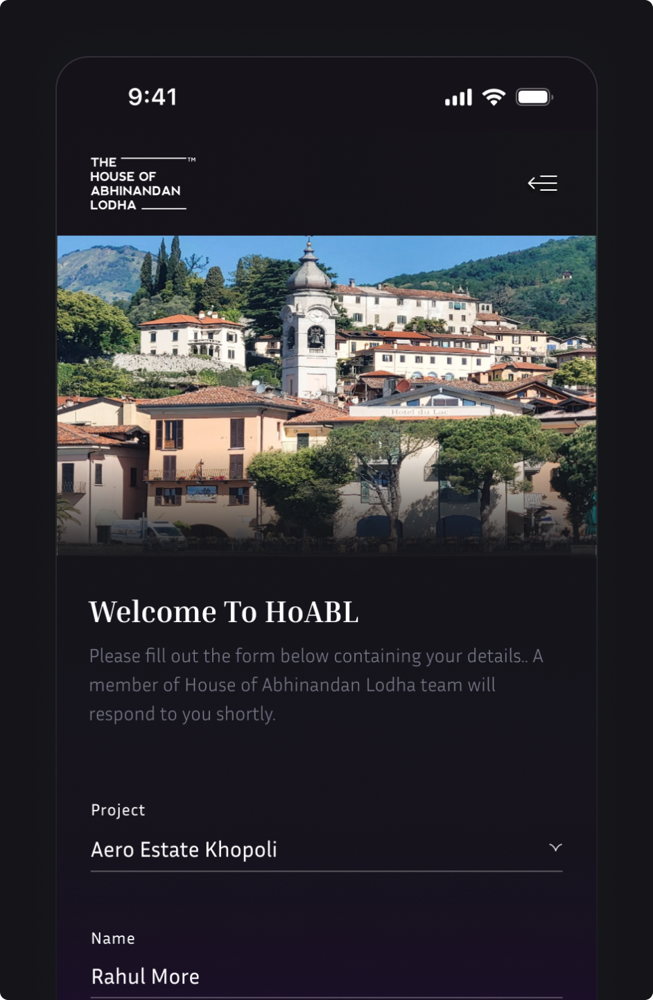
through streamlined forms and clearer CTAs
with a focused post-login experience reducing support dependency
Core service values translated into 3D visual cues reducing cognitive load and reinforcing trust.
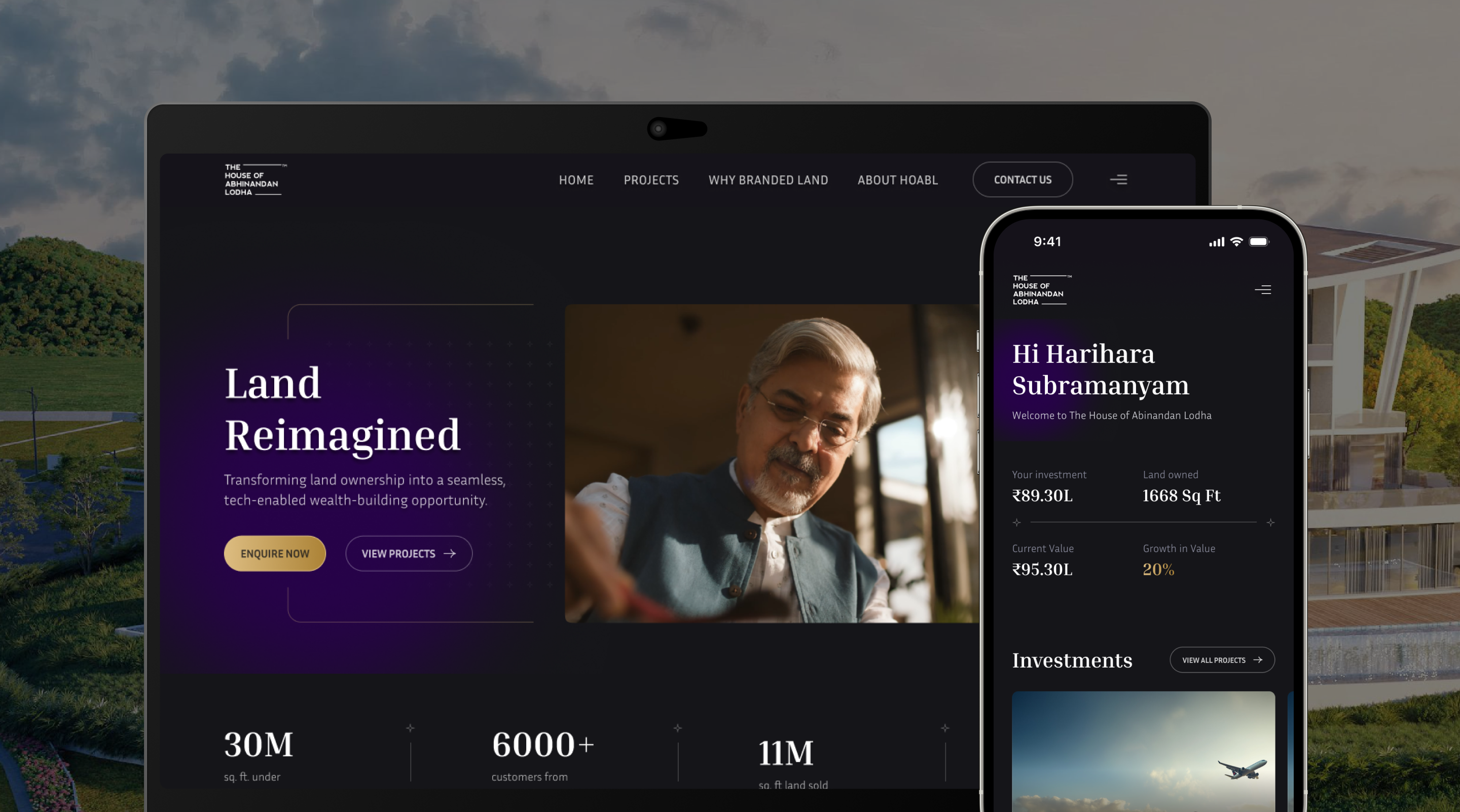
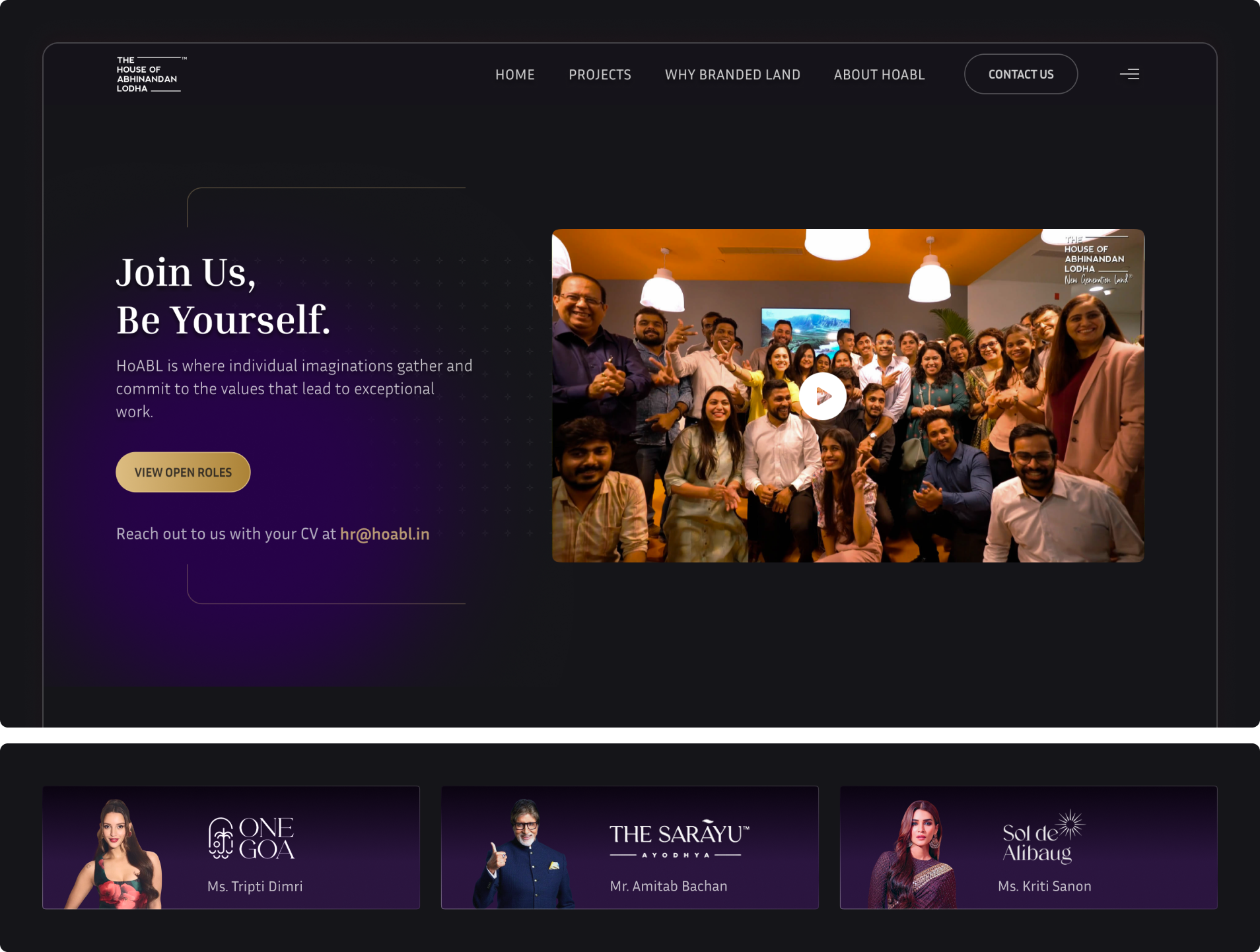
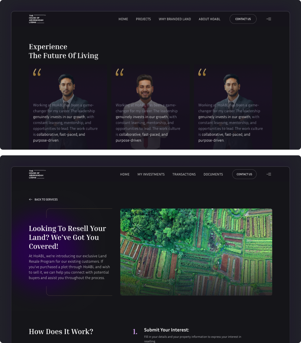
Interface balanced brand storytelling and conversion using hierarchy, focused CTAs, and intuitive layouts.
Controlled palette and clear hierarchy reduced cognitive load, enabling low-friction payments.
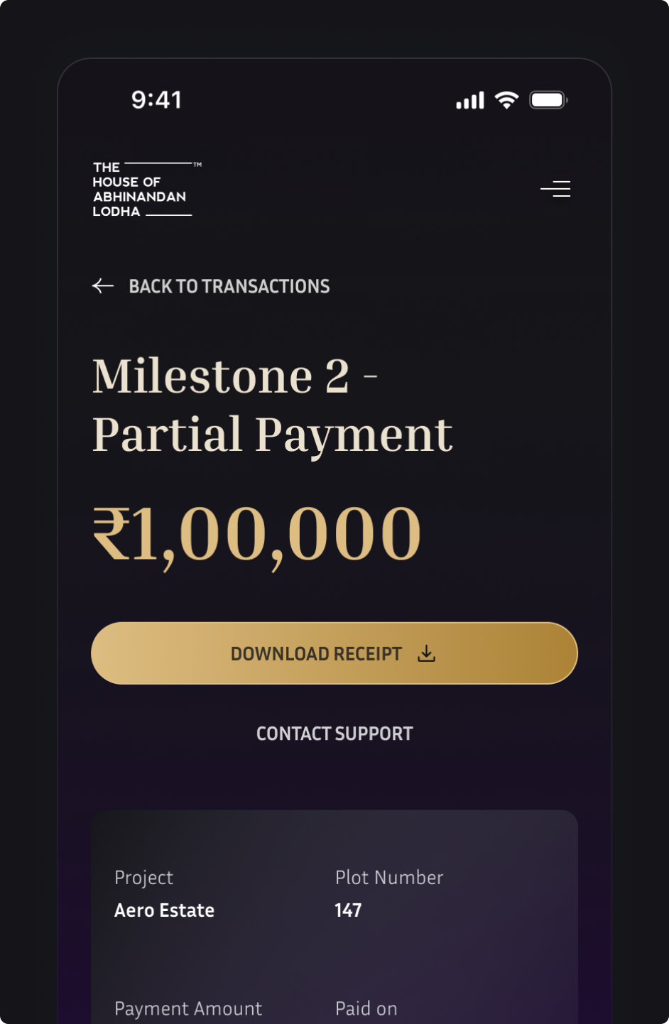
Property details and financial tools unified to enable faster, confident decisions.
Core service values translated into 3D visual cues reducing cognitive load and reinforcing trust.
Core service values translated into 3D visual cues reducing cognitive load and reinforcing trust.
Interface balanced brand storytelling and conversion using hierarchy, focused CTAs, and intuitive layouts.
Interface balanced brand storytelling and conversion using hierarchy, focused CTAs, and intuitive layouts.
Controlled palette and clear hierarchy reduced cognitive load, enabling low-friction payments.
Controlled palette and clear hierarchy reduced cognitive load, enabling low-friction payments.
Property details and financial tools unified to enable faster, confident decisions.
Property details and financial tools unified to enable faster, confident decisions.
For HoABL – House of Abhinandan Lodha, the redesign used UX and visual design to increase engagement by 2.6× across key digital journeys.
through simplified layouts
through revamped navigation
through cohesive visual system
.png)
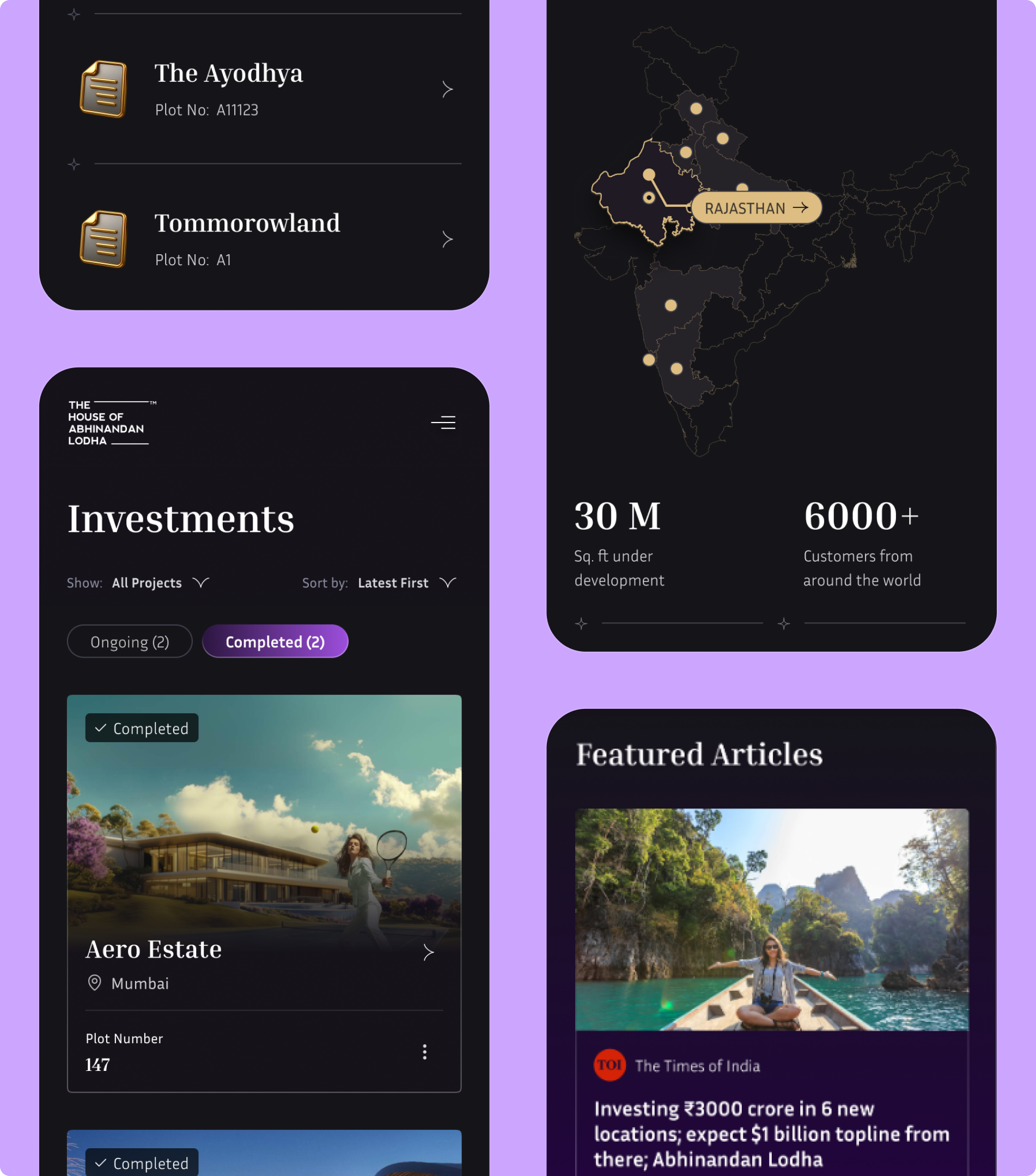
A personalized investment and transaction management dashboard was designed to surface portfolio value, growth, and activity at a glance - enabling confident, low-effort decision-making.
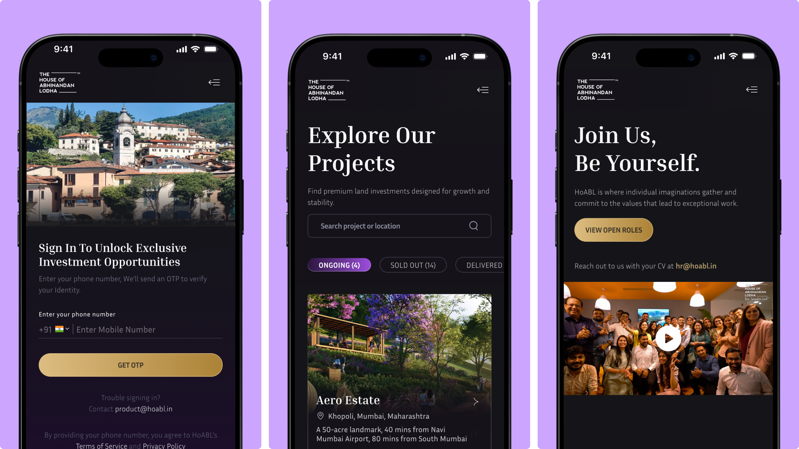
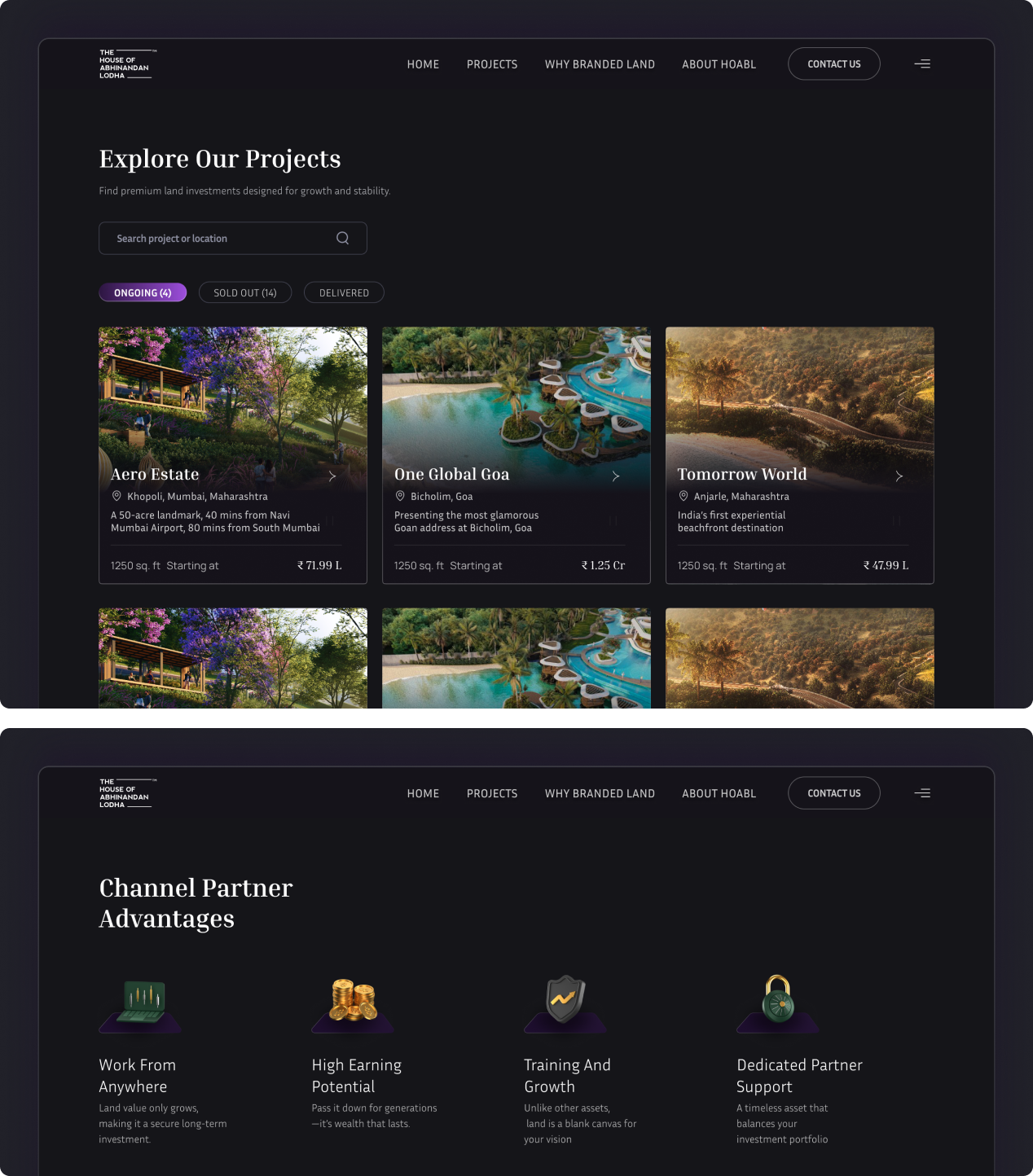
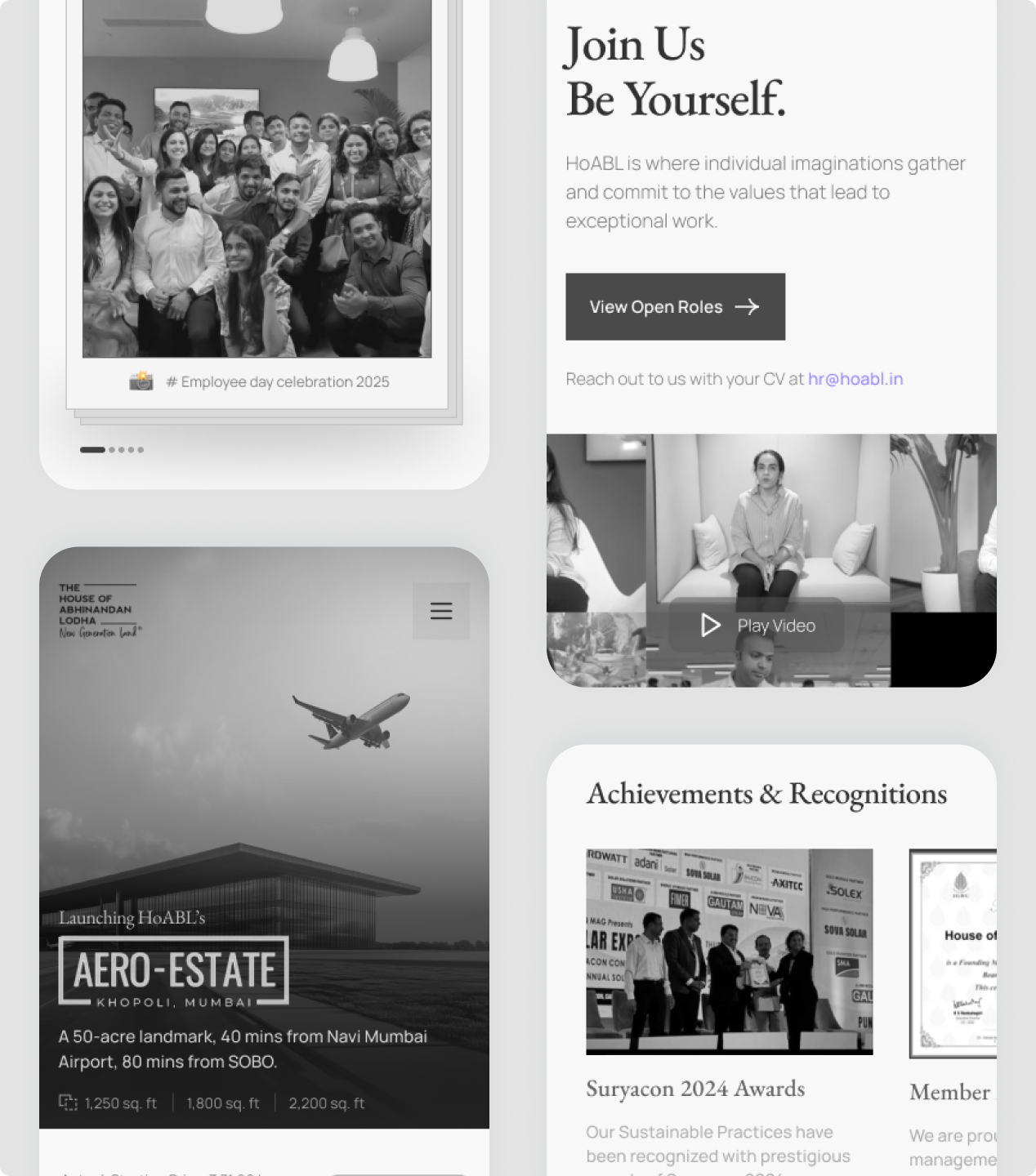
Content and UI guided users from entry to exploration, with filterable project listings reducing effort and cognitive load.
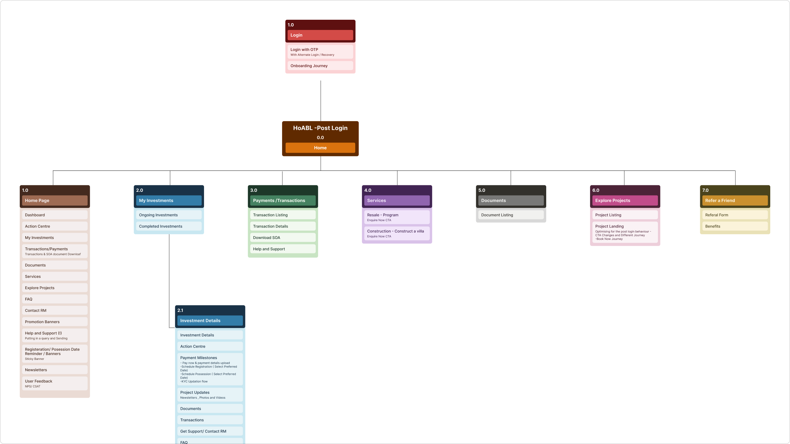
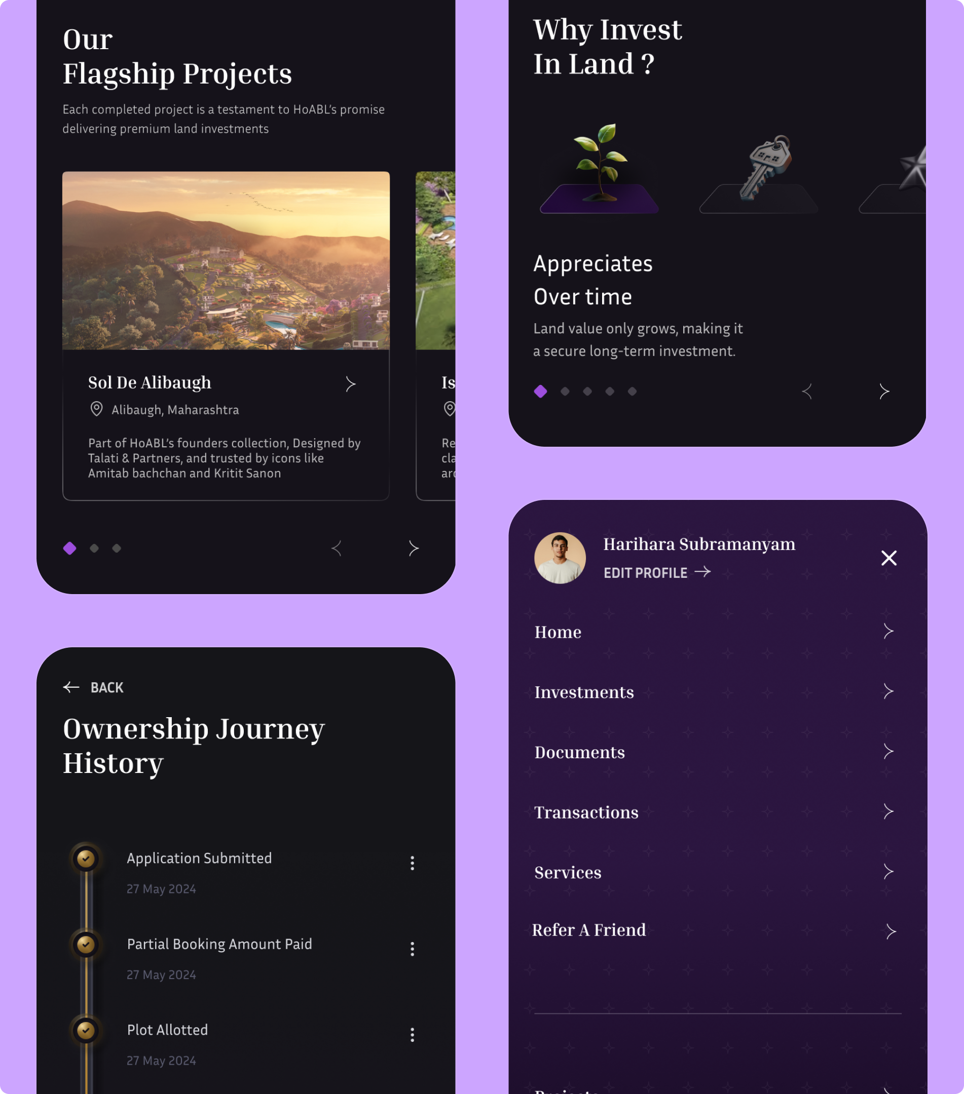
A clear post-login information architecture was defined to group investments, transactions, services, documents, and projects into distinct, task-led sections.
Integration of advanced SEO tools and CMS infrastructure with a single source of truth for seamless management and updates.
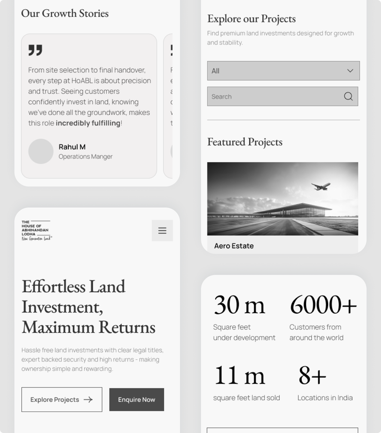
Wireframes establishing intuitive property browsing, modular project layouts, and conversion-focused CTAs were created before moving to visual design.
A minimalist and clean visual design with generous whitespace, clear typography, and high-contrast CTAs for intuitive navigation.
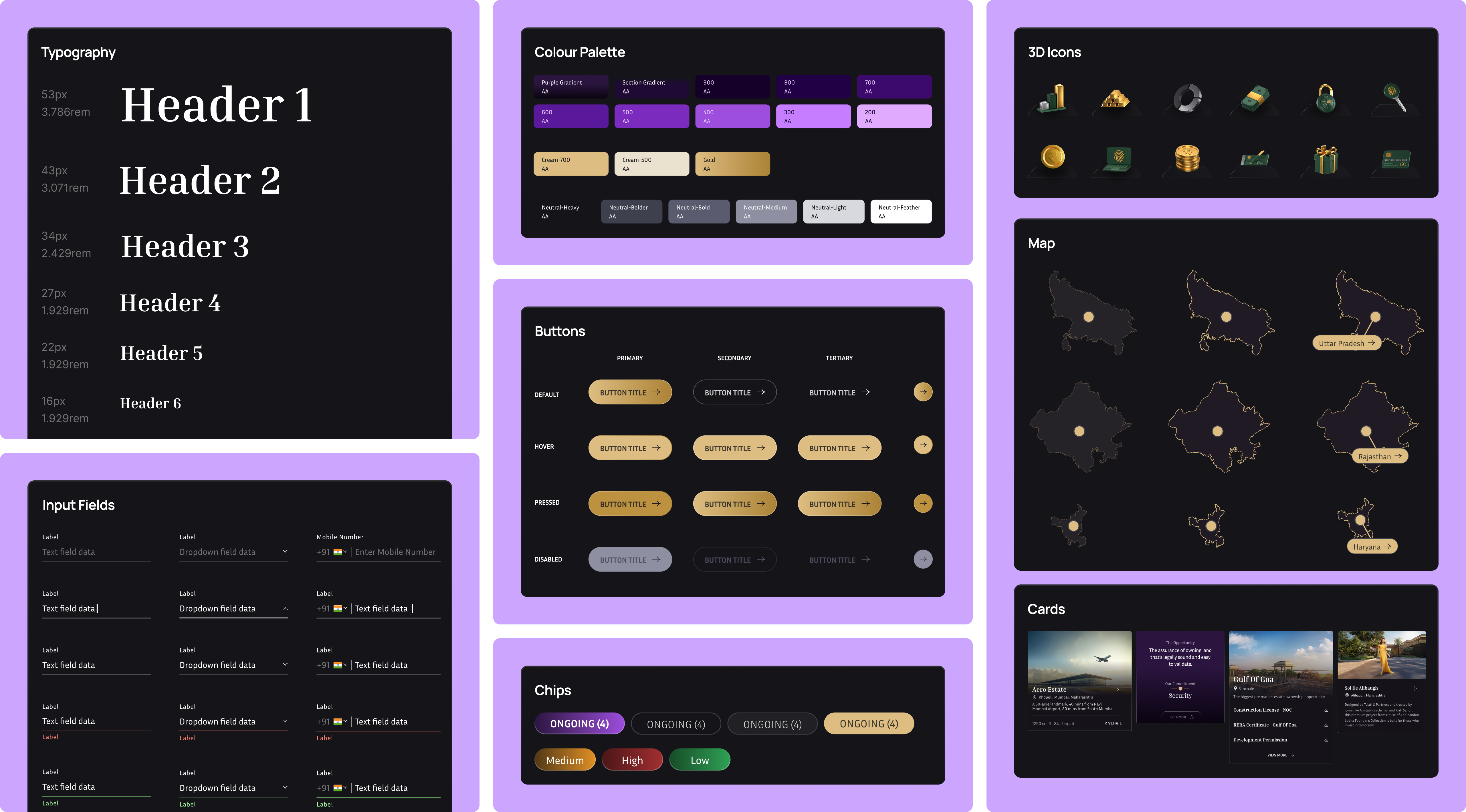
A cohesive design system featuring a refined color palette, consistent typography, and custom 3D icons was created for a unified brand experience across all devices.
Recommended Next
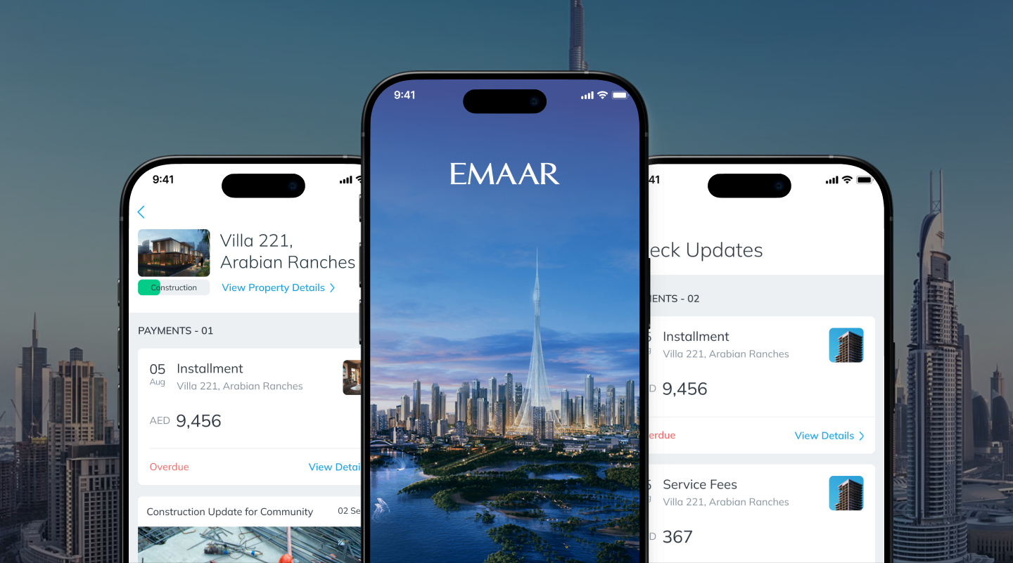
Digitally transforming billion-dollar enterprise with Emaar ONE app


